Instagram Post Maker With Logo: Add It to Every Post
How to add a logo to Instagram posts, every time: prepare a light and a dark PNG, keep it clear of the grid crop, then pick one of four ways to apply it.
To add a logo to every Instagram post, prepare it once (a transparent PNG in a light and a dark version, trimmed tight, exported at one fixed size), pick one position that survives the profile grid crop, and then apply it with a method that cannot drift: a locked template, a brand kit you reuse, or an Instagram post maker with your logo built in that places it by one rule across a batch. The hard part is not the first post. It is the fortieth.
I wrote a separate guide on where to put a logo on a social post: which corner, how big, how much clear space. This one is about the part that comes after that decision, getting the same logo onto every post, every week, without thinking about it.
Why "every post" is the hard part
Anyone can place a logo nicely once. The problem is that posts get made at different times, in different moods, from different files. One week the logo is the PNG from your website, the next it is a screenshot of it. One week it sits bottom right, the next it moves top left because the photo was busy there. Nobody decides to be inconsistent; it happens one reasonable exception at a time.
A logo builds recognition only when it repeats. So the real job is to remove the decisions: one file, one size, one position, one method. The brand consistency guide makes the wider case; here are the mechanics.
Step 1: prepare the logo file once
Most logo problems on social posts are file problems. Fix the file and half the mistakes below disappear.
- Start from the original. Ask whoever made your logo for the vector file (SVG, AI, EPS or PDF). If you only have a JPG from your website, it will probably have a white box around it, which is the single most common reason logos look pasted on.
- Export a transparent PNG. The background must be empty, not white. Open it on a dark background to check; any leftover white fringe shows immediately.
- Make two versions: a light one for dark backgrounds and a dark one for light backgrounds. One color each, usually your off-white and your near-black, or one brand color that has enough contrast. The full-color version with gradients and small details belongs on your website and profile picture, not in a corner at thumbnail size.
- Trim the empty space. Crop the PNG so the edges of the image touch the edges of the mark. A logo with invisible padding on one side will look off-center even when it is placed correctly, and it will look different in every tool you use.
- Export at a fixed size. On a 1080 by 1350 canvas, I keep a horizontal wordmark around 90 to 130 pixels wide (8 to 12 percent of the width). That is my own practice, not a standard. Export the PNG at about twice the size you will display it, so it stays sharp after the app scales it down, and never scale up a small file.
- Name the files clearly, for example logo-light.png and logo-dark.png, and keep them in one folder. Every tool gets these two files and nothing else.
If your mark only reads at large sizes, simplify it for social rather than making it bigger. A short wordmark or a single symbol does better in a corner than a full lockup with a tagline.
Step 2: pick a position that survives every crop
Instagram feed posts at 1080 by 1350 (4:5) show in full in the feed. The profile grid is different: it shows portrait tiles that are slightly narrower than 4:5, so a thin strip on the left and right of your post is hidden in the profile grid view. On a 1080 pixel wide post that works out to roughly 30 to 35 pixels per side, by my arithmetic. It is not much, but it is exactly where a logo pushed into a corner lives.
Rules I follow for 4:5 posts:
- Keep the logo at least about 80 pixels in from every edge. That margin survives the grid tile, the feed and a later reuse as a square.
- Keep it out of the headline's corner. If your headlines sit in the upper two thirds, the logo goes in the bottom band, and the other way round.
- Pick one of the bottom corners or the bottom center unless your layout puts text low. The 4:5 portrait design guide maps the text zones this depends on.
- Decide once and write it down. "Bottom right, 80 pixels in, logo-light on photos, logo-dark on pale backgrounds" is a whole brand rule in one line.
Before you commit, drop one finished post into the Instagram post crop preview. It shows the feed, the grid tile and the Story frame from the same image, so you can see whether the logo survives all three.
Step 3: choose how you will apply it
There are four realistic ways to get the logo onto every post. They differ in how much the consistency depends on you remembering.
1. By hand in an editor
Any editor works: Photoshop, Affinity, Figma, Photopea, even Keynote. The trick is to never start from a blank canvas.
- Make one master file at 1080 by 1350 with the logo layer placed at your chosen position and margin.
- Lock the logo layer so you cannot nudge it by accident.
- Add your two logo versions as separate layers and toggle the one that suits the background.
- For each new post, duplicate the master, replace the background and the text, and export.
This gives you total control and costs nothing extra if you already own the editor. It also relies entirely on you: the logo stays put only as long as you always duplicate the master. Fine for one post a week. Tedious at four.
2. Canva with a Brand Kit
Canva's Brand Kit holds your logo, colors and fonts so they are one click away. The important detail is that you apply the kit; Canva does not stamp the logo on for you. Consistency comes from how you use it:
- Upload both logo versions to the Brand Kit.
- Build one template at the Instagram portrait size with the logo placed and positioned.
- Make every new post from that template, never from a fresh design.
If you make many posts at once, Canva's Bulk Create (on paid plans) fills one template with rows of data from a spreadsheet, swapping the text and images you connect while anything you did not connect, such as the logo, stays where you placed it. The limit is the same as the editor route: the day you design a post outside the template, the rule is gone.
3. A batch tool that places the logo for you
The third way is to make placement the tool's job instead of a habit. You upload the logo once, and the tool places it by a fixed rule on every post it generates.
This is how the logo works in Creobee, the Instagram post generator with your logo on every post that I build. You describe your business once and upload your logo, and each of Creobee's five designed styles places it for you by its own fixed rule, straight on the post or on a small chip when the color under it would hide it. Creobee then makes a batch of up to 30 finished posts, each with its own headline and caption, at 1080 by 1350, designed as one feed in your colors. If you would rather pick the corner yourself, the original Classic look still offers six positions, from top left to bottom right, with the background, text color and overlay locked across the batch.
The trade-off is control. There is no canvas, no templates and no free placement; the style decides, or Classic's six positions do. If you want to design each post, use the editor or Canva. If you want the logo never to wander again, a locked setting beats a good intention.
4. Phone apps with watermark presets
Many photo-editing and watermark apps let you save a preset (logo file, corner, size, opacity) and apply it to a whole set of photos at once. This works well for businesses whose posts are mostly photos from the phone: a salon's finished cuts, a bakery's shelf in the morning.
Two cautions. These apps stamp the same file in the same spot regardless of what is underneath, so check each photo for contrast and switch to the other logo version where needed. And many default to a large, semi-transparent watermark that looks like stock-photo protection. Turn the opacity up to full, the size down, and it reads as a brand mark instead.
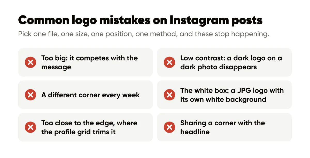
Common mistakes
- Too big. If the logo is the first thing you notice in the grid, it is competing with the message. Shrink it until the headline wins.
- Low contrast. A dark logo on a dark photo disappears; a colored logo on a busy photo turns to noise. Keep both versions ready and use the one that contrasts. The background images guide covers darkening or choosing backgrounds so the corner stays readable.
- A different corner every week. The most common one, and the one that quietly undoes the rest. Pick one position and keep it for months.
- The white box. A JPG logo with its own white background looks like a sticker. Use the transparent PNG.
- Too close to the edge. Anything within a few dozen pixels of the side can be trimmed in the profile grid.
- Resizing every time. A logo that changes size from post to post looks inconsistent even in the right corner.
- Sharing a corner with the headline. The logo and the text should never fight for the same spot.
A 20-minute setup you only do once
- Export logo-light.png and logo-dark.png, trimmed and transparent.
- Decide the position and margin and write the rule down in one line.
- Check one post in the crop preview.
- Set up your chosen method: a locked master file, a Canva template, or a batch tool that places it for you.
After that, the logo stops being a decision. If you would rather not assemble each post at all, an AI Instagram post generator that puts your logo on every post handles the placement, the headline and the caption in one go. Your first 3 posts are free, no card needed, which is enough to see how your logo sits on your grid.
Frequently asked questions
Should my logo be on every single Instagram post?
On branded graphics, yes: the repetition is what makes it work. On casual phone photos or reposted customer content, it is fine to leave it off, as long as all your designed posts carry it in the same place.
What file format is best for a logo on Instagram posts?
A transparent PNG, exported from the original vector file, trimmed tight to the mark. Keep a light and a dark one-color version so you can match any background.
Does the Instagram profile grid cut off logos?
It can. The profile grid shows 4:5 posts as slightly narrower tiles, so thin strips on the left and right are hidden there. Keep the logo about 80 pixels in from the edges and it survives.
Can I put my logo on Instagram posts automatically?
Yes, in three ways: a watermark preset in a photo app, a template with the logo already placed (in Canva or any editor), or a post generator that stores your logo and places it by a fixed rule on every post in a batch.
Is it better to use a watermark or a small logo?
A small, fully opaque logo in a fixed corner. A large semi-transparent watermark across the image protects photos from reuse but makes posts look like stock previews, and it competes with your message.


Put it into practice
Turn this into posts designed for your feed
Paste your website. Creobee reads what you sell, then plans, writes and designs your posts about it as one feed in your logo and colors, captions included, and on Autopilot it posts them for you.
How the AI Instagram post generator works