How to Italicize on Instagram: Bio and Captions
How to italicize on Instagram when there is no italic button: how italic text works, where it shows in a bio, caption or comment, and where it quietly breaks.
Instagram has no italic button, so italic text on Instagram is made from Unicode characters that look like slanted letters. Type your line into an italic font generator, copy the result, and paste it into your bio, caption or comment. It renders on iPhone, Android and the web, but it breaks inside hashtags and @mentions.
Why is there no italic button on Instagram?
Because the bio, the caption box and the comment field are plain text. Instagram stores a string of characters, not a document with formatting, so there is nothing for a bold or italic toggle to attach to. Stories are the exception: the text tool there has its own styles, because Stories text is drawn into the image rather than saved as text.
That plain-text design is also why the workaround exists. If the field only accepts characters, the trick is to find characters that already look italic.
How does italic text on Instagram actually work?
Unicode, the standard that assigns a number to every character your phone can show, has a block called Mathematical Alphanumeric Symbols, code points U+1D400 to U+1D7FF. It exists for mathematicians, who need 𝑥 and x to be different symbols in the same formula. The block includes a full italic alphabet starting at U+1D434 and a sans-serif italic alphabet starting at U+1D608, plus bold, script, fraktur and monospace sets.
An italic generator swaps each letter you type for the matching symbol. The output is still text, so it survives copy and paste into any plain-text field, including Instagram's. Your phone's font has glyphs for these symbols and draws them slanted. Instagram never knows anything happened.
One detail gives the trick away. There is no italic small h in that block. U+1D455 is marked reserved, because a slanted h already existed at U+210E as the Planck constant symbol ℎ, and Unicode does not encode the same character twice. A good generator substitutes ℎ; a lazy one leaves you with a plain h in the middle of "𝑡ℎ𝑒". If you have ever seen an italic bio with one upright letter, that is why.
Step by step: italic in your bio, caption or comment
- Open the Instagram italic font generator and type the phrase you want slanted. Keep it to a few words; you will see why below.
- Pick a style. Sans-serif italic (𝘈𝘵𝘰𝘮𝘪𝘤 𝘏𝘢𝘣𝘪𝘵𝘴) sits closest to Instagram's own interface font and reads as a true italic of the text around it. Serif italic (𝐴𝑡𝑜𝑚𝑖𝑐 𝐻𝑎𝑏𝑖𝑡𝑠) looks like a book title and stands out more. Bold italic is there when you need both.
- Tap Copy.
- Paste it where you want it. For the bio: profile, Edit profile, Bio, paste, Done. For a caption: paste straight into the caption box while composing or editing. For a comment: paste into the reply field like any other text.
- Check it on a phone, not just on the screen you typed it on. Then, if you can, check it from a second phone or a friend's Android. A style that renders on your device is not proof it renders on theirs.
The same steps work in the name field and in DMs. Whether you should use italic in the name field is a different question, and the answer below is no.
Can you write in italic on Instagram Stories?
Yes, and you do not need a generator. The Stories text tool has several built-in styles, and some of them are slanted. If you paste Unicode italic into a Story text box it will render too, but the native styles are cleaner at large sizes, and they are what most people mean by "Instagram fonts" when they ask. Save the Unicode method for the places that have no styles: bio, captions, comments.
Where italic text fails on Instagram
This is the part most guides skip, and it is where the method costs you.
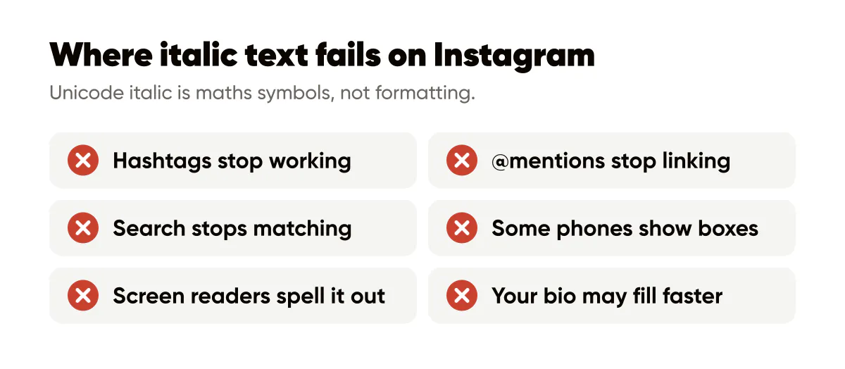
Hashtags stop working. This is the one I had to see for myself, so I put a styled tag on a test post from the Creobee account and went looking for it. To Instagram, #𝘨𝘳𝘢𝘯𝘥𝘰𝘱𝘦𝘯𝘪𝘯𝘨 and #grandopening are two different strings, which means two different tag pages, and the styled one is empty. Nobody browsing the tag you meant will ever see the post. The same applies to @mentions: a styled handle does not link to the account, and the person does not get notified.
Search stops matching. Instagram search reads your name field and bio as typed. To the index, 𝘺𝘰𝘨𝘢 and yoga are different strings, so an italic "yoga instructor" in your bio is invisible to someone searching for a yoga instructor. That is why the name field, the most heavily indexed text on your profile, should stay plain. What gets indexed and how is in Instagram SEO: keywords in captions and bios.
Some phones show boxes. Current iPhones render the block, and so do recent Androids that ship Google's fonts. Older or heavily customised Android devices sometimes lack the glyphs and draw a rectangle for each letter. You cannot see this from your own phone, which is the reason for step 5 above.
Screen readers spell it out. A person using VoiceOver or TalkBack hears the underlying character names, so "𝘯𝘦𝘸" may come out as "mathematical sans-serif italic small n, e, w", or as silence. Instagram cannot fix that in the app, because the characters really are maths symbols. The W3C's guidance on info and relationships puts the principle plainly: information and structure conveyed through presentation should be available in text too. Emphasis carried only by lookalike glyphs is not.
Your bio may fill faster than you expect. The limit is 150 characters. Every letter in this block sits above U+FFFF, which means it is stored as two 16-bit units, and apps disagree about whether that counts as one character or two. Instagram does not document which count its editor uses, so paste first and watch the field before you rewrite anything. The social media character counter gives you the visible letter count; Instagram's own editor has the final say.
When is italic worth using?
Rarely, and briefly. On Creobee's own account I keep captions plain and use italic for one thing at most: a book or podcast title, a quoted line, or a single word I would have stressed out loud. In a bio, one slanted phrase under a plain headline reads as deliberate. Three lines of it read as a template someone forgot to finish.
If the temptation is to italicise because the caption feels flat, the caption is the problem. A stronger first line does more than a slant ever will. That is where the time should go, whether you write the caption yourself or start from an AI caption generator that writes in your voice.
Two habits keep italic from hurting you. Never style anything a person needs to search, tap or copy: hashtags, handles, prices, dates, phone numbers. And treat the styled phrase as decoration for sighted readers, so the plain text around it still carries the full meaning on its own.
Do this this week
Open your profile and read the bio and your last three captions. If anything you want found is styled, change it back to plain text first. Then pick one place where italic earns its keep, probably a title or one stressed word in a caption, run it through the generator, paste it, and check the post from a second phone. If it looks right there, you have your rule: one italic phrase, plain everything else.
Related reading: bold text on Instagram covers the heavier sibling of this trick and where it breaks, Instagram bio fonts ranks every style by how it reads at bio size, and why Instagram removes line breaks fixes the other formatting problem that hits every caption.


Put it into practice
Turn this into posts designed for your feed
Paste your website. Creobee reads what you sell, then plans, writes and designs your posts about it as one feed in your logo and colors, captions included, and on Autopilot it posts them for you.
How the AI Instagram post generator works