Instagram Post Backgrounds That Keep Text Readable
Instagram post backgrounds that keep text readable: abstract or photo, the contrast rules, stock licensing made plain, and a five-step routine for 30 posts.
The best background for a branded post is the one your headline can beat. Pick a small family of backgrounds, abstract gradients or photos in one mood, darken them until your text passes a contrast check, confirm the license allows commercial use, and export at a size the platform will not mangle. Everything else is taste.
Abstract or photo backgrounds for branded posts?
Both work, and they fail in different ways. Abstract backgrounds (gradients, soft shapes, textured color fields) are predictable. Nothing in them competes with your words, the palette is yours to control, and thirty of them in a row look like one brand without effort. Their weakness is that they can feel like wallpaper if the headline is weak, because there is nothing else on the canvas to carry the post.
Photo backgrounds carry mood and context. A cafe owner posting over a shot of their own espresso machine says something a gradient never will. Their weakness is contrast. Photos have highlights, faces, edges and detail exactly where your text needs quiet space, and every new photo resets the visual rhythm of your grid.
My default for Creobee's own account is abstract for text-led posts and photos only when the photo is the point. It is also why our AI Instagram post generator starts every new user on an abstract gradient until they pick or upload something else, precisely because it is the safer bet for readability at batch scale.
Should you use your own photos or stock?
Use your own photos whenever the subject is you, your workspace, your product or your process. They are the strongest proof-of-experience signal you have, and nobody else can post them. The E-E-A-T guide for solo creators explains why that kind of receipt matters far beyond Instagram.
Use stock when you need a mood shot you cannot make yourself: a city skyline, a texture, a season. Keep it to one visual family (same color temperature, same level of grain, same distance from the subject) so it still reads as your brand and not as a random search result.
Contrast is the whole job
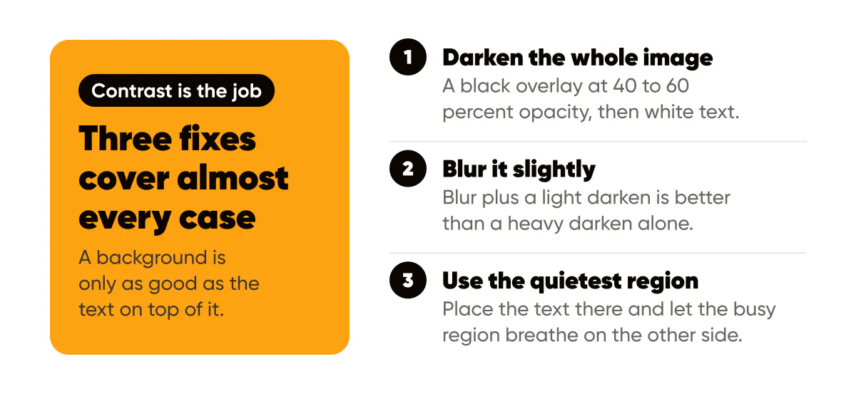
A background is only as good as the text on top of it. The WCAG 2.2 contrast minimums ask for 4.5:1 for normal text and 3:1 for large text. Headlines on a 1080x1350 post are large text by any definition, but I still aim for the higher number because phones get viewed in sunlight and feeds get scrolled at speed.
Three fixes cover almost every case:
- Darken the whole image with a black overlay at 40 to 60 percent opacity, then use white text. This is the fastest fix and the one I use most.
- Blur the image slightly so edges stop fighting letterforms. Blur plus a light darken is better than a heavy darken alone.
- Place the text over the quietest region of the photo and let the busy region breathe on the other side. A rule-of-thirds crop helps here.
If none of those work, the photo is wrong for a text post. Save it for a photo-only post or a carousel slide. The full set of rules, including scrims, font floors and thumbnail testing, is in the text over images readability rules.
How do you keep 30 backgrounds looking like one brand?
Constrain the inputs. I keep a folder of eight backgrounds on my laptop for Creobee's own account: four gradients built from our amber brand color and near-black, and four photos with the same warm temperature. Every batch uses one of those eight. When I generate a set of posts, the variety comes from the headlines, not from the backdrops.
If you use photos, apply one treatment to all of them: the same overlay color, the same overlay opacity, the same crop tightness. Two photos with the same treatment look related even if their subjects differ. Two photos with different treatments look like two brands even if the subject is the same. This is the same argument I make in brand consistency on social media: lock the frame, vary the message.
Licensing in plain language
You can only post a background you have the right to use. Photos you took are yours. Photos a client or friend took need permission, ideally in writing. Photos found through an image search are almost never free to reuse, regardless of how many other accounts are using them.
Free stock sites publish their own licenses, and they are not all the same. The Pexels license allows free commercial use with some stated exclusions, and it is worth reading the exclusions rather than assuming. Creative Commons images come in several variants; the Creative Commons license types page explains which ones require attribution, which forbid commercial use and which forbid modification. A background that gets darkened and cropped is a modification, so a no-derivatives license rules it out for this use.
Two habits keep this simple. Save the license URL in the same folder as the image. And prefer sources that let you use images commercially without attribution, because a credit line on a 4:5 post is one more piece of text competing with your headline. The longer version, including screenshots, reposts and AI-generated imagery, is in stock photos, licenses and copyright for creators.
What file format and size should a background be?
Start with the largest clean version you can get, at least 1080 pixels on the short side so a 4:5 crop does not upscale. Upload it as JPEG or WebP; PNG makes sense only for graphics with flat color and sharp edges, where its lossless compression does not balloon the file. The MDN overview of image file types is the reference I send people when they ask why their 8 MB PNG background was rejected by an upload form. Creobee, for example, caps logo and background uploads at 3 MB, and a well-compressed JPEG of a 1080x1350 photo lands well under that.
Once the post is composed, export the final graphic at 1080x1350 and let the platform recompress it. Uploading a 4000-pixel image does not give you a sharper feed post; it gives Instagram more to throw away.
A five-step background routine for this week
- Pick your family: abstract, photo, or a fixed ratio of the two. Write it down in your one-page design system.
- Collect eight backgrounds that fit the family, with the license link saved next to each file.
- Apply one treatment to all eight: same overlay color, same opacity, same blur.
- Drop your longest headline on each and run the pair through a contrast checker. Cut any background that fails.
- Generate your next batch using only those eight, and look at the grid preview before posting.
That last step is the one people skip. A background that looks fine alone can clash with its neighbors in a grid. For the wider system of colors, logo and layout that the backgrounds sit inside, branded visuals in 2026 lays out the recognition-first standards I follow.
Put it into practice
Turn this into posts designed for your feed
Paste your website or say what you do. Creobee plans, writes and designs your posts about it as one feed in your logo and colors, captions included, and on Autopilot it posts them for you.
How the Instagram feed design works