How to Bold Text on Instagram (Bio and Captions)
How to bold text on Instagram with no bold button: how Unicode bold works, bold sans vs serif, where it holds in bios and captions, and where it breaks.
Bold text on Instagram is made of Unicode bold characters, because the app has no bold button for bios, captions or comments. Type your phrase into a bold text generator, copy the bold version, and paste it into Instagram. It stays bold anywhere plain text is accepted, and it breaks inside hashtags and @mentions.
How to make text bold on Instagram
- Open the Instagram bold text generator and type the words you want heavier. A headline, a name, one phrase. Not the whole caption.
- Choose a style. Bold sans (𝗦𝗼𝘂𝗿𝗱𝗼𝘂𝗴𝗵, 𝗯𝗮𝗸𝗲𝗱 𝗮𝘁 𝟱𝗮𝗺) looks like a heavier weight of Instagram's own font. Bold serif (𝐒𝐨𝐮𝐫𝐝𝐨𝐮𝐠𝐡, 𝐛𝐚𝐤𝐞𝐝 𝐚𝐭 𝟓𝐚𝐦) looks like a headline off a printed page. The next section is about choosing between them.
- Tap Copy.
- Paste. In the bio: profile, Edit profile, Bio, paste over the line you want bold, Done. In a caption: paste into the caption box while composing or editing. In a comment: paste into the reply field.
- Look at it on a phone before you move on. Then look at it from a second phone if you can get hold of one, because the letters are drawn by the viewer's device, not by Instagram.
That is the whole method. The rest of this is why it works, which style to pick, and the places it fails without telling you.
Why is there no bold button in the first place?
The bio and caption fields store plain text. No markup, no styling layer, nothing for a bold button to switch on. What they can store is any character in Unicode, and Unicode contains a block called Mathematical Alphanumeric Symbols, running from U+1D400 to U+1D7FF. It exists for equations, where a bold 𝐀 and a plain A mean different things, so the standard gave bold its own set of symbols instead of leaving it to formatting.
A generator swaps each letter you type for its bold symbol. The output is still text, so Instagram accepts it, and your phone's font draws the heavy glyphs. Nothing about the post is formatted. The boldness is baked into the characters, which is why it survives being copied into a comment, a DM, Threads or a LinkedIn post. Any field that takes plain text will carry it.
One small advantage over italic: the bold sets come with digits. Type 5am in the bold style and the 5 goes heavy with the letters. Type it in the italic style and the 5 stays upright, because Unicode never drew italic digits. If your headline has a time or a year in it, bold handles it and italic does not.
Bold sans or bold serif?
Bold sans for almost everything. Instagram's interface is set in a sans-serif face, so a bold sans phrase reads as emphasis inside the text around it, the way bold works in a document. It is the more legible of the two at bio size, because the strokes stay even instead of thinning out at the joins.
Bold serif when you want the phrase to feel like a title rather than a stressed word. A serif line above a plain sans bio reads as a nameplate. It pulls more attention, which is exactly why one line is the limit. Two serif lines and the profile looks like a wedding invitation.
The generator also offers bold italic, bold script and bold gothic. Treat those as wordmarks: a single name, never a sentence. Bold gothic in particular turns to texture below about 14 pixels, which is roughly where bio text lives on a phone.
Where bold text stays bold on Instagram
- Bio. The most common use, and the one that reads best.
- Name field. It renders, but read the search warning below before you do it.
- Captions on posts and Reels, including the part hidden behind "more".
- Comments and replies.
- Direct messages.
Where bold text breaks
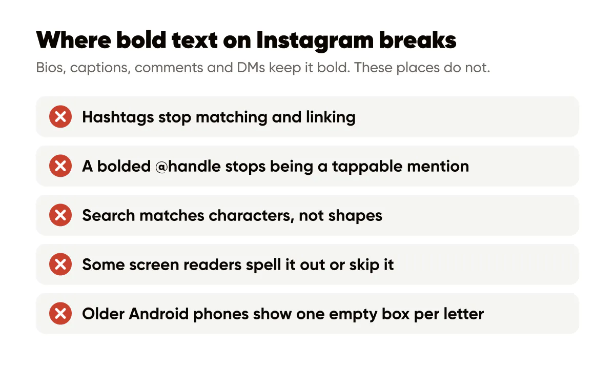
Hashtags and mentions. A hashtag only matches on the exact characters after the hash, so #𝘆𝗼𝗴𝗮 is not #yoga. It does not turn blue, it does not link anywhere, and nobody browsing that tag will find it. A bolded @handle stops being a tappable mention the same way. Keep both plain, always, even when the rest of the line is bold.
Search. Instagram matches your name and bio against what people type, and it matches characters, not shapes. 𝘆𝗼𝗴𝗮 is not yoga to the index. Bold the one word that describes what you do and you have quietly removed yourself from the searches you most want to win. The name field is the most heavily weighted text on your profile, which makes it the worst possible place for this; how Instagram keywords get indexed covers what belongs there instead.
Stories and alt text. The Stories text tool has its own real fonts, so use those rather than pasting. Alt text should never be styled at all, since its only reader is a screen reader.
Older Android phones. Current iPhones and recent Androids draw the mathematical block fine. Some older or heavily skinned Android builds do not have the glyphs and show one empty box per letter. When I added the styles to Creobee's free bold text generator I pasted all twenty into a test account and read the profile back on both phones I own. The bold, italic and monospace sets came through on both. The circled and squared ones came through as boxes on the older handset. You cannot see any of this from the phone you typed it on, which is why step 5 exists.
Does bold text on Instagram hurt reach?
There is no penalty for using it, and no evidence Instagram treats it as a signal at all. What you lose is indirect. Any bolded keyword stops counting as a keyword, and a caption that is bold from top to bottom is harder to read, which shows up as people scrolling past. Bold one line and the trade is fine.
The accessibility caveat nobody mentions
VoiceOver and TalkBack read the characters underneath. Depending on the screen reader and its version, 𝗦𝗮𝘃𝗲 𝘁𝗵𝗶𝘀 comes out as the plain words, or as "mathematical sans-serif bold capital S, a, v, e", or as nothing at all. The W3C's success criterion on information and relationships asks that information conveyed through presentation also be available in text. Lookalike bold conveys its emphasis to sighted readers only.
The rule that falls out of that is narrow and easy to follow: never bold anything a person needs to act on. Prices, dates, times, phone numbers, addresses, the call to action itself. Bold the headline, keep the instructions plain, and the profile still works for someone who hears it rather than sees it. The wider checklist is in accessible social media design.
What good bold actually looks like in a bio
Headline bold, everything else plain. A bakery bio, written as a placeholder:
𝗦𝗼𝘂𝗿𝗱𝗼𝘂𝗴𝗵, 𝗯𝗮𝗸𝗲𝗱 𝗮𝘁 𝟱𝗮𝗺
Naturally leavened bread and croissants, sold out most days by 9.
Open Tue to Sun, 7am.
Preorder for pickup below.
The bold line does one job. It tells a visitor at a glance what this account is. The hours and the call to action stay plain, so they can be searched, read aloud and copied out. Set the same bio in bold from top to bottom, which is what most generators nudge you toward, and nothing stands out because everything does.
Captions follow the same rule. Bold the first line, the one that shows before "more", and leave the body alone. And if what you really want is bold typography at a size people can read while scrolling past, the headline does not belong in the caption at all. It belongs on the image, which is what an Instagram quote maker is for. The caption only has to introduce it.
Do this this week
Read your bio as a stranger who just saw one post. If nothing is bold, run your first line through the bold text generator in bold sans, paste it, and leave the other lines as they are. If everything is bold, undo all but the first line. Then check that your name field, your category and any keyword you want found are plain text, and open the profile from a second phone to confirm nothing came through as a box.
Related reading: how to write in italic on Instagram covers the slanted version of the same trick and where it costs you more, Instagram bio fonts ranks all twenty styles by how they hold up at bio size, and why Instagram removes line breaks fixes the spacing you will want the moment your headline is bold.

Put it into practice
Turn this into posts designed for your feed
Paste your website. Creobee reads what you sell, then plans, writes and designs your posts about it as one feed in your logo and colors, captions included, and on Autopilot it posts them for you.
How the AI Instagram post generator works