Brand Consistency on Social Media: What to Lock
Brand consistency on social media: which colors, type, logo spot and layout to lock, what to vary, and a 20-minute audit that shows where your feed drifts.
Brand consistency on social media means a follower can recognize your post before reading a word of it. You get there by locking four things, your palette, your type, your logo position and your layout family, and varying only the message and imagery. Recognition compounds with every post; reach resets to zero each time.
Why brand consistency beats chasing reach
Reach is rented. Every post starts from nothing and earns whatever the ranking system gives it that day. Recognition is owned. Every post you publish in a consistent frame adds to a pattern your followers carry in their heads, and that pattern makes the next post faster to notice and easier to trust.
The mechanism has a name. The mere-exposure effect is the tendency to develop a preference for things simply because they are familiar. It is one of the more robust findings in psychology, and it only works if the exposures look alike. Fifty posts in fifty styles are fifty first impressions. Fifty posts in one style are one impression, repeated fifty times.
There is a second, quieter effect. The Nielsen Norman Group describes the aesthetic-usability effect, where people perceive attractive, coherent designs as easier to use and more trustworthy. A feed that looks like it was made by one hand reads as competent before anyone has checked whether it is.
Does consistency matter if the algorithm decides who sees my post?
Yes, because the ranking system decides distribution, but the human decides whether to stop. Instagram's own ranking explainer describes predicting how likely a person is to interact with a post based on signals including their past interactions with the poster. Recognition is what turns a follower into a repeat interactor. If they do not know the post is yours in the first half second, they scroll, and the system learns they are not interested.
What to lock and what to vary
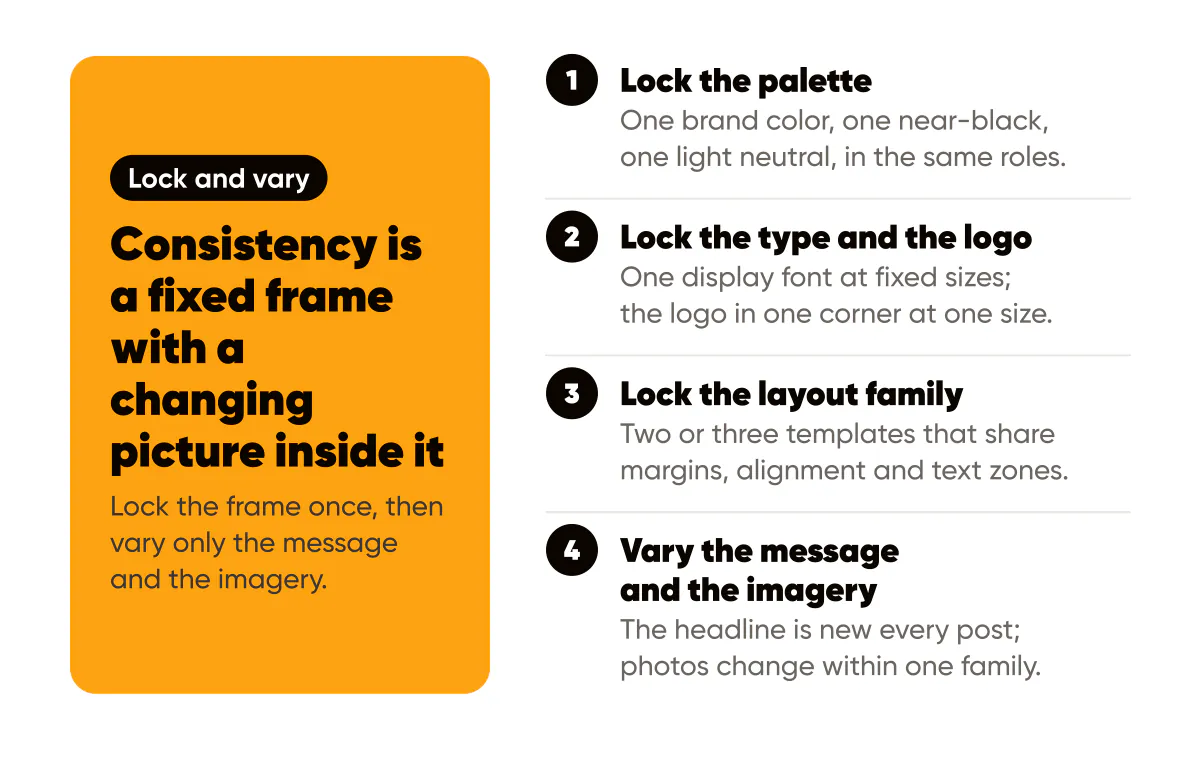
The mistake is treating consistency as sameness. Sameness is boring and people tune it out. Consistency is a fixed frame with a changing picture inside it. The frame is what I lock. The picture is what I vary.
Here is the split I use for Creobee and recommend to everyone who asks:
- Lock the palette: one brand color, one near-black, one light neutral, in the same roles every time.
- Lock the type: one display font, one text font or a second weight, at fixed sizes for headline and support.
- Lock the logo: one corner, one size, one color version, with the same margin from the edge.
- Lock the layout family: two or three templates that share margins, alignment and text zones.
- Vary the message: the headline, the claim, the idea is new every post.
- Vary the imagery: photos, gradients and illustrations change, within a family that behaves the same under text.
Locking the first four is a one-time cost. I spent about an afternoon on Creobee's version, and the one-page design system for solopreneurs walks through building yours in about an hour. Once it exists, every post gets faster, because the decisions that used to take twenty minutes are already made.
Can a brand be too consistent?
It can be too static, which is different. If every post is the same layout with the same background color, followers stop registering the individual posts and register the pattern only. The fix is not to break consistency but to widen the frame slightly: two or three layout templates in rotation instead of one, and a background family that varies in image while holding the treatment steady. The grid planning guide shows how alternating a small set of templates creates rhythm without drift.
The other way to be too consistent is to refuse to change when the brand has genuinely moved. Consistency is a means to recognition, not a vow. When a refresh is warranted, do it deliberately, in one move, and keep one anchor element so followers can follow you across the change. The brand refresh guide covers that transition sequence.
The consistency audit
Once a quarter I do a twenty-minute audit. It is embarrassingly simple and it catches drift every time.
- Open your profile grid and take a screenshot of the last twelve posts.
- Count the distinct background colors, distinct fonts, and distinct logo positions across those twelve. Anything above two or three per category is drift.
- Cover the captions and handle with your thumb and ask a friend whose feed is not yours whether all twelve are from the same brand. If they hesitate, you have your answer.
- Find the post that looks least like the others and write down what changed. That is your leak.
- Fix the template, not the post. The post is already published; the template is what makes the next twelve.
When I ran this for Creobee after a few months, the leak was logo position. I had let it float between two corners depending on the headline layout. Six positions in the generator back then, but I should have been using one. I fixed the default position and the next batch came out uniform. Creobee's designed styles now place the logo for you, which closes that leak.
How do I stay consistent when I generate posts in batches?
Batching is the easiest place to be consistent, because the settings are chosen once for the whole set. If you generate thirty posts from one template with one palette and one logo position, cohesion is automatic; the only thing varying is the headline. The failure mode is the opposite: making one post at a time and improvising the frame each time. Whatever tool you use, set the frame first and generate second. That is the idea behind designing the Instagram feed as one set: the logo, colors and style are chosen once, and every post in the week follows them.
A worked example
Consider a hypothetical freelance accountant. Before: posts alternate between a blue template from one tool, a green template from another, photos with white text, and text posts with black. The logo appears in three places at two sizes. Each post is fine alone. The grid looks like four different businesses.
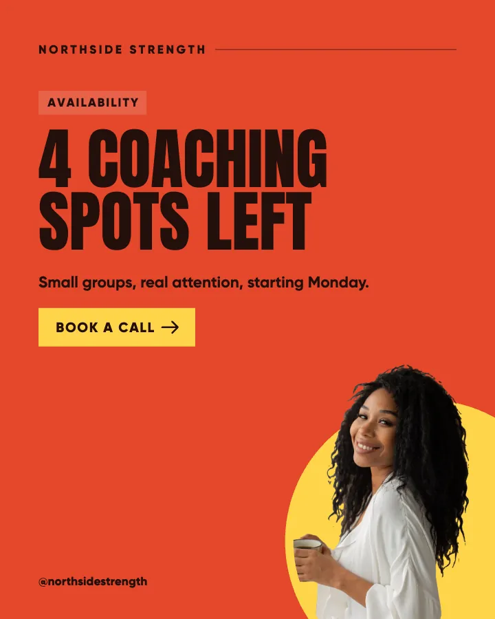
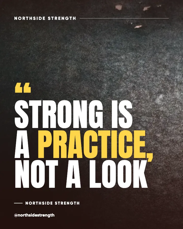
After locking the frame: a deep navy and a warm off-white as the two main surfaces, one heavy sans for headlines, an amber accent on one word per post, the logo in the bottom-right at one size, and two layouts in rotation, a full-color text post and a darkened photo post. Nothing about the accountant's expertise changed. Recognition did, and with it the sense that this is a person who has their act together, which is the one thing an accountant's marketing has to convey. The page on social media posts for accountants shows a bookkeeping feed built on one frame like this.
Do this this week
Screenshot your last twelve posts and run the five-step audit. Write down the single biggest leak. Fix it in your template, not by editing old posts. Then produce your next batch from the corrected template and compare the two screenshots side by side in a month.
The wider case for recognition-first visuals in 2026, including why 4:5 became the default format, is in the 2026 branded visuals standards. Pair it with the logo placement guide if the corner is your leak, as it was mine.
One decision sits upstream of all of this: whether the face on the account is you or the business. I work through that trade-off in personal brand or business brand.
Put it into practice
Turn this into posts designed for your feed
Paste your website or say what you do. Creobee plans, writes and designs your posts about it as one feed in your logo and colors, captions included, and on Autopilot it posts them for you.
How the Instagram feed design works