How to Mix Posts, Carousels and Stories in a Week
A weekly Instagram content mix for small business: what posts, carousels, animated posts and stories each do, a mix for three paces, and a steady grid.
 KutayOctober 9
Color, type, layout and logo rules that make branded social media graphics readable and recognizable, with examples you can apply to your next post.
You do not need a designer to make posts people recognize. You need a handful of rules and the discipline to keep them. This category collects the rules I built into every Creobee post: text over images that stays readable, a color palette with contrast checked, one logo position, type sizes that survive a phone screen, and the 4:5 portrait format that gives a feed post the most space without cropping.
Every article here ends with something you can apply to your next post, not a mood board. The free tools at /tools include a text contrast checker, a brand color extractor and Instagram font generators, and the size guides at /sizes give the exact canvas, safe zone and file limits for each placement. Start with the readability rules, then choose your palette, then decide where the logo lives. After that, branding is mostly repetition.
Text over images stays readable with 9 rules: 4.5:1 contrast, scrims, calm backgrounds, size floors, margins and a thumbnail test. One fix covers most.
Social media colors that work: a three-color brand system, the 4.5:1 contrast test every text pairing must pass, and 10 ready-made palettes with hex codes.
Logo placement on social media posts: which corner, how big (8 to 12 percent of the width), how much clear space, and the Instagram zones to keep it out of.
Font size for social media posts: headlines about 70px, support lines 36px on a 1080x1350 canvas, plus the two-font pairing and hierarchy rules I follow.
The Instagram 4:5 format (1080x1350) gives a post the most feed space without cropping. Why it beats square, and how to lay out text the grid never cuts.
A weekly Instagram content mix for small business: what posts, carousels, animated posts and stories each do, a mix for three paces, and a steady grid.
KutayOctober 9
Open the Reel, tap the three dots, then Remove from profile grid. It stays in your Reels tab with its likes. Plus how to put a Reel back on your grid.
KutayOctober 6
How to make animated Instagram posts: the size and length to use, how to animate one in Canva step by step, and how to keep your grid looking planned.
KutayOctober 6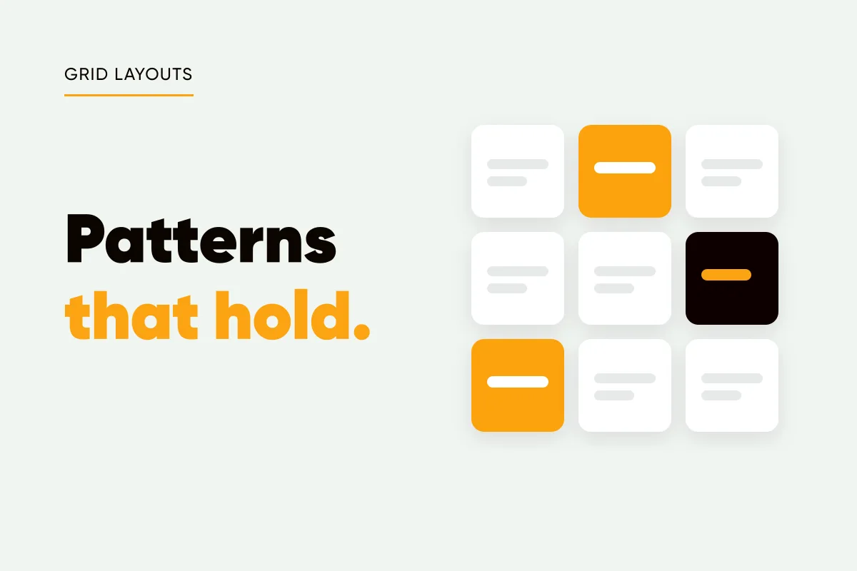
Instagram grid layout ideas for a business feed: checkerboard, columns, diagonal and one look, why row and puzzle layouts break, and where Reels fit.
KutayOctober 6
How to add a logo to Instagram posts, every time: prepare a light and a dark PNG, keep it clear of the grid crop, then pick one of four ways to apply it.
KutaySeptember 23
Canva Bulk Create for Instagram, step by step: a 1080x1350 template, a CSV with a row per post, connected fields, its limits and when an alternative is faster.
KutaySeptember 23
Predis AI vs Canva for Instagram: a generator that posts from a brief, or an editor with an AI layer. A fair look at speed, brand, formats, price and fit.
KutaySeptember 23
How to bold text on Instagram with no bold button: copy Unicode bold into your bio or captions in one tap, pick sans or serif, and avoid where it breaks.
KutaySeptember 11
How to italicize on Instagram when there is no italic button: how italic text works, where it shows in a bio, caption or comment, and where it quietly breaks.
KutaySeptember 11
Instagram bio fonts are Unicode letters, not fonts. How to change your bio font without an app, six styles that read well, and how they count toward your 150.
KutaySeptember 11
Testimonial posts that read as evidence, not boasting: asking permission, specific quotes, honest before and afters, a quote card template and the FTC rules.
KutaySeptember 2
Personal brand vs business brand: five criteria for choosing as a solopreneur, the hybrid most one-person companies should use, and what it means for your logo.
KutayAugust 31
Fix your AI brand voice with one page: 10 real sentences, 5 banned phrases and 3 tone words for any prompt, plus a five-caption test to prove it works.
KutayAugust 26
Accessible social media design in practice: the contrast ratio to hit, the smallest readable text size, alt text that states the words, and captions.
KutayAugust 23
How to rebrand your Instagram without confusing followers: keep one anchor, announce the change, re-template evergreen posts. A two-week plan and a checklist.
KutayAugust 23
One-page brand guidelines you can build in an hour: three colors, two fonts, logo rules, three layouts and tone words to reuse in every tool and AI prompt.
KutayAugust 22
Stock photo licensing for social media, in plain language: copyright, fair use, Creative Commons, what free stock sites allow, reposts and AI images.
KutayAugust 22
Instagram post backgrounds that keep text readable: abstract or photo, the contrast rules, stock licensing made plain, and a five-step routine for 30 posts.
KutayAugust 21
Canva vs AI post generators for social media: which fits your volume, skill, time and need for control, where each falls down, and how to use both together.
KutayAugust 21
Color psychology in marketing: what the research supports, what is folklore (blue does not simply mean trust), and a practical way to pick a brand color.
KutayAugust 20
Minimalist social media design, explained: why two-to-five-word posts survive the scroll, how to write a three-word headline, and how whitespace does the work.
KutayAugust 20
Brand consistency on social media: which colors, type, logo spot and layout to lock, what to vary, and a 20-minute audit that shows where your feed drifts.
KutayAugust 19
Visual hierarchy in graphic design is size, weight, contrast, position and whitespace. How to give a social post one focal point and test it in 3 seconds.
KutayAugust 19
Logo placement on social media posts: which corner, how big (8 to 12 percent of the width), how much clear space, and the Instagram zones to keep it out of.
KutayAugust 18
Text over images stays readable with 9 rules: 4.5:1 contrast, scrims, calm backgrounds, size floors, margins and a thumbnail test. One fix covers most.
KutayAugust 18
Social media colors that work: a three-color brand system, the 4.5:1 contrast test every text pairing must pass, and 10 ready-made palettes with hex codes.
KutayAugust 17
Font size for social media posts: headlines about 70px, support lines 36px on a 1080x1350 canvas, plus the two-font pairing and hierarchy rules I follow.
KutayAugust 17
Instagram quote posts get scrolled past when the words and design are borrowed. How to write a short line of your own and design a 4:5 post people save.
KutayAugust 16
Instagram alt text in thirty seconds a post: where to add it, what to write for text graphics, 20 examples to copy, and the contrast rules for legible posts.
KutayAugust 14
How to create a cohesive Instagram feed with a small system instead of perfectionism: two or three template families, one fixed palette and a posting rhythm.
KutayAugust 13
The Instagram 4:5 format (1080x1350) gives a post the most feed space without cropping. Why it beats square, and how to lay out text the grid never cuts.
KutayAugust 11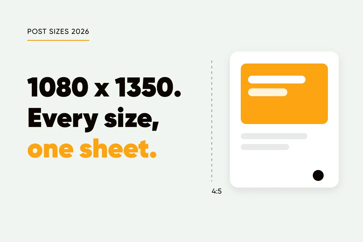
Instagram image sizes for 2026 in one list: 1080x1350 portrait, 3:4, square, landscape, Stories and Reels, plus safe zones and export settings for sharp text.
KutayAugust 11
Need an AI image generator with correct text? Generate the picture with no words in it and typeset the words on top. How to do it, and when to use both.
KutayJuly 18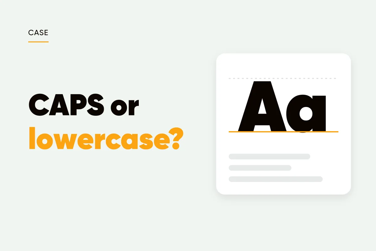
Sentence case vs all caps on social posts: caps for two to four word statements, sentence case for anything longer, lowercase only as a deliberate voice.
KutayJuly 9
Instagram text alignment for posts: center one to three short lines and quotes, left-align lists and longer text, skip right, and put the logo on the same edge.
KutayJuly 7
Highlight one word in a headline, by weight or color, and pick the word that carries the promise. Why it works, and how it meets caps and line breaks.
KutayJuly 4
Font licensing explained for social media graphics: desktop vs web licenses, Google Fonts commercial use, what bundled fonts allow, and how to keep a record.
KutayJuly 2
White space in graphic design, applied to social posts: margins as a share of the canvas, one focal point, room around the logo and headline line spacing.
KutayJune 30
Gradient backgrounds for social media posts that stay classy: two palette colors, low contrast, one direction, one abstract family, and when a flat color wins.
KutayJune 27
Dark background social media posts stop the scroll when used well: when near-black beats white, contrast rules for light text, and a 70/30 rhythm for your grid.
KutayJune 25
Image SEO best practices for blog and social graphics: filenames people search, alt text that states the words, WebP exports and Open Graph link previews.
KutayJune 23
Instagram Highlights for business work as your profile's navigation: five Highlights in buyer order, short names, covers in one style and a quarterly refresh.
KutayJune 16
LinkedIn image posts for founders: the 4:5 size that works, the file types LinkedIn accepts, text-first writing with one graphic, and a calmer palette.
KutayJune 4
Instagram Reel cover design best practices: design for the cropped grid tile first, keep text in the 9:16 safe zone, and reuse the template your feed uses.
KutayJune 2