Why 4:5 Portrait Is the Best Instagram Post Format (and How to Design for It)
The Instagram 4:5 format (1080x1350) gives a post the most feed space without cropping. Why it beats square, and how to lay out text the grid never cuts.
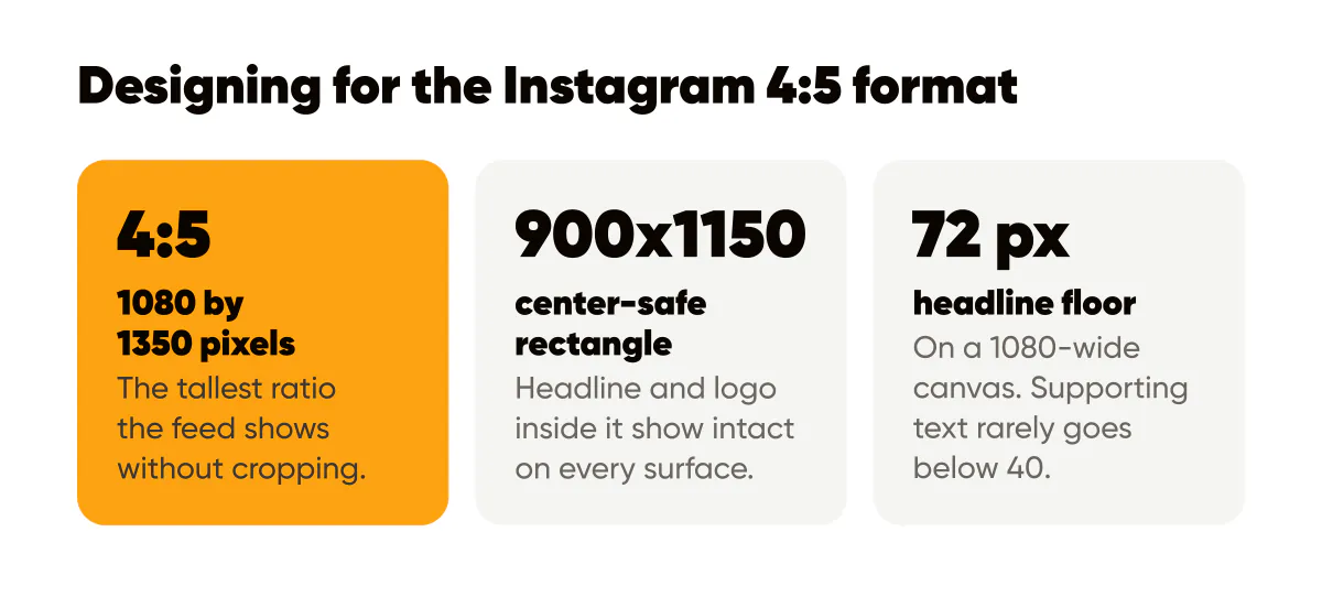
4:5 portrait (1080 by 1350 pixels) is the best default Instagram post format because it is the tallest ratio that Instagram, Facebook, LinkedIn and Threads all show without cropping, so it fills more of the screen than a square at the same width. Instagram alone has also accepted 3:4 (1080 by 1440) since 2025; use that when Instagram is the only destination. Design for it by keeping headline, supporting line and logo inside a centered safe rectangle.
The case for 4:5 as your default Instagram post format
In the first month of building Creobee, my AI Instagram post generator, I made 4:5 the format for every post it produces, and I have not designed a square feed post since. The argument has three parts, and none of them requires trusting anyone's engagement numbers.
First, height. The feed shows every post at the full width of the screen, so the only variable is how tall your post is. A square uses the width and stops. A 4:5 post keeps going for another quarter of that height. When someone scrolls past, your post simply occupies more of the moment.
Second, no cropping. Instagram allows ratios from landscape to 4:5 in the feed. Anything taller than 4:5 gets trimmed to fit. So 4:5 is the sweet spot: the maximum vertical space with zero loss. The exact dimensions are in the Instagram post size cheat sheet, along with the other formats you might occasionally need.
Third, attention. On a phone, a 4:5 post that fills most of the viewport pushes the previous and next posts mostly off screen. That is not an algorithm trick, just less competition for the eye in the second your post is visible.
Is 4:5 better than square for Instagram?
For feed posts, yes, and I struggle to find a case where square wins. Square was the original Instagram format, so a lot of habits and templates still default to it. The honest downside of 4:5 is the profile grid: Instagram's grid tiles are portrait now but not exactly 4:5, so a narrow band at the edges of each post is hidden in grid view. If you keep text inside a safe area, that band never contains anything important. The grid view is also where posts are judged as a set rather than one by one, and planning how they sit next to each other there is what Instagram feed design is about.
There is also a workflow argument. If you design square and later want a portrait version, you have to invent content for the extra space. If you design 4:5 and need square, you crop. Start from the bigger canvas. If your tool starts from a different width, the 4:5 aspect ratio calculator gives you the matching height.
Should I use 9:16 for feed posts instead?
No. 9:16 is the Stories and Reels format, and if you upload a 9:16 image as a feed post, Instagram crops it to 4:5 anyway. You lose the top and bottom of your design, which is usually where a template puts the logo and the call to action. Design 9:16 for Stories, 4:5 for the feed, and derive one from the other rather than forcing one to do both jobs. Buffer's Instagram size guide is a good sanity check whenever you are unsure which surface accepts which ratio. An animated feed post can stay 4:5 too; see how to make animated Instagram posts.
How to lay out a 4:5 post
A 1080 by 1350 canvas viewed on a phone is smaller than it feels in a design tool. Here is the zoning system I use for every text-led post, described in pixels from the top.
- Outer margin: about 80 pixels on every side. Nothing that must be read lives outside it.
- Top band, roughly 80 to 250: logo or a small category label. Keep it small; this is not the headline's job.
- Headline zone, roughly 350 to 900: the one sentence the post exists for, large, in your display font.
- Support zone, roughly 900 to 1150: a shorter line that adds a detail, a number, or a nudge.
- Bottom band, 1150 to 1270: a handle, a URL, or nothing at all.
The important idea is the center-safe rectangle. Feed, grid, Story repost and screenshot all preserve the middle of the image; they disagree about the edges. If your headline and logo sit inside roughly the central 900 by 1150 pixels, every surface shows them intact.
Where does Instagram's own interface overlap the post?
In the feed, nothing overlaps the image itself. The username sits above, the like, comment and share icons sit below, and the caption starts under those. That is one more reason 4:5 is comfortable to design for: the image is a clean rectangle with no UI on top of it.
Stories are the opposite. Meta documents the safe zone for text on Stories and Reels, where the top and bottom bands are covered by the progress bar, your name, and the reply field. When I reuse a 4:5 post as a Story, I center it on a 9:16 canvas and the interface lands on the padding, not on the design.
Text size and hierarchy on 4:5
The single most common mistake I see on text posts is too many words at too small a size. A 4:5 post is a poster, not a page. Nielsen Norman Group's work on legibility, readability and comprehension separates whether text can be decoded from whether it will be read; on a feed, both have to happen inside a second or two.
My floor for headline text on a 1080-wide canvas is about 72 pixels tall, and I go much larger for short headlines. Supporting text rarely goes below 40. Anything smaller gets eaten by compression and by the fact that the feed image is displayed narrower than 1080 on most phones. The contrast and line-length rules that go with these numbers are in the text over images readability guide, and the order in which the eye should land on headline, support and logo is the subject of visual hierarchy in social graphics.
Here is a concrete example. A bakery posts "Sourdough drops at 7am. Gone by 9." as the headline, two lines, centered, about 96 pixels tall. Below it, "Saturday only" at 44 pixels. Logo at the top, small. Nothing else. On a phone that reads instantly, and it still reads when shared to a Story at reduced size.
Carousels and 4:5
Every slide in a carousel must share a ratio, and 4:5 is the right one for the same reasons as a single post. The extra height is especially valuable on slide one, where the hook has to earn the swipe. If you build carousels regularly, the carousels that convert guide covers slide structure, and the standards in branded visuals for 2026 explain why a 4:5-first system keeps a whole grid recognizable.
Do this this week
Take your three most recent square posts and rebuild each one at 1080 by 1350 using the zones above. Do not add words; add space. Then post the next one in 4:5 and look at it in your own feed on your phone, not in the design tool. If your headline reads before your thumb moves, the layout works.

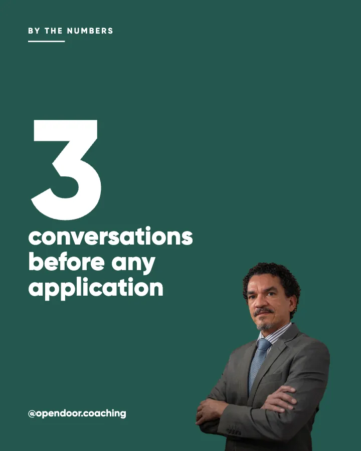
Put it into practice
Turn this into posts designed for your feed
Paste your website or say what you do. Creobee plans, writes and designs your posts about it as one feed in your logo and colors, captions included, and on Autopilot it posts them for you.
How the AI Instagram post generator works