Where to Put Your Logo on Social Media Posts (and Where Not To)
Logo placement on social media posts: which corner, how big (8 to 12 percent of the width), how much clear space, and the Instagram zones to keep it out of.
Put your logo in the same corner on every post, small enough to stay secondary to the message, with clear space around it and away from the zones where platform buttons overlap the image. Position consistency matters more than size. A small logo in a fixed spot builds recognition; a big logo that moves around builds nothing.
Logo placement on social media posts: the conventions and why they exist
Corners exist for logos. They are the parts of a rectangle the eye visits last, which is exactly where a brand mark belongs: seen after the message, not before it. Bottom-right is the most common choice because it is where reading ends in left-to-right languages. Bottom-left and top-left are the next most common. Center placement is for logo reveals and little else.
The reason to care is not aesthetics. It is repetition. The mere-exposure effect, the well-documented tendency to prefer things simply because we have encountered them before, works on your logo only if the encounters look the same. A mark that appears in the same place at the same size on fifty posts becomes a fixture. A mark that wanders becomes noise.
When I first built logo placement into Creobee, I gave it exactly six positions: top-left, top-center, top-right, bottom-left, bottom-center, bottom-right. Not because more positions were hard to code, but because more positions were a way for users to accidentally break their own consistency. Constraining the choice was the feature. The designed styles Creobee has now take the last step and place the logo for you, each by its own fixed rule.
How big should a logo be on an Instagram post?
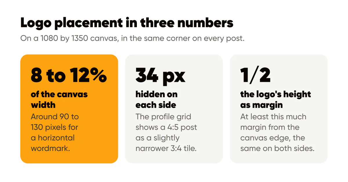
Smaller than you think, and the same size every time. On a 1080 by 1350 canvas, my own logos run around 8 to 12 percent of the canvas width, which lands somewhere near 90 to 130 pixels wide for a horizontal wordmark. A square mark can go slightly smaller. That is a practice, not a rule from any standard, and the right number depends on how detailed your mark is.
The test is the thumbnail. Open your grid and look at a post at that size. The logo should be identifiable as yours but should not be the first thing you notice. If it competes with the headline, shrink it. If it disappears entirely, simplify the mark rather than enlarging it; a detailed logo that only reads at large sizes is the wrong logo for social.
The zones to avoid
Platforms draw their own interface over your image, and the overlap zones change per surface. In the Instagram feed, a 4:5 post sits above the action row, so the image itself is mostly clear, but the bottom edge of a tall post can feel crowded against the like and comment icons. In Stories and Reels, the situation is much worse: profile information sits at the top, and the reply bar, captions and action column occupy the bottom and right edge.
Meta publishes a safe zone guide for text overlays in Stories and Reels that describes the margins to keep clear. My rule of thumb, derived from that guidance and my own testing, is to treat the top and bottom bands of a 9:16 frame as off-limits for logos and headlines, and to keep the right edge clear as well. If the same 4:5 post will be reused as a Story, place the logo where it survives both crops, which usually means keeping it away from the extreme bottom of the frame.
Should the logo go top or bottom?
Bottom, in most cases, for two reasons. The headline lives in the upper or central area of a portrait post, and putting the logo at the top forces the two to compete for the first glance. And the profile grid shows a 4:5 post as a slightly narrower 3:4 tile, which hides a thin strip (about 34 pixels on a 1080 pixel post) on the left and right, so a logo pushed into a far corner risks being clipped at the side. Placing it inside the safe margins of the bottom band, a little in from the edges, solves both problems.
Top placement is reasonable when the design puts the headline low, for instance a post where a photo fills the upper two thirds and the text sits on a dark band below. In that layout the top-left corner is the calmest spot on the canvas. The point is that the logo and the headline occupy different corners and never fight. The guide to designing for 4:5 portrait posts maps the text and thumb zones this decision depends on.
Clear space and background
A logo needs breathing room. Give it a margin from the canvas edge that is at least half the logo's own height, and keep the same margin on both sides of the corner. Do not let headline text approach it; if the headline needs the bottom of the canvas, move the logo up or to the other side, not closer.
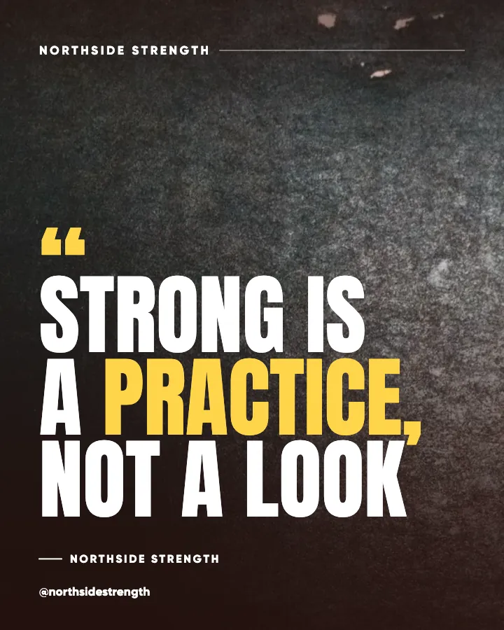
Background matters as much as position. A colored logo on a busy photo is illegible, and a dark logo on a dark background disappears. Two habits fix this. Keep a single-color version of your mark, in your light neutral and in your near-black, and place whichever one contrasts with the background at that corner. And when the background is a photo, darken or blur the area behind the logo slightly, or place the logo on the darkest part of the image. The AI image branding tips cover how to keep that treatment consistent when the background changes every post.
A few habits worth adopting:
- Export the logo once at the exact pixel size you use, and reuse that file instead of resizing a different one each time.
- Keep the same corner across a whole template family, and only change corners when you change templates.
- Use the one-color version of the mark on posts; save the full-color version for your profile picture and website.
- Never stretch or skew the logo to fit a space; move it or shrink it instead.
- Check every post as a thumbnail before it goes out, specifically to see whether the logo is present and legible.
Small logo, consistent template
Here is the position I want to argue for directly: your template is your logo. A follower scrolling at speed recognizes the shape of your posts, the color, the type, and the layout long before they see the mark in the corner. The logo confirms what the template already told them. That is why a small mark in a consistent frame outperforms a large mark on inconsistent designs. The brand consistency guide makes the case in full, and the 2026 post size cheat sheet has the exact canvas dimensions the margins above assume. It is also why I would rather give people a designed frame than Instagram templates for small business to fill in one post at a time.
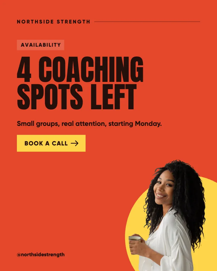
A worked example: a hypothetical florist posts a mix of product photos and text quotes. Before, the logo is a large full-color mark placed wherever there is room, sometimes center-bottom, sometimes top-right. After, every post carries a cream one-color mark, about 110 pixels wide, in the bottom-right corner, 60 pixels from each edge, and every headline sits in the upper two thirds. The florist's grid immediately reads as one brand, and the logo is smaller than it was.
Do this this week
Pick one corner. Export a one-color logo at one pixel size. Set a fixed margin from the edge. Rebuild your active templates with those three settings, and check the result as a Story crop as well as a feed post. Then leave it alone for three months; recognition needs time you cannot shortcut.
If you have never locked a template family in the first place, the brand templates that convert browsers into buyers walkthrough is the right place to start, with the logo decision above as the last field you fill in.
Put it into practice
Turn this into posts designed for your feed
Paste your website or say what you do. Creobee plans, writes and designs your posts about it as one feed in your logo and colors, captions included, and on Autopilot it posts them for you.
How the Instagram feed design works