Accessible Social Media Design: Contrast, Alt Text and Readable Type
Accessible social media design in practice: the contrast ratio to hit, the smallest readable text size, alt text that states the words, and captions.
Accessible social media design means anyone can read your post: text with at least 4.5:1 contrast, type large enough to read on a phone, alt text that says what the image says, CamelCase hashtags, captions on video, and the key message repeated in the caption. Each rule also widens your reach.
Why accessible social media design is a reach decision
I used to file accessibility under "nice to do later". Then I looked at how people actually consume my posts: on a phone, outdoors, at speed, often with the sound off, sometimes with a screen reader, often with eyes that are tired or older than mine. Every barrier I remove is a person who can now read the post. That is not charity. That is distribution.
There is a second effect. Alt text and caption text are machine-readable; the words baked into your image are not. When your message exists only as pixels, search and recommendation systems cannot read it. Making the post accessible also makes it findable, which is the point SEO for social posts makes from the other direction.
Contrast: the rule with an actual number
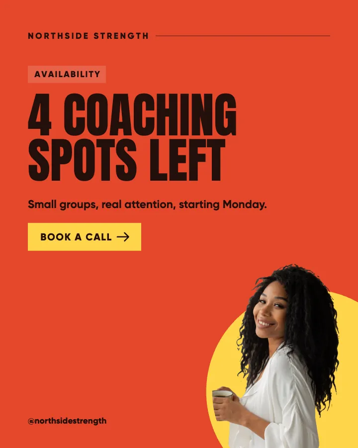
The WCAG 2.2 contrast minimum is 4.5:1 for normal text and 3:1 for large text. Headlines on a 4:5 post count as large, but I hold everything to 4.5:1 anyway because sunlight, cheap screens and dimmed brightness eat contrast that looks fine on a designer's monitor.
The common failure is white text on a bright brand color. Our amber fails that test by a wide margin, so amber gets dark text, always. Bright teal, coral, lime and most pastels fail the same way. Paste your text and background hex codes into the WebAIM contrast checker and you have your answer in five seconds. The brand color palette guide walks through building a palette where every pair passes before you ever open a design tool.
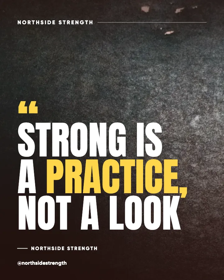
Text over photos needs the same discipline. Darken the photo, blur it, or move the text to the quiet part of the image. The text over images readability rules cover all the fixes.
How big should text be on a social media post?
Big enough to read at thumbnail size, because that is how most people first see it in a grid, in Explore, or in a shared DM preview. On a 1080x1350 canvas my floors are: headline at least 80 pixels, supporting text at least 40, and nothing at all under 32. Shrink the finished post to about 300 pixels wide on your screen. If you cannot read the headline, it is too small or too light.
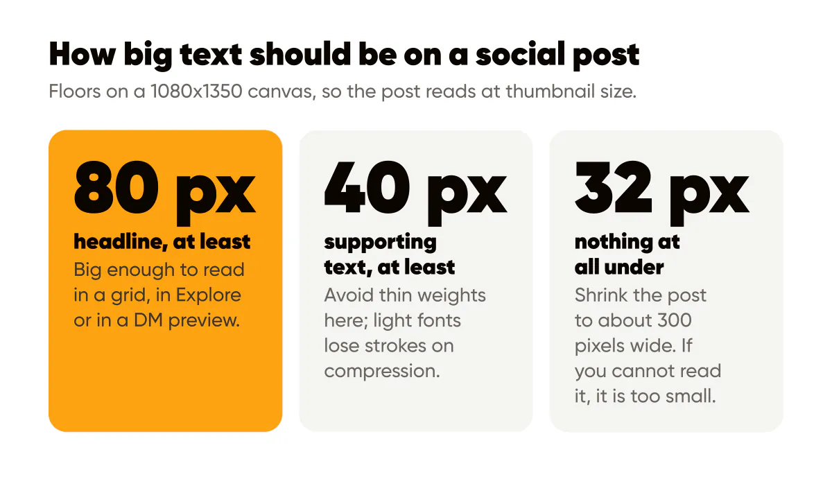
Two related rules. Avoid thin weights for anything smaller than a headline; light fonts lose strokes on compression. And keep line length short, five to seven words per line for headlines, so eyes do not lose their place. The typography rules for social posts cover sizes, weights and pairing in detail.
Alt text: describe the image, state the words
Screen readers read alt text aloud. Instagram generates automatic alt text if you write none, and it is usually something like "may be an image of text". That helps nobody. Write your own.
The W3C alt text decision tree is the best short guide I know. For branded text posts the answer is simple: the alt text should contain the words on the image, plus a short description of what else is there if it matters. If my post says "Post less, mean more" over an amber gradient with a small logo, the alt text is: "Text on an amber background reads: Post less, mean more. Creobee logo bottom right."
Does alt text help you get discovered?
It helps the people who need it first, and it does no harm with search second. Instagram's search works from text, not pixels, so a natural description that includes what the post is about is both accessible and useful. Do not stuff it with keywords or hashtags; that makes it worse for the screen reader user it exists for, and it reads as spam to everyone else. The Instagram alt text guide shows where the setting lives and how to write it in under a minute.
The caption is not optional
If the entire message of your post is inside the image, people who cannot see the image get nothing. Repeat the key line in the caption. This is a small habit that fixes the biggest accessibility hole in text-led posts, and it doubles as your searchable text.
Three more caption habits:
- Write hashtags in CamelCase, like SmallBusinessTips rather than smallbusinesstips, so screen readers pronounce each word instead of one long sound.
- Put hashtags at the end, after the real content, so the reader hears the message before the tags.
- Avoid decorative fonts pasted into captions from Unicode generators; they are read aloud as gibberish or skipped entirely.
Video and carousels
Captions on video are non-negotiable. Most people watch with sound off, and people who are deaf or hard of hearing watch with no sound at all. Use the platform's caption tool or burn subtitles into the video, and keep them inside the safe zone so the interface does not cover them.
For carousels, every slide should stand alone in contrast and size, and the alt text field applies per slide, so write it per slide. If a carousel tells a story, the alt text should let someone follow the story with their eyes closed.
Flashing, strobing or rapidly cycling animations can trigger seizures and should simply not appear in your content. Slow, gentle motion is fine.
An accessibility pass for this week
The A11Y Project checklist is written for websites, but the principles carry straight to social. Here is the short version I run on every batch before posting:
- Check every text and background pair once in the contrast checker. Fix or discard failures.
- View the batch at thumbnail size and confirm every headline reads.
- Write alt text for each post that states the words on the image.
- Repeat the headline in the first line of the caption.
- Convert hashtags to CamelCase and move them to the end.
- Caption every video before uploading.
It adds perhaps ten minutes to a batch of thirty posts, because most of the work is done once, in the template. Set your colors and type sizes correctly in the template and steps one and two pass automatically from then on, which is the entire argument for having a system in the first place. It is also why the AI social media post generator I built picks every post's text colors against the surface they sit on, so contrast is settled before you ever see the post.
Put it into practice
Turn this into posts designed for your feed
Paste your website or say what you do. Creobee plans, writes and designs your posts about it as one feed in your logo and colors, captions included, and on Autopilot it posts them for you.
How the Instagram feed design works