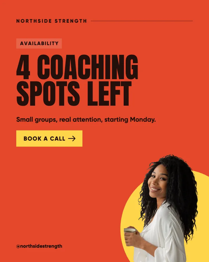
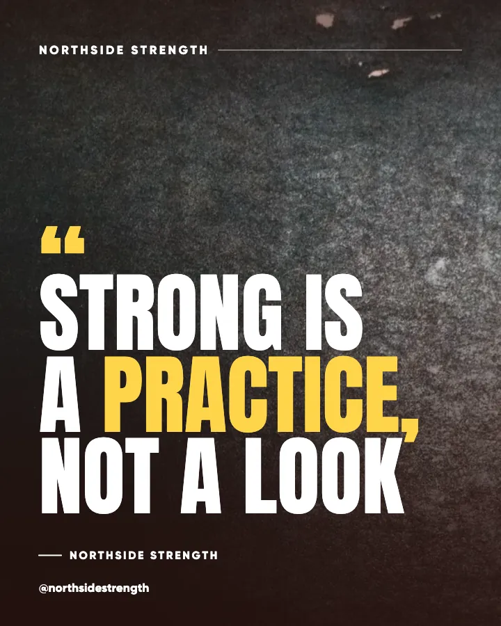
Instagram feed design, done for you: a grid that stays designed as you post.
Instagram feed design is how your profile reads at a glance: a tight palette, consistent type, a few recurring looks and a pattern that repeats. Creobee does it for small businesses. You describe your business once, and it plans, writes and designs your posts as one feed in your logo and colors, laid out in a checkerboard, columns or diagonal pattern that keeps its shape every time a new post goes up.
Example posts for a fictional gym and personal training, made with Creobee.
How it works
01
Describe your business
Two or three sentences about what you do and who it is for. Your voice suggests the feed's style, and the plan decides what each post says.
02
Set your feed's look
Keep the suggested style or pick one of 5 (Poster, Block, Studio, Playful and Editorial), then a grid pattern (columns, checkerboard and diagonal) and your brand color. A live preview shows how your next nine posts will look on your profile.
03
Get the month, in grid order
Up to 30 designed posts with captions per batch, each one in its place in the pattern. Download them, or on Autopilot schedule them in order and the pattern holds on your profile.
Six posts, six layouts, one feed
A designed feed is not thirty copies of one layout. The kind of post decides the layout, and the pattern decides the look. Here are six posts for an imaginary physiotherapy practice whose brief mentions its 45-minute first visit and new early appointments. In a checkerboard they would alternate between a full picture and a block of the brand color, so the grid reads as one set while each kind of post keeps its own layout.
Educate/Checklist
Desk setup check in four steps
Screen at eye level, elbows at ninety degrees, feet flat on the floor, and a reminder to stand up every half hour. None of it costs anything. If your neck still aches after a week of this, it is worth a proper look, and that is exactly what a first appointment with us is for.
Educate/Myth vs fact
Bed rest fixes a sore back
It feels right, and for a day or two it can help. After that, gentle movement usually does more than lying still: short walks, easy stretches and your normal routine where you can manage it. If the pain is sharp, spreading or getting worse, book an assessment instead of guessing.
Engage/Question
Where do you feel it after work?
Neck, lower back, wrists, or somewhere we would never guess? Tell us in the comments, no judgment. We read every answer, and the most common one becomes next week's how-to, with the three simple exercises we give patients for it in the clinic.
Educate/Number
45 minutes for your first assessment
We do not rush the first visit. You tell us what hurts and when, we test how you move, and you leave with a clear plan and two or three exercises to start that evening. Follow-up visits are shorter, because the thinking has already been done together.
Promote/Offer
Early appointments now open at 7am
For everyone who cannot leave work in the middle of the day: from next month we see patients from 7am on Tuesdays and Thursdays. Same physios, same length of appointment, same plan. Book through the link in our bio or call the front desk.
Inspire/Original line
Strong enough for the life you want
Rehab is not about getting back to a number on a chart. It is about carrying the shopping, playing on the floor with your kids and sleeping through the night again. That is the goal we set together on day one, and it is the one we measure progress against.
Each headline is designed into its post; the caption goes underneath when you post or schedule it.
What makes an Instagram feed look designed
People see your grid before they read a single post. When someone taps your name from a comment or a search, they decide quickly whether you look like an established business, and they decide it from nine or twelve small tiles. A feed that looks designed is not one with a filter on every photo. It is one that repeats a few decisions so often that the repetition becomes your brand.
Most guides to a cohesive Instagram feed come back to the same four ingredients, and good template packs are built on them too:
A tight palette: one brand color, one accent, a light and a dark. Used the same way on every post.
One type pairing: a display face for headlines and a plain face for the small words, never a new font per post.
A few recurring looks: for example a full picture, a block of your brand color and a light surface. Three looks read as a system; thirty one-off designs read as thirty people.
A pattern for how those looks take turns, so the grid has a shape you can see from across the room.
Instagram shows your profile in three columns, newest first. Every new post lands in the top left corner and pushes every other post one place along. That single fact decides which grid layout ideas work for a business that posts every week, and it is why so many carefully planned feeds fall apart after one extra post.
Take the popular row layout: three picture posts, then three color posts, then three light ones. It looks tidy on the day you plan it. Post once more and every row slides by one tile, so the neat stripes become a staircase. Post twice and the staircase changes again.
Patterns that repeat every two, three or four posts are different. A new post only changes which look lands where; the shape stays. That is why checkerboard (repeats every two), columns (every three) and diagonal (every four) are the three patterns worth building a business feed on, and why row patterns are only worth it if you always post exactly three at a time.
Instagram has let everyone rearrange their grid by hand since June 2026, which is handy for fixing a one-off. A pattern that holds on its own means you never spend an evening dragging tiles around.
Checkerboard, columns or diagonal: which to choose
All three keep their shape. They differ in how busy the grid feels and how many looks you need.
Checkerboard (picture, color): two looks, and no two neighbors ever share one. The strongest contrast of the three, so it suits bold brands, trainers, studios and anyone whose pictures are strong enough to carry every other post.
Columns (picture, color, light): three looks, and each column keeps one of them. The calmest and most flexible pattern, which makes it the easiest for service businesses that mix tips, questions and offers. It is the default in Creobee.
Diagonal (picture, color, light, color): looks run in lines down and to the right. More movement than columns, more variety than checkerboard; it suits playful brands, bakeries and anything with a sense of fun.
One look: every post as a full picture. Right for photo-led feeds, where the pictures themselves supply the variety.
Since early 2025, Instagram's profile grid shows every post as a 3:4 thumbnail. A 4:5 post (1080 by 1350 pixels) loses a thin strip on each side in the grid, about 34 pixels of its 1080. A headline that runs close to the edge, or a logo tucked into a corner, gets cut off on your profile even though it looks fine in the feed.
Designing for the grid means two things. Keep every word and the logo well inside the sides. And make each look easy to tell apart at thumbnail size: a color block that is clearly lighter or darker than your picture posts, so the pattern shows even when the tiles are small on a phone.
If you design your own posts, this routine gets you most of the way. An aesthetic Instagram feed for business is less about taste than about repetition, so write the decisions down once and stop making them every week:
Choose one brand color and use it exactly, every time. Add one accent that stands out against it.
Choose one headline font and one text font, and keep them. Write headlines short enough to read on a thumbnail.
Decide your three looks, then pick a pattern that repeats every two, three or four posts.
Check that every word passes the WCAG AA contrast standard (4.5:1) on every background you use.
Keep text and logo away from the sides, clear of the 3:4 crop.
Plan and make posts in batches, then post them in the order you made them, so the pattern holds.
Creobee makes every one of those decisions for you and keeps making them the same way. The feed gets one style, suggested by your voice and changeable in a tap: Poster (huge capitals and a starburst), Block (notched blocks and a footer bar, the professional one), Studio (minimal, one big headline and plenty of air), Playful (sticker highlights and waves) or Editorial (serif headlines and arch frames). The original Classic look, a headline over a full background, is still there if you prefer it.
Your palette comes from your brand color, used exactly, or from the background you pick. Every word on every surface meets the WCAG AA contrast standard, and nothing important sits in the strip the profile grid crops off. Each post takes its look from your pattern, and next month's posts pick up where this month's left off, so the grid keeps its shape across batches.
The layout follows the kind of post. A checklist becomes a numbered list, a myth gets both sides with the myth struck through, a question gets a reply prompt, an offer gets a button, a number gets a big-number post and an original line becomes a quote. Your logo goes on every post. The art is one of 94 backgrounds or your own photo, and if you switch on "Add people", photos from a library of 30 real people appear on some posts, tinted in your colors or standing in a frame. No picture in the feed is AI-generated, so there is nothing AI-made to spot.
On Autopilot, you schedule the batch in grid order to Instagram, Facebook Page, LinkedIn, Threads, Pinterest, Bluesky and TikTok, and nothing goes out without your OK.
Grid planner apps vs Creobee
As of September 2026, planner apps such as Planoly, Plann and Later let you preview your grid and rearrange posts before they go live. They are the better choice when your feed is mostly your own photos and videos. Creobee is for the designed posts you would otherwise make yourself.
Creobee
What it does
Plans, writes and designs the posts, then lays them out
Who designs the posts
Creobee, in your colors and logo
Grid pattern
Checkerboard, columns or diagonal, kept as new posts go up
Captions
Written for every post, in your voice
Posting
On Autopilot, to 7 networks in grid order
Best for
Designed posts: tips, answers, offers and stories
Grid planner apps
What it does
Previews and arranges posts you made somewhere else
Who designs the posts
You, usually in a design app
Grid pattern
You arrange it by hand
Captions
Caption ideas and AI writing help in most apps
Posting
Scheduling built in
Best for
Feeds built from your own photos and Reels
Feature
Grid planner apps
Creobee
What it does
Previews and arranges posts you made somewhere else
Plans, writes and designs the posts, then lays them out
Who designs the posts
You, usually in a design app
Creobee, in your colors and logo
Grid pattern
You arrange it by hand
Checkerboard, columns or diagonal, kept as new posts go up
Captions
Caption ideas and AI writing help in most apps
Written for every post, in your voice
Posting
Scheduling built in
On Autopilot, to 7 networks in grid order
Best for
Feeds built from your own photos and Reels
Designed posts: tips, answers, offers and stories
Pricing
Pick how much gets done for you
Every plan designs your feed. Pick how many posts, and whether we post them too.
Your logo and brand color, and real people if you want them
Download everything, keep it in your gallery
Recommended
Autopilot
For handing the whole job over
$39/month
90 designed posts a month, captions included
Posted for you on Instagram, Facebook, LinkedIn, Threads, Pinterest, Bluesky and TikTok
Schedule every post you make, in grid order, across 10 accounts
Publishing never uses your posts
Everything in Solo
Pro
For posting every day across several accounts
$79/month
300 designed posts a month, captions included
500 scheduled posts a month on up to 15 accounts
Schedule your own photos too, uploaded from your device
Schedule up to 90 days ahead
Everything in Autopilot
For comparison: freelancers usually charge $300 to $1,500 a month for 8 to 16 posts.
7-day money-back guarantee
Cancel anytime from your dashboard
Your plan starts right after checkout
Questions about the Instagram feed design
Straight answers on pricing, posts, and what Creobee does and does not do.
It is designing your posts as a set rather than one at a time: one palette, consistent type, a few recurring looks and a pattern for how they take turns, so your profile grid reads as one brand at a glance. It matters because people judge a business by its grid before they read a single caption.
Columns is the safest start: three looks, one per column, calm enough for any mix of tips, questions and offers. Checkerboard gives the most contrast and suits bold brands. Diagonal has the most movement and suits playful ones. Avoid row patterns unless you always post three at a time, because one extra post breaks them.
The pattern holds as long as your designed posts go up in the order they were made. A photo or Reel posted in between, or a post you skip, shifts everything after it by one place, which leaves a seam where the pattern restarts. Instagram's grid rearranging fixes a one-off, and on Autopilot the scheduler keeps your batch in order for you. Each new batch continues the pattern from the last one you made on the same device.
Two feeds in the same style share a design language, the way two shops using the same template pack do. Everything else is yours: your exact brand color, your logo, your background or photo, posts written about your business, and a layout chosen for each kind of post. Style, pattern, color and background multiply, so two feeds in the same style can still look quite different.
Solo is $19 a month for 30 designed posts, Autopilot is $39 for 90 posts and posts them for you on Instagram, Facebook Page, LinkedIn, Threads, Pinterest, Bluesky and TikTok, and Pro is $79 for 300 posts and up to 15 connected accounts. Every plan includes every style, grid pattern and brand color, "Add people", your logo and captions. Posting for you is on Autopilot and Pro.
Creobee makes still 4:5 posts: no video or Reels, no carousels yet, no replies to comments or DMs and no analytics. It also does not create AI-generated pictures (by design) or shoot photos of your work. It writes posts in English, Spanish, Portuguese, French, German and Turkish, and no other languages. Pair it with your own photos and Reels for the parts only you can show.
Partly. Every new account gets 3 finished posts free, with no card and no watermark, so you can see your own brand on real posts before paying anything. After that, plans start at $19 a month for 30 posts, with a 7-day money-back guarantee. Your first three posts come back one of each look, so you can already see how your grid will read.