AI Image Branding: 4 Ways to Keep Visuals On Brand
AI image branding in four steps: lock your colors, type and shapes, prompt from one brand lexicon, tie posts together with overlays, refine from results.
Lock in your visual DNA
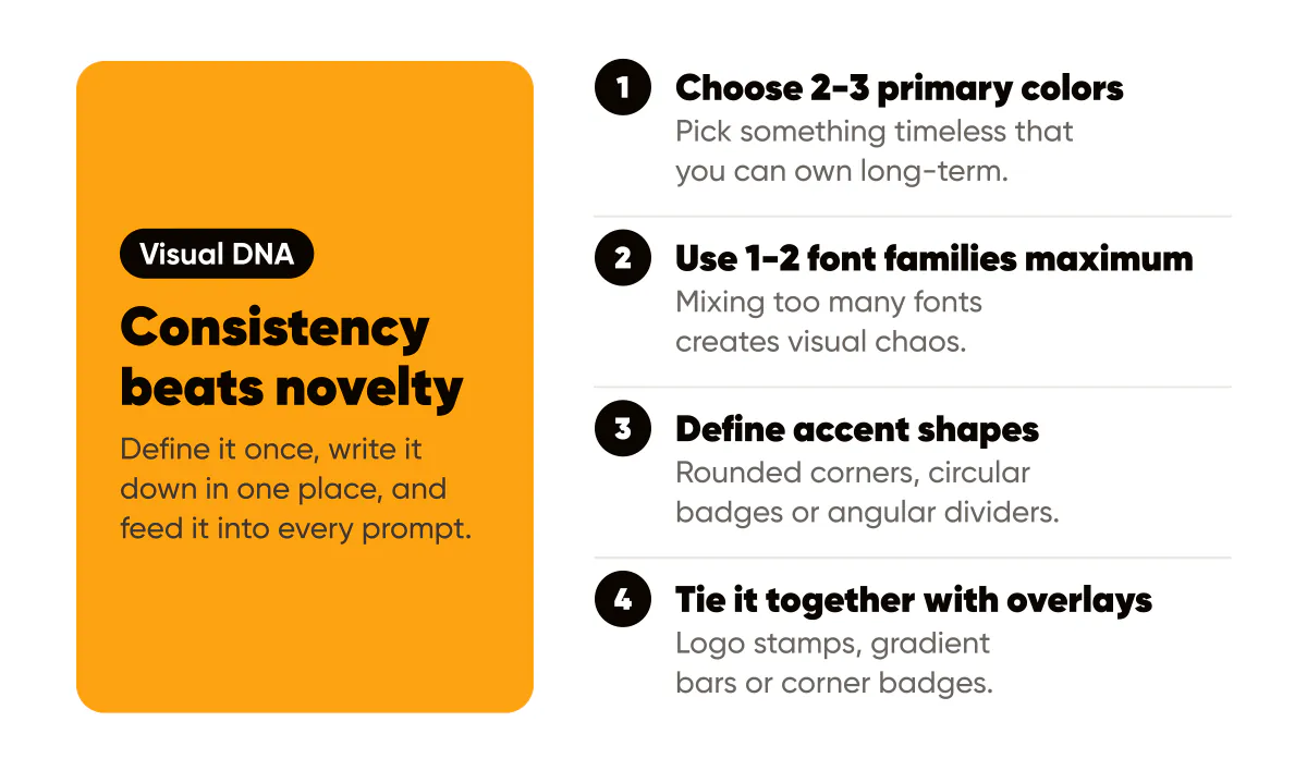
Define primary colors, typography, and accent shapes. Write them down in one place so every post stays recognizable. Your visual DNA is what makes your content instantly identifiable. When someone sees your post in their feed, they should recognize it as yours before reading your name.
Choose 2-3 primary colors that reflect your brand personality, following the same rules in our brand color palette guide. These should work well together and create contrast. Avoid trendy colors that will date quickly. Pick something timeless that you can own long-term. Document your color codes so you can use them consistently.
Select typography that matches your brand voice, using the pairing rules from our typography for social posts guide. Bold, modern fonts work for energetic brands. Clean, minimal fonts work for professional brands. Use 1-2 font families maximum. Mixing too many fonts creates visual chaos. Consistency in typography creates cohesion.
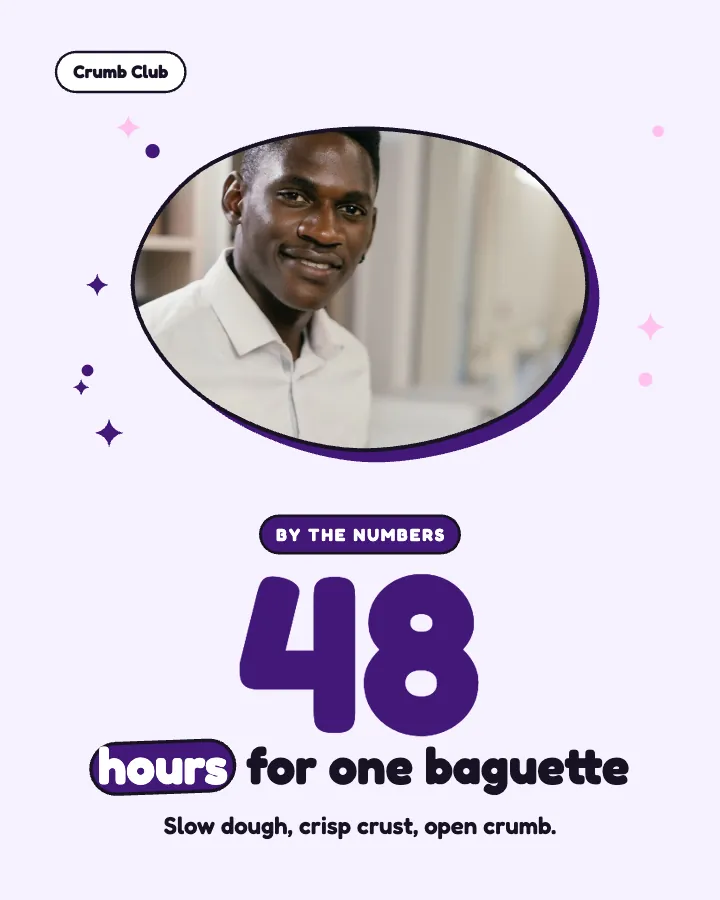
Define accent shapes or patterns that appear across your visuals. Maybe you always use rounded corners, or circular badges, or angular dividers. These small elements create visual consistency even when content varies. They're the details that make your brand feel intentional.
Save your business description, audience and voice once in Creobee's AI social media post generator, and every new batch starts from that brief. The whole batch is designed in one style with your logo and brand color, so every post shares the same type, palette and shapes. You're not starting from scratch each time: you're working from a proven foundation that maintains consistency.
Train prompts on your brand lexicon
Include brand adjectives and camera styles in your prompt. Consistency beats novelty when building trust. When you describe your brand consistently in prompts, AI tools will generate visuals that feel cohesive.
Create a brand lexicon document with adjectives that describe your visual style: "minimal," "bold," "warm," "modern," "playful," etc. Include camera styles: "clean lighting," "soft shadows," "high contrast," "professional," etc. The more specific you are, the more consistent your outputs.
Feed this lexicon into every AI prompt you use. Over time, the AI learns your preferences and generates visuals that align with your brand. Consistency in prompts creates consistency in outputs. This is especially important when using multiple AI tools or team members.
Update your lexicon as your brand evolves, but change gradually. Sudden shifts confuse your audience. If you're rebranding, transition slowly so followers can adapt. Consistency builds recognition, and recognition builds trust.
Use overlays to tie it together
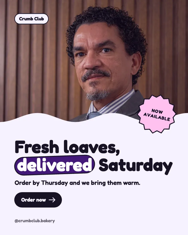
Add logo stamps, gradient bars, or corner badges, following the placement rules in our logo placement guide. Small overlays make AI art feel intentional instead of generic. These elements signal that content is part of your brand system, even when visuals vary.
Logo stamps should be subtle but visible. A small logo in the corner or as a watermark maintains brand presence without overwhelming the content. Keep it consistent in size and placement across all visuals.
Gradient bars add visual interest and brand color. Use them as dividers, backgrounds for text, or accent elements. They're versatile design elements that can adapt to different content while maintaining consistency.
Corner badges can highlight key information: "New," "Limited," "Featured," etc. Use them sparingly and consistently. Too many badges feel cluttered. One well-placed badge adds value without distraction.
In Creobee, each style keeps its type, shapes and logo placement the same across a batch, while the posts take turns between looks in a grid pattern. This creates visual rhythm that followers recognize subconsciously.
Test and refine your visual system
Your visual DNA isn't set in stone. It should evolve based on performance. Track which visuals get the most engagement the way our creative performance guide recommends. Do bold colors perform better than subtle ones? Do certain layouts drive more saves? Use data to refine your system over time.
Ask your audience for feedback. What do they associate with your brand? What visuals do they remember? This qualitative data complements your quantitative metrics and helps you understand how your visual DNA is perceived.
Put it into practice
Turn this into posts designed for your feed
Paste your website. Creobee reads what you sell, then plans, writes and designs your posts about it as one feed in your logo and colors, captions included, and on Autopilot it posts them for you.
How the AI social media post generator works