Font Size for Social Media Posts: Typography Rules for 2026
Font size for social media posts: headlines about 70px, support lines 36px on a 1080x1350 canvas, plus the two-font pairing and hierarchy rules I follow.
Good social media typography is one display font for headlines, one text font for everything else, and weight rather than extra fonts for hierarchy. On a 1080 by 1350 canvas, keep headlines large enough to read as a thumbnail, keep lines short, and use all caps only for a word or two. Fewer decisions, more consistency.
What font size should Instagram posts use?
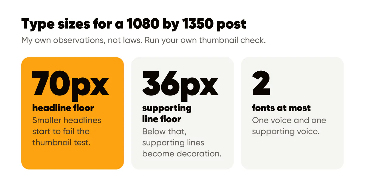
On a 1080 by 1350 canvas, set headlines at roughly 70 pixels or larger and supporting lines at about 36 pixels or larger. Those are the floors where text on my own posts stops surviving the profile-grid thumbnail. Headlines of two to six words can go far bigger, and small print sits at about a quarter of the headline size.
The two-font rule for social media typography
Every post you make is a small typographic layout viewed on a phone for about a second. That constraint settles most debates. You do not have room for three fonts, six weights, and decorative flourishes. You have room for one voice and one supporting voice.
The display font is your headline face. It should have personality, because it is doing the recognizing. The text font is quieter and handles supporting lines, captions on the image, and anything longer than a few words. The Google Fonts Knowledge guide to pairing typefaces explains the principle better than I can: pair for contrast in structure, not for similarity, and let one clearly lead.
Many brands can drop to a single font family and use its weights instead. A geometric sans with a black weight for headlines and a regular weight for support reads as two voices while behaving like one. Creobee's own brand uses a single family this way, and I have never missed the second font.
Which fonts work best for Instagram posts?
The honest answer is whichever readable font you commit to for a year. Specifically, though, look for a display face with a heavy weight and generous letterforms, because thin strokes vanish at thumbnail size. Avoid scripts and condensed faces for headlines; both lose legibility fast when scaled down. Avoid fonts with unusual letter shapes if your words include numbers, since a stylized 1 or 7 can be misread in a glance.
If you are unsure, pick a well-hinted sans with at least four weights and move on. The font matters far less than what you do with it.
Hierarchy comes from size and weight, not more fonts
A social post has at most three levels of text: the headline, one supporting line, and small print such as a handle or logo wordmark. Give each level a fixed size and weight and never improvise. The Google Fonts Knowledge page on using type for hierarchy covers the levers, and on a small canvas only two of them matter much: size and weight. Color is the third, used on a single word.
My working ratios for a 1080 by 1350 canvas, which are my own practice and not a standard: headline in the heaviest weight, supporting line at roughly half the headline size in a regular weight, small print at a quarter of the headline size. When a post has only a headline, which is most of my posts, the hierarchy is a single emphasized word set in the brand color or a heavier weight.
How big should text be on a 4:5 post?
Big enough to read when the post appears as a thumbnail in your grid. That is the test I use, and it is stricter than any pixel rule. In practice, on my own posts, headlines under about 70 pixels on a 1080-wide canvas start to fail the thumbnail test, and supporting lines under about 36 pixels become decoration rather than text. Treat those as my observations, not laws, and run your own thumbnail check.
The related mistake is too many words at a readable size. A headline that needs three lines at 90 pixels is not a headline; it is a paragraph. Cut words before you cut size. The minimalist design guide is about that exact trade.
Line length, line breaks and case
Butterick's Practical Typography entry on line length recommends 45 to 90 characters per line for reading text. Social headlines sit far below that range, often at 10 to 25 characters, which is why line breaks become a design decision instead of an afterthought. Break lines where a person would pause when speaking the sentence, keep the shortest line last or first rather than in the middle, and never let a single word orphan onto its own line unless that word is the point.
A few rules I apply to every post:
- Set headlines in sentence case by default, because it reads fastest and looks least like an advertisement.
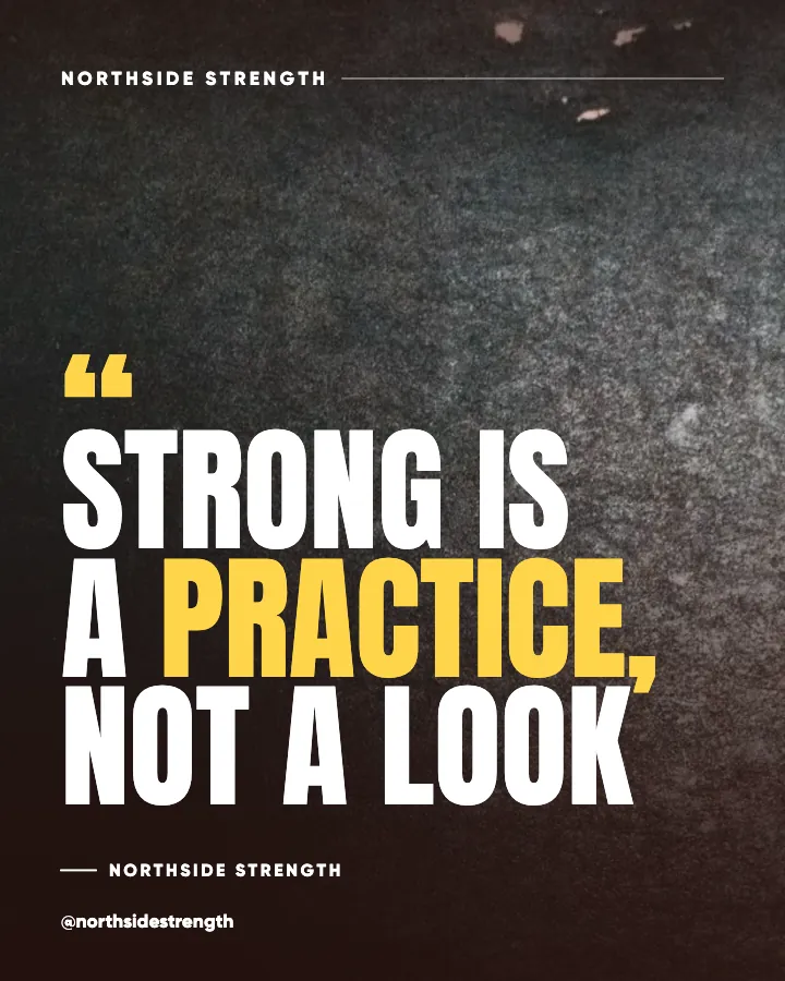
- Use all caps only for one to three words, and add letter spacing when you do, since tight capitals blur at small sizes.
- Never justify text on a social post; ragged right edges read better at short lengths.
- Keep supporting lines to one or two lines, and cut them entirely if the headline stands alone.
- Use the same alignment in every post in a template family, whether left or centered, so the eye knows where to start.
Tracking, meaning letter spacing, deserves one more note. Slightly tighter tracking on very large headlines and slightly looser tracking on small caps are both standard practice. Anything more dramatic is a style choice you will regret in three months.
Should you use the same fonts on every platform?
Yes, and it is easier than it sounds because the posts are the same image. A 4:5 post built for Instagram gets reused on LinkedIn, Threads, and Pinterest without modification, so the fonts travel with it. The exceptions are text typed into a platform, such as a Story sticker, where you are limited to the platform's fonts. There, pick the plainest sans available and accept the mismatch. Recognition lives in your designed posts, not in a sticker.
A worked example
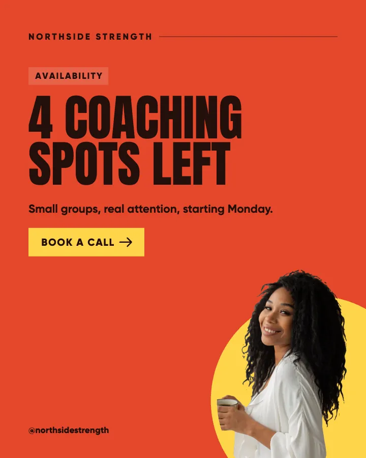
Take a hypothetical yoga studio. Before: a script font for the headline, a serif for the supporting line, a sans for the handle, all centered, with the headline set small to fit five lines. After: one heavy geometric sans for a three-word headline, the second word in the studio's sage green, a single supporting line in the regular weight, left aligned, and the logo small in the bottom-right corner. The second version uses fewer elements and reads in a glance from the grid.
That structure is not specific to yoga. It is the layout most of my posts use, and it is the layout I recommend locking into your templates, which the 2026 branded visuals standards describe from the recognition side.
Do this this week
Pick one font family with at least four weights. Write down three sizes for headline, support, and small print, and one alignment. Rebuild your last three posts with those settings and look at them as thumbnails next to each other. If any headline is unreadable at that size, cut words until it is. Then make those settings your default in whatever tool you use. Each style in the AI Instagram post generator I built follows the same idea: fixed type for the whole batch, with one highlighted word carrying the emphasis.
For the next step, deciding where the eye lands first once the type is set, read visual hierarchy in social graphics, and for the special case of text sitting on a photo, the nine readability rules for text over images.
Put it into practice
Turn this into posts designed for your feed
Paste your website or say what you do. Creobee plans, writes and designs your posts about it as one feed in your logo and colors, captions included, and on Autopilot it posts them for you.
How the Instagram feed design works