Instagram Image Sizes 2026: The Full Cheat Sheet
Instagram image sizes for 2026 in one list: 1080x1350 portrait, 3:4, square, landscape, Stories and Reels, plus safe zones and export settings for sharp text.
The Instagram post sizes that matter in 2026 are 1080x1350 pixels (4:5) for feed portrait, 1080x1080 for square, 1080x566 for landscape, and 1080x1920 (9:16) for Stories and Reels. Design feed posts at 4:5 by default, keep text inside a centered safe area, and export as high-quality JPEG or PNG at exactly 1080 pixels wide.
The 2026 Instagram size cheat sheet
I keep this list pinned above my desk because I rework Creobee's post designs more often than I would like to admit. Every size below is the recommended upload dimension, not a hard limit. Instagram accepts other sizes and then resizes or crops them, which is exactly what you want to avoid. If you want to check a specific image, the free Instagram post crop preview shows all five frames and downloads the 4:5 version.
- Feed portrait: 1080 by 1350 pixels, a 4:5 ratio. This is the default I recommend for almost every feed post.
- Feed 3:4: 1080 by 1440 pixels. Accepted since 2025 and the exact shape of the profile-grid tile. Instagram-only; Facebook, LinkedIn and Threads trim it to 4:5.
- Feed square: 1080 by 1080 pixels, 1:1. Still fine, still safe, but it gives up vertical space you could have used.
- Feed landscape: 1080 by 566 pixels, roughly 1.91:1. Use it only when the photo itself is wide and cropping would ruin it.
- Stories and Reels: 1080 by 1920 pixels, 9:16. Full screen, with interface elements covering the top and bottom. A short animated feed post can stay at 1080 by 1350: how to make animated Instagram posts.
- Carousels: every slide should share one ratio. Mixed ratios get cropped to match the first slide.
If you want a second opinion on any of these, Buffer's Instagram post size guide and Hootsuite's image size guide for every network are the two references I check when I suspect something changed. They update them regularly, which is more than I can say for most size charts floating around Pinterest. For every other network, the full social media image size guide keeps the same format as this one.
Why does 4:5 get more screen than square?
Simple geometry. In the feed, every post is displayed at the same width, the width of the phone screen. A 1:1 image at that width is as tall as it is wide. A 4:5 image at the same width is 25 percent taller, because 1350 divided by 1080 is 1.25 (the 1080x1350 aspect ratio calculator does the same arithmetic for any other width). That extra height is not decoration. It is the difference between your headline sharing the screen with the post above it and your headline owning the screen.
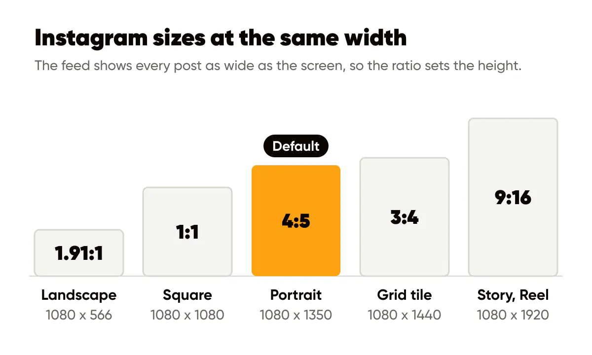
Nothing gets cropped, either. 4:5 displays in the feed without trimming, so what you design is what people see. Since 2025 Instagram also accepts 3:4, which is 1080 by 1440 pixels and the exact shape of the profile-grid tile (the 1080x1440 page has the arithmetic). It is the right pick when Instagram is your only network. Facebook, LinkedIn and Threads still trim anything taller than 4:5, so for one export that goes everywhere, 4:5 stays the default. Landscape posts, by contrast, become a thin strip with a lot of empty space above and below. I made the full case for this default in why 4:5 portrait is the best Instagram post format, so I will not repeat it here beyond the summary: more pixels, no crop, no downside.
What happens to my post in the profile grid?
The grid is where 4:5 needs a little care. Instagram moved profile thumbnails from squares to taller portrait tiles, and on my account those tiles are slightly narrower than 4:5, so a thin band on the left and right of each post is hidden in the grid view. Instagram lets you adjust the preview crop per post, but the reliable fix is design-side: keep your logo and headline inside a central rectangle and leave the outer margins as breathing room.
My working rule is about 80 pixels of margin on every side of a 1080 by 1350 canvas. Text and logos stay inside. Backgrounds, gradients and photo edges can run to the border. That single habit means a post survives the feed, the grid, a share to Stories and a screenshot without anyone noticing anything was cut.
One master template beats five formats
For feed posts, I design one 4:5 master and derive the feed formats from it. Square is a center crop of the master, and a Reel cover is the master placed on a 9:16 background of the same color, with the safe zone respected. When I share a feed post to Stories, the same trick works: the post sits in the middle of a 9:16 frame.
Stories I plan are a different matter. A feed post with padding above and below reads as a reshare, so a Story planned for the week gets its own full-height 1080 by 1920 design in the same style as the feed, with its words inside the safe zone. That is how Creobee makes them too: each planned week includes native 9:16 stories next to the posts, as the story ideas for small business guide shows. What I will not do is hand-build every format from scratch; brands that try usually run out of time by Wednesday. The trade-off is covered more broadly in the branded visuals standards for 2026, where 4:5-first is one of the core recommendations.
If you make carousels, the master matters even more. Every slide in a set must share one ratio and one margin system, or the swipe feels broken. The carousels that convert guide goes deeper on slide structure; for sizing, the only rule is: pick 4:5, apply it to every slide, never mix. It is the same rule I built into Creobee's AI Instagram post generator: every post and every carousel slide comes out at 1080 by 1350, with the words kept clear of the grid crop.
Where is the safe zone for Stories and Reels?
Meta publishes an official page on text overlays and the safe zone for Stories and Reels. The short version: the top of a 9:16 frame is covered by your profile name and the progress bar, and the bottom is covered by the reply field, so anything you need read should live in the middle band. Meta's page states the exact margins, so treat it as the source rather than any screenshot you find online, including mine.
When I turn a 4:5 post into a Story, I place the 1080 by 1350 image dead center on the 1080 by 1920 canvas. That leaves 285 pixels above and below, comfortably outside the interface. The Stories versus feed posts breakdown explains when that repurposed Story is enough and when a native one earns its extra effort.
Export settings that keep your text sharp
Instagram recompresses everything you upload. You cannot avoid it, but you can avoid compounding it. A few rules cover most of the damage.
- Export at exactly 1080 pixels wide. Uploading larger does not give you a sharper result; Instagram downsizes it and you lose control over how.
- Use high contrast between text and background. Compression artifacts show up first around small, low-contrast text. I go through this in detail in the readability rules for text over images.
- Avoid thin fonts below roughly 40 pixels tall on the canvas. They smear after compression, especially over photos.
- Export once from your source file. Do not screenshot an export and re-upload; every generation adds artifacts.
JPEG, PNG or WebP for Instagram?
For photo-based posts, a JPEG at quality 85 to 90 is the practical choice. For flat graphics with large solid colors and text, PNG keeps edges crisp and Instagram will convert it anyway. WebP is a good intermediate format for your own storage, and MDN's overview of image file types is the clearest explanation of what each format trades away. Creobee exports posts as 1080 by 1350 PNG files, which is why I default to PNG for text-heavy posts: the letterforms stay clean through Instagram's own compression.
Do this this week
Open whatever tool you use and create one 1080 by 1350 template with 80-pixel margins marked. Move your logo and headline inside them. Then take your last five posts, re-export them into that template, and compare the grid preview before and after. If your headlines were getting trimmed, you will see it immediately, and the portrait format guide will show you where to place them instead.

Put it into practice
Turn this into posts designed for your feed
Paste your website or say what you do. Creobee plans, writes and designs your posts about it as one feed in your logo and colors, captions included, and on Autopilot it posts them for you.
How the AI Instagram post generator works