Visual Branding on Social Media: 2026 Standards
Visual branding on social media in 2026: the three-frame recognition test, the design specs that hold up, and whether AI-generated images hurt engagement.
The feed got faster than your design process
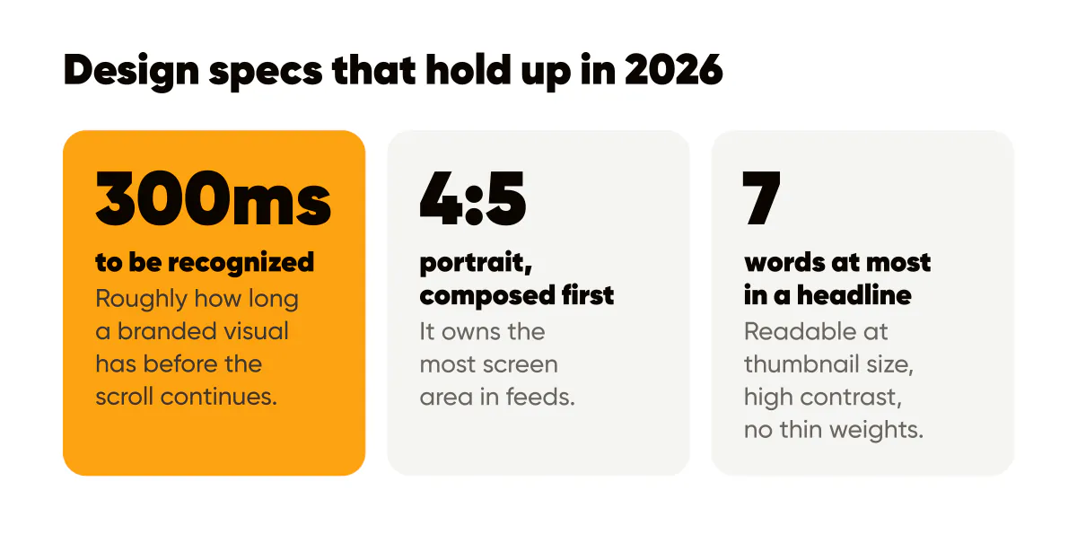
A branded visual in 2026 has one job: be recognized and understood before the scroll continues: roughly 300 milliseconds. Everything else (cleverness, detail, even beauty) is negotiable. Feeds are denser, autoplay is everywhere, and AI-generated imagery raised the volume of "fine-looking" content to the point where fine-looking is invisible.
The creators winning attention this year aren't producing prettier images. They're producing more identifiable ones. Same palette, same type, same layout skeleton, post after post, so that recognition happens before reading does.
The three-frame recognition test
Take your last nine posts, shrink them to thumbnail size, and mix them into a grid with six posts from other accounts in your niche. Ask someone who follows you to point at yours. If they can't do it in three seconds, you don't have a visual brand. You have nine separate designs.
I run this test on Creobee's own account quarterly, and it's humbling every time. The fix is never "design harder." It's constraint: lock two colors, one type pairing, and one layout grid into a template, then stop making design decisions per post. Our template guide walks through the setup.
Do AI-generated images hurt engagement?
Not when they're branded and consistent: audiences in 2026 care whether a visual is useful and recognizably yours, not which tool made it. What does hurt: the default AI look. Untethered gradients, uncanny stock-photo people, a different style every post. Generation is a production method; branding is the differentiator. Generic output from any tool, AI or not, performs like what it is.
Design specs that hold up this year
- Compose for 4:5 portrait first (1080×1350): it owns the most screen area in feeds, and everything else crops down from it.
- Headline readable at thumbnail size: roughly seven words maximum, high contrast against the background, no thin weights.
- Contrast that passes accessibility checks: WCAG-level contrast stopped being an edge case when dark mode became half your impressions.
- Alt text on every post. It serves readers who need it, and it's also the only part of your image an AI answer engine can quote.
Ship it as a system, not as artwork
One-off design is the most expensive habit in solo content. Every post that starts from a blank canvas costs you 40 minutes and a little brand equity, because it looks slightly unlike the last one. A fixed brand system inverts the economics: design decisions happen once, production becomes batch work, and consistency accrues automatically, which is the entire design philosophy behind Creobee, and why it replaces Instagram templates for small business that you fill in post by post. Measure the system, not the artwork: track saves and profile visits per template family, keep the winners, retire the rest. The creative performance guide has the scorecard.

Put it into practice
Turn this into posts designed for your feed
Paste your website or say what you do. Creobee plans, writes and designs your posts about it as one feed in your logo and colors, captions included, and on Autopilot it posts them for you.
How the AI Instagram post generator works