Social Media Colors: 10 Palettes With Hex Codes
Social media colors that work: a three-color brand system, the 4.5:1 contrast test every text pairing must pass, and 10 ready-made palettes with hex codes.
A social media color palette needs three colors, not ten: one brand color people learn to recognize, one near-black for text and dark backgrounds, and one light neutral for the opposite. Test every text pairing against the WCAG 4.5:1 contrast minimum. Most small brands fail this with white text on their bright brand color.
The three-color system for brand colors on social media
Every palette I have built for a small brand, including Creobee's, ends up with the same skeleton. A brand color that does the recognizing. A near-black, never pure black, that carries body text and dark backgrounds. A light neutral, usually an off-white or warm gray, for light backgrounds and text on dark. An optional fourth accent for the one word you want to pop.
That is it. More colors mean more decisions every time you make a post, and every decision is a chance to drift. The Interaction Design Foundation's overview of color theory covers harmonies and schemes in depth, and I would read it once for the vocabulary. Then I would ignore most of it in daily practice, because a solopreneur's problem is not a lack of color options. It is too many.
Creobee's own palette is a concrete example. The brand color is an amber, close to a warm orange. The near-black is a very dark navy. The light neutral is an off-white. Every post on Creobee's own account uses some arrangement of those three, and after a few weeks of posting, the amber alone reads as the brand.
How do you pick the one brand color?
Pick for differentiation and for contrast, in that order. Look at the ten accounts your customers also follow and note their dominant colors. If they are all blue and green, an amber or a deep red will be visible in a way another blue never will. This is not about color meaning; it is about being the odd one out in a specific feed. The skeptical guide to color psychology in marketing explains why I put category contrast ahead of "blue means trust."
Then check whether your candidate color can carry text. Some colors can host dark text and light text. Most bright colors can host only one. That constraint decides how you will use the color for years, so test it before you fall in love with it.
Contrast rules that decide whether text gets read
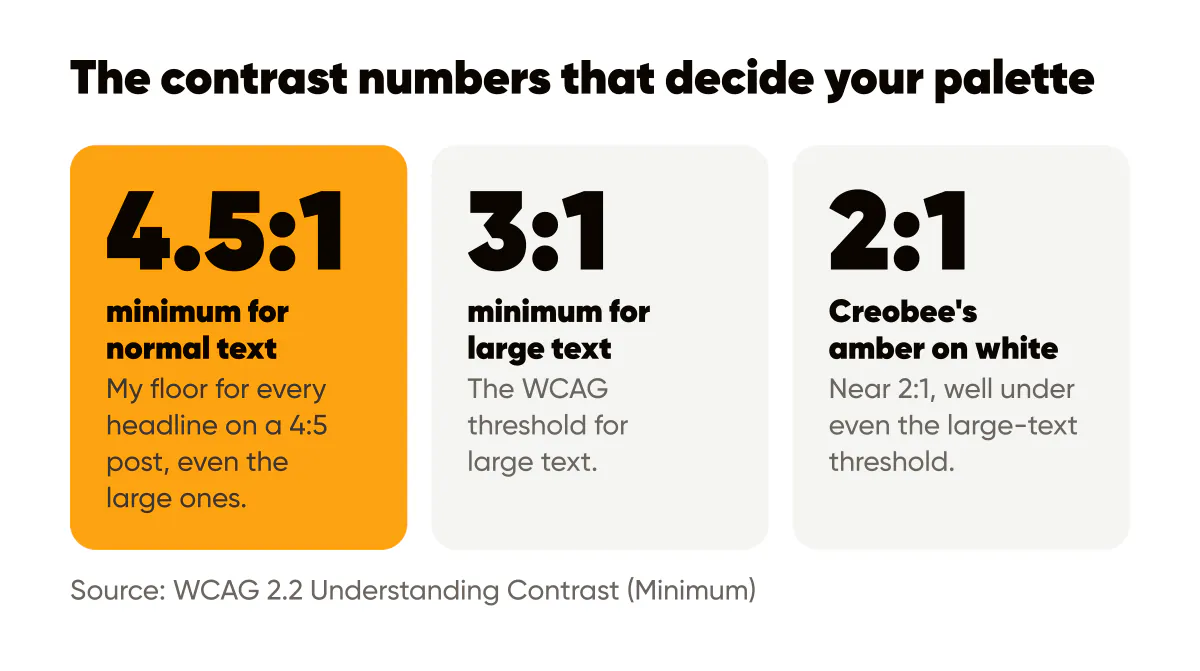
The WCAG 2.2 Understanding Contrast (Minimum) page sets a ratio of 4.5:1 for normal text and 3:1 for large text. Those numbers were written for web pages, but a phone screen in daylight is a harsher environment than a desktop browser, so I use 4.5:1 as the floor for every headline on a 4:5 post, even the large ones.
The tool I use is the WebAIM contrast checker. Paste two hex codes, read the ratio. It takes ten seconds, and it settles arguments I would otherwise have with myself at midnight.
Why does white text on a bright color fail so often?
Because brightness and lightness are not the same thing. A saturated orange, yellow, teal, or lime looks intense, so it feels like it should contrast with white. Measured against white, it usually does not. When I ran Creobee's amber against white in the checker, the ratio came in near 2:1, well under even the large-text threshold. Against the dark navy, the same amber passes comfortably.
The fix is a rule, not a case-by-case judgment: bright brand color, dark text. Dark background, light text. Bright color as a full background with white words is the single most common contrast failure I see in small-business feeds, and it is why so many otherwise good posts are unreadable in a thumbnail.
Here is how the pairing table looks for a typical three-color palette:
- Near-black background with light neutral text is the safest pairing and should be your default for headlines.
- Light neutral background with near-black text is the second default and the better choice for longer supporting lines.
- Brand color background with near-black text works for most mid-to-light brand colors; test it, and reject it if the ratio is under 4.5:1.
- Brand color as an accent on a dark or light background is always safe, because you are coloring one word, not the whole canvas.
- Brand color background with light text is the pairing to assume fails until the checker proves otherwise.
Consistency is the point of a palette
A palette does not exist to look nice. It exists so that a follower recognizes your post before reading it. That recognition only builds if the same three colors appear in the same roles, post after post. Swap the brand color for a seasonal purple in October and you spend recognition you took months to earn.
The brand consistency guide makes the fuller argument, but the short version is that a good palette is a constraint you accept on purpose. It removes decisions from your week and hands them to a system you trust.
This also matters when you generate images in batches. If you produce thirty posts at once from a fixed palette, cohesion is automatic; if you pick colors per post, drift is automatic instead. The AI image branding tips cover how to hold a palette steady across generated visuals. It is also how I built the AI Instagram post generator in Creobee: you give it your logo and brand color once, and every post in the week is designed from them.
What about using photos with your palette?
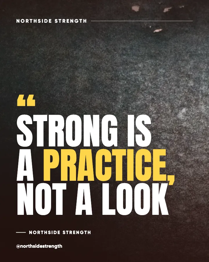
Photos bring their own colors, and they will fight your palette unless you control them. Two approaches work. Darken the photo with a scrim and set light text on top, so the palette shows up in the text and logo only. Or choose photos whose dominant tone already sits near your near-black or your neutral, so the brand color accent still stands out. Full-color photos with brand-colored text over them are almost never readable, no matter how good the photo.
10 ready-made social media color palettes (hex codes)
Each palette below follows the three-color skeleton: a brand color, a near-black, a light neutral, plus one accent. I ran every pairing through the WCAG contrast formula, and the ratios in brackets are the text-on-background combinations that clear 4.5:1, so you can use them as they stand.
Amber Studio: #FCA311, #14213D, #F5F1E8, #E5E5E5. Warm and confident, with navy text on amber (7.9:1) or on off-white (14.2:1); suits coaches, course creators and anyone who wants to be the bright one in a blue feed.
Forest Bakery: #2F5D50, #1C2A25, #F4EFE6, #D9A066. Calm and natural, with cream text on forest green (6.5:1) and dark green text on cream (13.0:1); suits bakeries, florists and wellness brands.
Clay and Sand: #9C4A2A, #2B211C, #F7EFE5, #E8C9A0. Earthy and handmade, with sand text on terracotta (5.4:1) and dark brown text on sand (13.8:1); suits potters, interior stylists and independent makers.
Sage Wellness: #8AA891, #22302A, #F3F5F0, #C9D6C0. Soft and quiet, with dark green text on sage (5.3:1) or on mist white (12.6:1) and never white on sage; suits yoga teachers, therapists and skincare brands.
Coastal: #1B6F8A, #0F2A33, #EEF6F8, #F2C57C. Clean and steady, with pale text on teal (5.2:1), ink text on pale (13.7:1) and sand yellow for a single highlighted word; suits consultants, accountants and travel businesses.
Ink and Coral: #EA6A4F, #1E1E24, #FAF7F2, #F6B8AA. Energetic without shouting, with charcoal text on coral (5.3:1) or on paper white (15.5:1); suits designers, photographers and small fashion labels.
Slate and Lime: #B5E048, #1F2933, #F5F7FA, #52606D. Technical and modern, with slate text on lime (9.6:1) or on off-white (13.7:1) and lime reserved for one word on slate; suits developers, SaaS founders and fitness coaches.
Plum Boutique: #5B2A86, #221532, #F6F1FA, #D4A5FF. Rich and a little formal, with lavender-white text on plum (8.9:1) and dark plum text on lavender-white (15.5:1); suits jewelers, event planners and premium services.
Charcoal Mono: #FFC400, #111111, #F2F2F2, #444444. Stark and direct, with black text on yellow (11.8:1) or on light gray (16.9:1) and yellow for the one highlighted word; suits copywriters, agencies and anyone whose posts are mostly words.
Denim and Butter: #2E4A7D, #16223A, #FBF6E9, #F5D77A. Friendly and trustworthy, with cream text on denim (8.1:1) and navy text on cream (14.7:1) or on butter (11.2:1); suits family businesses, tutors and local services.
If none of these fit, pull the dominant colors from your logo or a favorite photo with the brand color palette extractor, then run each text pairing through the text contrast checker before it goes into a template.
A one-hour palette exercise
Write your candidate brand color's hex code at the top of a page. Below it, write a near-black that is tinted toward the same hue rather than pure black, and an off-white tinted the same way. Run all six pairings through the checker and cross out every one under 4.5:1. What remains is your rulebook. Print it, or paste it at the top of your one-page brand sheet, which the one-page design system for solopreneurs walks through building in about an hour.
Do this this week
Open the checker, paste your brand color against white and against your darkest color, and write both ratios down. If white fails, change every post template that uses white text on your brand color to dark text today. Then make the three surviving pairings the only ones you allow yourself for the next month.
Once the palette is locked, the next readability problem is usually the words on top of it, and the nine readability rules for text over images pick up exactly where contrast leaves off.

Put it into practice
Turn this into posts designed for your feed
Paste your website or say what you do. Creobee plans, writes and designs your posts about it as one feed in your logo and colors, captions included, and on Autopilot it posts them for you.
How the Instagram feed design works