Instagram Bio Fonts: How to Change Your Bio Font
Instagram bio fonts are Unicode letters, not fonts. How to change your bio font without an app, six styles that read well, and how they count toward your 150.
Instagram bio fonts are not fonts. They are Unicode characters shaped like bold, italic, script or monospace letters, which is why they survive a paste into the bio field with no app installed. Type your line into a font generator, copy one style, paste it under Edit profile, and check it on a phone before you save.
How do Instagram bio fonts work without an app?
The bio is a plain text field. It cannot hold formatting, but it can hold any character in Unicode, and Unicode happens to contain several alphabets drawn to look like styled Latin letters. The Mathematical Alphanumeric Symbols block at U+1D400 to U+1D7FF supplies the bold, italic, script, gothic, outline and monospace sets, all of them originally for equations. Enclosed Alphanumerics at U+2460 to U+24FF supplies the circled letters. Halfwidth and Fullwidth Forms at U+FF00 to U+FFEF supplies the wide ones. A bio font generator is a lookup table that swaps each letter you type for the matching symbol.
That is also all the paid keyboard apps do. Same substitution, except they want full keyboard access so they can type it for you, which means letting an app see everything else you type. A browser page does the job with no install and no permission. The Instagram font generator runs entirely on your device: type a line and every style appears with its own copy button.
The steps once you have copied one: open Instagram, go to your profile, tap Edit profile, tap Bio, paste, tap Done. On the web it is the same flow with a Submit button at the end.
The 150-character limit and how styled letters count
The bio limit is 150 characters. What exactly gets counted is the part nobody agrees on, and it starts to matter the moment you paste something styled.
Every letter from the mathematical block is one character, but it sits above U+FFFF, so software that stores text as UTF-16 spends two units on it. Some platforms count units, some count characters, and Instagram has never published which it does. The honest advice is to let the app referee: paste your bio, read what the counter says is left, then trim. It is the only number that decides whether Save works.
One case is not ambiguous at all. Strikethrough and underline are not separate alphabets. They are ordinary letters with an invisible combining mark stapled to each one, which is why the effect works across every style. A six-letter word set in strikethrough is twelve characters under any counting scheme you like. Strike through a bio that already fits and it stops fitting, with nothing on screen to explain why.
Small caps go the other way. Most of those letters come from the phonetic blocks, which sit inside the single-unit range, so a small-caps line costs about what plain text costs. Wide letters are cheap in characters too, but they eat so much horizontal room that a full bio wraps into a wall.
The practical answer is to style one line and leave the rest. A social media character counter shows the count against the Instagram bio limit while you draft, and the line-by-line budget that keeps a bio under 150 is in Instagram bio optimization.
Six bio font styles that read well on a phone
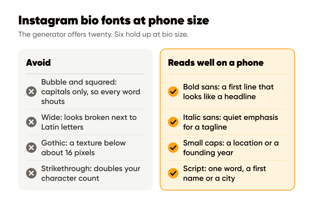
The generator offers twenty. Six hold up at bio size, which is roughly 13 to 15 pixels on a phone screen.
- Bold sans (𝗬𝗼𝗴𝗮 𝗳𝗼𝗿 𝘁𝗶𝗿𝗲𝗱 𝗯𝗼𝗱𝗶𝗲𝘀). The workhorse. It reads as a heavier weight of Instagram's own font, so a bold first line looks like a headline rather than a gimmick. The full case is in bold text on Instagram.
- Italic sans (𝘧𝘰𝘳 𝘵𝘪𝘳𝘦𝘥 𝘣𝘰𝘥𝘪𝘦𝘴). Quiet emphasis for a tagline or a quoted phrase. Note that it has no digits, so any number in the line stays upright; the italic guide has the rest of the caveats.
- Bold serif. A nameplate look for a studio name or a personal brand headline. One line, never two.
- Small caps (ʟɪꜱʙᴏɴ, ꜱɪɴᴄᴇ 2019). Good for a location or a founding year, and cheap in characters. A few letters have no small-cap form and quietly stay lowercase, so read the output before you copy it.
- Monospace (𝙼𝚘𝚗 𝚝𝚘 𝚂𝚊𝚝, 𝟽𝚊𝚖 𝚝𝚘 𝟿𝚙𝚖). Reads as data, which suits opening hours sitting in an otherwise plain bio. Use it only where the numbers are decorative. Anything a visitor needs to search or copy stays plain.
- Script (ℒ𝒾𝓈𝒷ℴ𝓃). One word. A first name, a city. A full sentence in script is unreadable at this size and takes a screen reader a very long time.
Which bio fonts should you avoid?
Bubble (🅨🅞🅖🅐) and the squared styles only exist as capitals, so every word shouts, and the discs are wider than the letters they sit beside. Wide (Yoga) was designed to sit in East Asian text grids and looks broken next to Latin letters. Gothic (𝔜𝔬𝔤𝔞) is a texture rather than a typeface below about 16 pixels. Strikethrough and underline stack combining marks that land unevenly across phones and double your character count. Outline and circled fail for a plainer reason: at bio size the detail collapses and you are left with a smudge.
Keep the name field plain
The name field, the bold line under your profile picture, is the most heavily indexed text on your profile. Instagram matches it against what people type, and it matches characters, not shapes. 𝘆𝗼𝗴𝗮 is not yoga to the index. Put a styled word there and you have removed yourself from the searches you most wanted. Keep it plain, with your name plus the thing you do, and let the bio carry whatever styling you want. Instagram SEO: keywords in captions and bios covers what the index actually reads.
Same logic for anything in the bio a person needs to search, tap or copy. Your city, your service, a price, a phone number. Style the headline, leave the facts plain.
Before and after: a Lisbon yoga studio bio
Before, the kind of bio the generators encourage. Name field set in script. Bio also all in script: the studio's name, Lisbon, the class times and "link below", every line in the same curly alphabet. It looks lovely in the generator preview. On a phone it is a grey ribbon nobody reads, the studio does not come up for "yoga Lisbon", and a screen reader spells out every letter.
After. Name field, plain text: the studio name, then "Yoga in Lisbon". Bio:
𝗬𝗼𝗴𝗮 𝗳𝗼𝗿 𝘁𝗶𝗿𝗲𝗱 𝗯𝗼𝗱𝗶𝗲𝘀
Small classes in Alfama, beginners welcome.
ʟɪꜱʙᴏɴ, ꜱɪɴᴄᴇ 2019
First class free, book below.
One bold headline, one small-caps detail line, everything else plain. The searchable words live in the plain name field, where they count. The call to action is readable by anyone and by anything. Two styles is the ceiling I would set for a bio; a third starts to read as decoration rather than structure.
Combine bio fonts with line breaks
A styled headline only earns its keep if it sits on its own line, and the bio editor makes line breaks harder than they should be. On some builds the return key in the bio field saves instead of breaking. A blank line that ends in a space collapses the moment you save. The fix is to write the whole bio somewhere else, breaks and all, then paste it in one go: the caption line break tool does this without the invisible characters that cause the collapse. Each break costs one of your 150. Why Instagram removes line breaks covers the fixes in detail.
A word on who cannot read it
Screen readers read the characters underneath, so a styled bio gets announced letter by letter, as "mathematical bold capital Y" and so on, or skipped entirely. The W3C's guidance on information and relationships says information carried by presentation should also be available in text. If your styled line is a headline and the plain lines carry the facts, the bio meets the spirit of that. If the styled line is the only place your offer appears, it does not.
Do this this week
Check the name field first. If any of it is styled, make it plain and add what you do. Then take your first bio line, run it through the font generator, paste the bold sans version, and leave the other lines as they are. Watch the counter. If you are over, cut words rather than the style. Finish by opening your profile from a second phone: boxes instead of letters is the one failure you cannot see from the device you typed on.
Related reading: Instagram bio optimization covers what those four lines should actually say, bold text on Instagram makes the case for the one style that works everywhere, and why Instagram removes line breaks sorts out the spacing around your new headline.

Put it into practice
Turn this into posts designed for your feed
Paste your website. Creobee reads what you sell, then plans, writes and designs your posts about it as one feed in your logo and colors, captions included, and on Autopilot it posts them for you.
How the AI Instagram post generator works