Instagram Alt Text: 20 Examples and How to Add It
Instagram alt text in thirty seconds a post: where to add it, what to write for text graphics, 20 examples to copy, and the contrast rules for legible posts.
Instagram lets you write custom alt text on every post, and for a branded text graphic the right alt text simply states the words on the image plus what the image shows. Pair that with 4.5:1 text contrast and headline text readable at phone size, and every post reaches blind, low-vision and search audiences you were skipping.
Why alt text on Instagram is worth thirty seconds
Instagram generates automatic alt text for images using object recognition, and for a branded text post the result is something like "a graphic with text." That describes nothing. A screen reader user hears it and moves on, which means the post you spent time on is invisible to a real slice of your audience.
Custom alt text fixes that, and it has a second effect I care about as much: it is text Instagram can index. A post whose only words live inside the image is a post Instagram cannot read. Put the headline in alt text and in the caption, and it becomes findable. That is the same reason keywords in captions and bios matter, which I cover in Instagram SEO: keywords in captions and bios.
I did not do this for Creobee's first few months of posting. Every one of those posts was a headline on a colored background with zero readable text anywhere. I went back and added alt text to the ones that still mattered. It took an evening.
How do I add alt text on Instagram?
When you create a post, go to the final screen where you write the caption, open Advanced settings at the bottom, and choose the option to write alt text. Each image in a carousel gets its own field. For a post already published, open the post, tap the menu, choose Edit, and you will find an option to edit alt text on each image. The Instagram Help Center has the current menu names if the interface has moved since I wrote this.
The field is short, so write like a caption for a person who cannot see the screen, not like a keyword list.
What should alt text say for a branded text post?
State the words, then the picture. The W3C's alt text decision tree is the standard reference: if an image contains text, the alt text should contain that text, and if the image conveys something visually, describe that too.
For a Creobee-style text post I use this pattern: the headline in quotes, then a short description of the design, then the brand. For example: "Text graphic reading 'Sourdough drops at 7am. Gone by 9.' in white on a dark green background, Elm Street Bakery logo at top." A person hears the message, understands the tone, and knows who posted it. Instagram gets the headline as text.
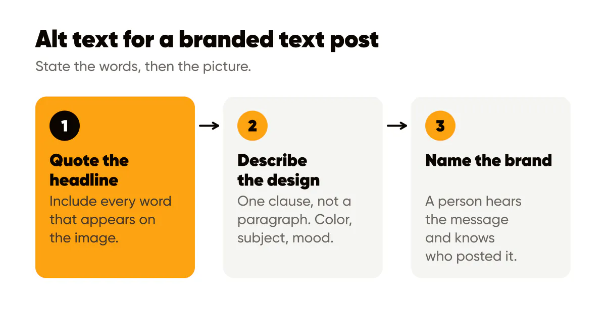
A few rules that keep it useful:
- Include every word that appears on the image. If the graphic has a headline and a subline, both go in.
- Describe the image in one clause, not a paragraph. Color, subject, mood.
- Skip "image of" or "photo of"; screen readers already announce that it is an image.
- Do not stuff keywords that are not on the image. It is for people first and search second, in that order.
- For a photo with no text, describe what matters in the photo: "A baker scoring a loaf on a flour-dusted bench."
How long should Instagram alt text be?
Keep it under 100 characters. Instagram's Help Center article on editing alt text explains where the field is but does not publish a character cap; most third-party guides quote 100 characters. I write to 100 anyway: screen readers often pause or cut off around 125 characters, and a shorter description gets heard in full.
20 Instagram alt text examples
Every example below is under 125 characters, states any words on the image first, and describes the picture in one clause. Swap in your own products, places and brand name.
Product photo
- Candle on a shelf: "Hand-poured soy candle in an amber glass jar on a wooden shelf, lit, with a linen label reading Cedar and Smoke."
- Ceramic mug: "Speckled white ceramic mug with a matte blue glaze, held in two hands over a kitchen counter."
- Skincare flat lay: "Three green glass serum bottles laid on a white marble surface with eucalyptus leaves."
- Bakery box: "Open kraft pastry box with six almond croissants, one broken open to show the layered center."
- Tote bag: "Natural canvas tote bag with a black line-drawn olive branch print, hanging on a wooden hook."
Quote card or text graphic
- Tip card: "Text graphic reading 'Post three times a week, not thirty times in a month' in white on dark green."
- Quote card: "Quote card reading 'Your logo is not your brand. Your template is.' in black on cream, Maple Studio logo below."
- Offer graphic: "Text graphic reading 'Spring cleaning slots open, book by Friday' in navy on a pale yellow background."
- Announcement: "Announcement graphic reading 'New hours from June 1: open Sundays' with a small clock icon on white."
- Number card: "Text graphic reading '40 websites launched since 2022' in large amber type on near-black, Sam Web Design logo."
Behind the scenes
- Workshop: "A woman in a canvas apron sanding a walnut tabletop in a sunlit workshop, sawdust on the floor."
- Kitchen: "Baker scoring a round sourdough loaf on a flour-dusted bench, oven glowing in the background."
- Desk: "Laptop open to a spreadsheet beside a coffee mug and a notebook with a handwritten content calendar."
- Packing orders: "Stack of small kraft boxes being sealed with washi tape at a packing table, shipping labels ready."
- Client meeting: "Two people reviewing printed logo sketches at a cafe table, coffee cups pushed to one side."
Carousel slide
- Cover slide: "Carousel cover reading '5 pricing mistakes freelancers make' in white on dark blue, slide 1 of 6."
- Step slide: "Slide 3 of 6 reading 'Mistake 3: charging by the hour' with one line of explanation in smaller text."
- Checklist slide: "Slide showing a five-item checklist titled 'Before you hit publish', four items ticked in amber."
- Comparison slide: "Slide split into two columns labeled Before and After, comparing a cluttered and a simplified homepage."
- Last slide: "Final slide reading 'Save this for your next quote' with a bookmark icon and the Dana Coaching logo."
Contrast and size: readability is accessibility
Alt text serves people who cannot see the image. Contrast and type size serve the much larger group who can see it but not well: older eyes, bright sunlight, a cracked screen, color vision deficiency, or just a fast scroll. The standards here are not opinions; they are published.
WCAG 2.2 sets the contrast minimum at 4.5:1 for normal text and 3:1 for large text. On a social graphic, headlines count as large text, but I hold everything to 4.5:1 anyway because Instagram's compression softens edges and eats margins. The WebAIM contrast checker will give you the ratio for any two colors in seconds.
Which color combinations fail on branded posts?
White text on a bright brand color is the classic failure. Creobee's brand color is an amber, #FCA311, and white on it does not pass, which is why our own amber posts use dark text and save white for dark backgrounds. If your brand color is a bright orange, yellow, light green or mid-blue, test before you trust it. Most bright colors need dark text; most dark colors need light text; the middle band of medium saturation is where both fail and you need a darker or lighter variant.
Photos are the other trap. Text over an unmodified photo has different contrast against every part of the image. The fix is a dark overlay, or a blurred and darkened background, so the text sits on a consistent tone. I spelled out those techniques in text over images: readability rules.
Size is simpler. On a 1080 by 1350 canvas viewed on a phone, I keep headlines at roughly 72 pixels or larger and never let supporting text go below about 40. Thin weights under that size disappear after compression.
Captions on video, and the caption itself
If you post Reels or video Stories, turn on captions. Instagram can generate them automatically, and you should read them before publishing because names and product terms get mangled. Captions serve deaf and hard of hearing viewers and the many people who watch with sound off.
Then there is the plain caption under the post. The most accessible thing you can do is repeat the image's key message in the first line of the caption, in text. It costs nothing, it is indexable, and a person who cannot read the graphic for any reason still gets the point. Writing hashtags in CamelCase, like BrandDesignTips instead of all lowercase, lets screen readers pronounce each word, and it is a small courtesy that a lot of accounts skip. The full checklist, including CamelCase, captions and emoji placement, is in accessible social media design.
Does alt text help with reach?
Indirectly, and I will not claim more than that. Alt text gives Instagram text to classify the post, and classification is how a post reaches the right topic audience. It is not a ranking signal that boosts a post on its own. The real gain is the audience you were excluding: people using screen readers, people with low vision, and anyone whose search happened to match the words on your image. Design consistency helps here too; a recognizable template with a predictable text position is easier for everyone to parse, which is a point I make in AI image branding tips.
Do this this week
Open your last ten posts and add custom alt text to each one using the pattern: words on the image, one clause of description, brand name. Then take your two most used color combinations and run them through the WebAIM checker. If either is under 4.5:1, darken the text color or the background until it passes, and update the template so the next batch inherits the fix. Creobee picks the text colors for every post it designs against the surface behind them, which is one reason it works without Instagram templates you have to maintain. Finally, turn on captions for your next Reel and read them before posting.

Put it into practice
Turn this into posts designed for your feed
Paste your website or say what you do. Creobee plans, writes and designs your posts about it as one feed in your logo and colors, captions included, and on Autopilot it posts them for you.
How the AI Instagram post generator works