Text Over Images: 9 Readability Rules for Text Overlays
Text over images stays readable with 9 rules: 4.5:1 contrast, scrims, calm backgrounds, size floors, margins and a thumbnail test. One fix covers most.
Text over an image is readable when the contrast ratio clears 4.5:1, the background behind the words is calm or darkened, the type is large enough to survive a thumbnail, and the lines are short and kept inside safe margins. Nine rules cover it, and a darkened or blurred background fixes most failures on its own.
Why text overlay readability fails on social
The picture looked great. Then you typed a headline over it, exported the post, and on your phone the words were half visible against a bright sky and half swallowed by a shadow. Every small brand does this, and the cause is always the same: the photo was chosen for how it looked alone, not for how it would behave under type. The free text contrast checker gives you the exact ratio for any background and text pair.
The Nielsen Norman Group's piece on legibility, readability and comprehension makes a useful distinction. Legibility is whether characters can be distinguished at all; readability is whether the text can be read comfortably. Social graphics fail at legibility first, because the background eats the letterforms, and the fix has to start there.
Below are the nine rules I apply to every post with a background image, in the order I check them.
Rules 1 to 3: contrast, scrims and busy backgrounds
Rule one is contrast ratio. Measure the text color against the background it actually sits on and require at least 4.5:1, the figure the WCAG 2.2 contrast minimum sets for normal text. Photos are not a single color, so measure against the lightest area behind the text if the text is light, or the darkest area if the text is dark. The WebAIM contrast checker will take an eyedropped hex code and tell you in a second.
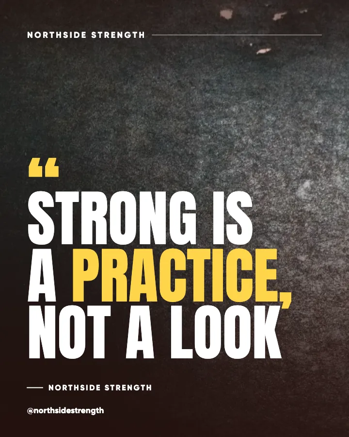
Rule two is the scrim, meaning a semi-transparent dark or light layer between the photo and the text. A scrim converts an unpredictable background into a predictable one. My default is a dark overlay across the whole image or a gradient that darkens the band behind the headline, with light text on top. It sacrifices some of the photo, and that is the trade: the photo becomes atmosphere and the words become the subject. In my experience this single move rescues more posts than any other.
Rule three is avoiding busy backgrounds altogether. Fine texture, foliage, crowds, and high-frequency patterns fight letterforms regardless of contrast. Either choose a photo with a quiet area where the text will go, blur the background, or drop the photo in favor of a flat color or gradient. The guide to choosing background images for branded posts covers how to build a set of backgrounds that already behave well under text.
Does a blurred background really help?
Yes, and often more than a scrim. Blur removes the edges that compete with the letters while keeping the color and mood of the photo. Combined with a light scrim, a blurred background behaves almost like a flat color. The cost is that the photo stops being a photo, so use blur when the image is context, not when it is the point.
Rules 4 to 6: size, line length and hierarchy
Rule four is a size floor. On a 1080 by 1350 canvas, I do not set headlines below about 70 pixels or supporting lines below about 36, because on my own posts anything smaller fails the thumbnail test in the grid. Those are my numbers rather than a standard, and you should calibrate against your own grid. The principle holds regardless: if you have to shrink the type to fit the words, cut the words.
Rule five is line length and breaks. Headlines over images work best at two to four short lines, each broken where the sentence would pause when spoken. Long single lines run into the edges of the safe area, and five-line blocks stop reading as headlines. The typography rules for social posts go into line length in detail.
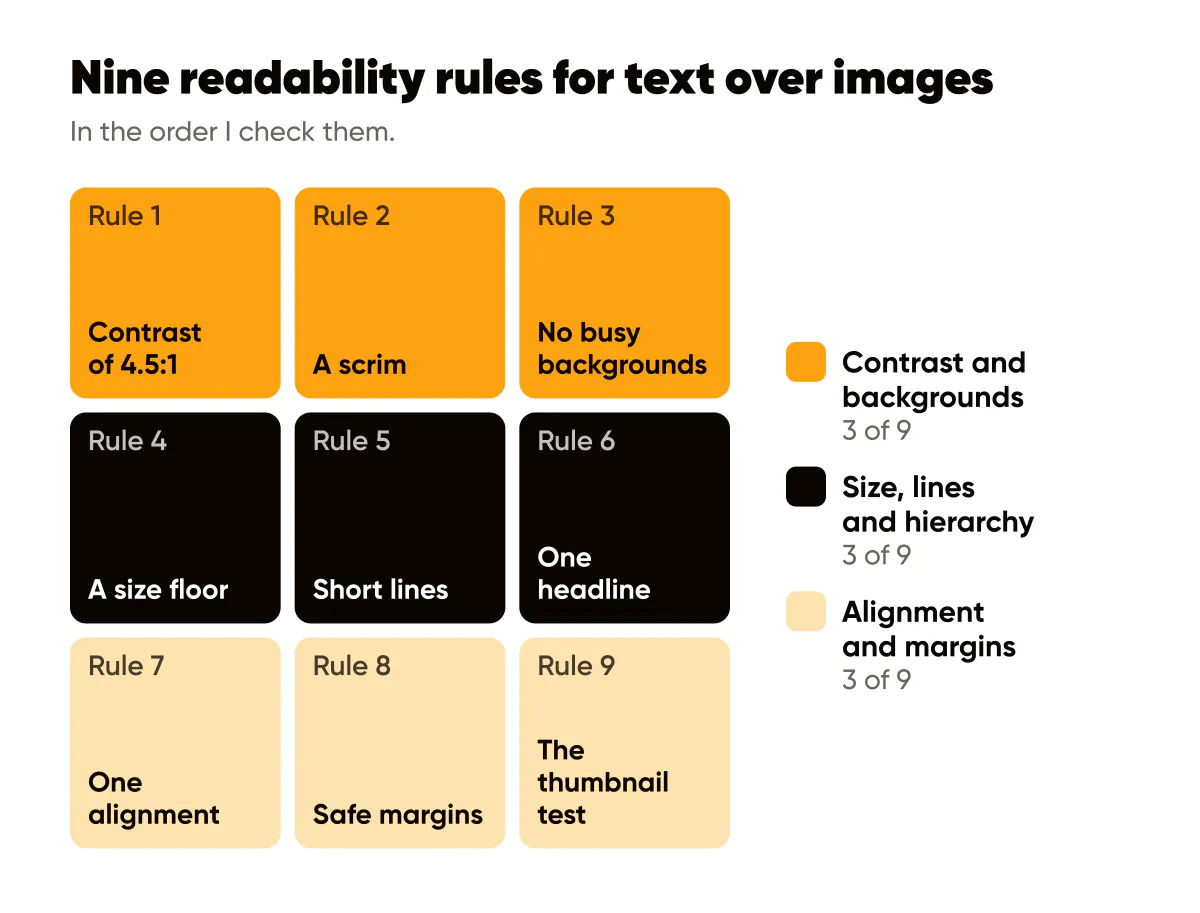
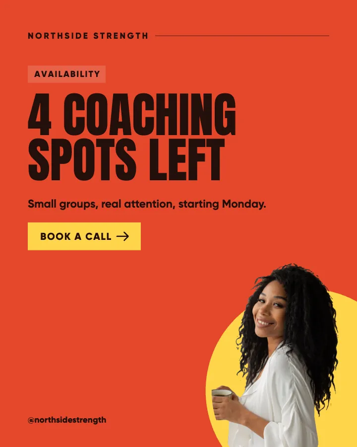
Rule six is hierarchy. One headline, at most one supporting line, and a small logo. Two headlines competing at similar sizes are unreadable in a glance even when each is perfectly legible. Decide which words matter most and make everything else visibly smaller or remove it.
How much text is too much on an image?
If the words need more than two seconds to read, they belong in the caption. That is the whole test. A 4:5 post gets a glance in the feed; a carousel slide gets a little longer because the reader has already committed by swiping. The carousel design guide covers how the reading budget changes across slides. For a single feed post, eight words is my ceiling and three is often better.
Rules 7 to 9: alignment, margins and the thumbnail test
Rule seven is alignment. Pick left or center and keep it for the whole template family. Left alignment reads faster for multi-line headlines; centered works for one to two lines. Mixing alignments inside one post, or across a grid, makes the eye hunt for the start of each line.
Rule eight is safe margins. Keep all text inside a rectangle set well in from the canvas edges, so nothing collides with the profile grid crop or with platform interface elements when the post is reused as a Story. Meta's safe zone guidance for Stories and Reels describes the bands to keep clear on 9:16, and on 4:5 I hold generous margins on all sides for the same reason.
Rule nine is the thumbnail test, and it is the one that catches everything the others miss. Export the post, put it on your phone, and view it at grid size. Can you read the headline without zooming? Is the logo visible? Does the text separate from the background? If any answer is no, the post is not finished. I do this for every batch I generate, and I reject a surprising share on this step alone.
Here is the sequence I run on a post that fails:
- Add or strengthen the dark scrim behind the headline first, because it fixes contrast and busy backgrounds at once.
- If it still fails, blur the background or swap to a calmer photo from the same family.
- If contrast is now fine but the words are still hard to read, cut words until the headline fits in three short lines at the size floor.
- Check alignment and margins, then re-export and look at the thumbnail again.
A worked example
A hypothetical personal trainer wants a post with the line "Strength is a habit, not a goal" over a gym photo. First attempt: white text in a medium weight centered over a bright, cluttered gym floor. Unreadable in the grid. Second attempt: the same photo darkened with a 60 percent black overlay, the headline moved to the upper third where the wall is plain, set heavier and larger in three lines, "habit" in the trainer's accent color, and the logo small in the bottom-right corner. Readable at thumbnail size, and the photo still sets the scene.
Notice that most of the fix was the scrim and the crop, not the font. That is the pattern almost every time, and it holds across a whole feed of social media posts for gyms and trainers, where most photos are busy floors and mirrors.
Do this this week
Take your last five posts with text over images and view them at grid size on your phone. For each one that fails, add a dark scrim, cut the headline to eight words or fewer, and re-export. Then lock the scrim and the text margins into your template so the next batch starts from a passing position rather than a failing one. The AI generator for social media posts I built measures every preset background and sets the headline to white or black to suit it, so that step is done before you see the post.
Once the words can be read, the next question is whether they are seen in the right order, and visual hierarchy in social graphics picks up there. If some of your followers use screen readers or have low vision, Instagram alt text and accessibility covers how to make the same post reach them too.
Put it into practice
Turn this into posts designed for your feed
Paste your website or say what you do. Creobee plans, writes and designs your posts about it as one feed in your logo and colors, captions included, and on Autopilot it posts them for you.
How the Instagram feed design works