How to Make a Promotional Post That Sells
How to make a promotional post that sells with no discount: the six-line offer post (who, outcome, inclusions, proof, one CTA, a real deadline) and its design.
An offer post converts when it answers six questions in order: who this is for, what outcome they get, what is included, why they should believe you, what to do next, and by when. Discounts are a substitute for the missing answers. Write all six, put them on a dark high-contrast template, and the price stays where it is.
The anatomy of an offer post that converts
Most sales posts fail because they start with the product. "Introducing my new coaching package" is about you. The reader is asking a different question: is this for me, and what happens if I say yes? The anatomy below is the order those questions arrive in, and the post should answer them in the same order.
- Who it is for: one sentence naming the person, specific enough that the wrong people self-select out.
- The outcome: what is different in their life or business after, in plain words, without adjectives doing the work.
- What is included: the concrete deliverables, sessions, files or credits, because vagueness here reads as hiding something.
- Proof: one testimonial, one result of your own, or one before-and-after, with a time frame.
- One call to action: a single verb and a single destination, because Hick's Law describes how every extra option slows the decision.
- One deadline: a real date or a real cap, or nothing at all.
That is six lines. An offer post does not need to be longer than six lines. Mine for the plan that runs social media on autopilot is under a hundred words, and it says who posts often enough to need 100 posts a month posted for them, what they stop doing, what the plan includes, and where to start.
Why does discounting feel easier than framing value?
Because a discount is a number, and a number requires no thought about the customer. Value framing requires you to know why someone buys, and many solopreneurs have never written that down. The discount fills the gap and then becomes the habit, until customers wait for the next one.
The other cost is quieter. A discount tells the reader the original price was not real. Once they believe that, every future full-price offer is a negotiation. I would rather be the brand whose price is boring and whose offer post is clear.
AIDA as scaffolding, not a formula
The old AIDA model (attention, interest, desire, action) maps onto the six lines cleanly: attention is the who-it-is-for line, interest is the outcome, desire is the inclusions plus proof, action is the CTA and deadline. I do not think of it as a formula. I use it as a check after writing: if the post has no desire section, I have listed features and skipped the part where the reader wants them.
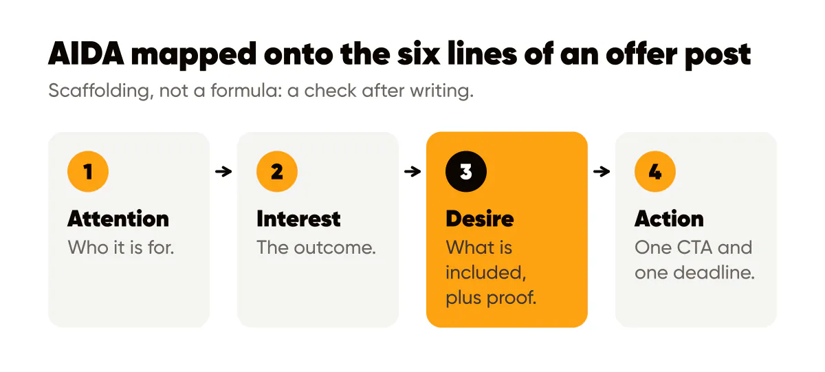
The reason to keep AIDA in mind is that offers often collapse two stages. A post that jumps from "who" to "buy now" has skipped interest and desire, and the reader feels rushed. A post that spends four lines on desire and never gets to action is a nice essay.
How long should an offer post be?
As long as the six answers take, and not a word more. On a 4:5 image that means the headline carries the who and the outcome in one line, and the caption carries the rest. On my account, the offer posts with the shortest captions have done best, which I take as a sign that clarity, not persuasion volume, is what was missing before.
Copyblogger's copywriting fundamentals argue that good copy is a clear conversation with one person. An offer post is that conversation compressed. If you would not say the sentence to a customer across a table, cut it.
The visual: a dark, high-contrast template for offers
Offer posts should look different from the rest of your feed, on purpose. My teaching posts use a light template; the offer post uses the inverted version, dark background, light text, same font, same logo corner. Someone scrolling sees the change in tone before reading a word, and the template change signals "this one is an ask" without a single exclamation mark.
Contrast is not only aesthetic here. The headline on an offer post has to be readable as a thumbnail, and the WCAG minimum contrast ratio is a good floor for light text on a dark background. Brand colors that are bright, like Creobee's amber, work as the accent on a dark template rather than as the background behind white text, which usually fails contrast.
Keep the image to the who-and-outcome headline plus your logo. The inclusions, proof, CTA and deadline live in the caption where people read them after the image has stopped them. This is the same discipline that makes brand templates convert browsers into buyers: one job per element, consistent every time.
The deadline problem
A fake deadline is the fastest way to teach your audience to ignore you. Countdown stickers that reset every week, "limited spots" for a digital download, "price goes up soon" with no date: people notice, and the noticing costs you the next real deadline too.
Real deadlines are easy to find if you look. A cohort has a start date. A service has a calendar with finite hours. A price change can be announced with a date and then actually happen. If none of those apply, leave the deadline line out and let the offer stand. An honest offer with no urgency beats a dishonest one with a timer.
A worked example: a brand photographer's mini-session offer
Say you shoot brand photos for small businesses and want to sell a half-day session. Headline on the dark template: "For founders whose website photos are three years old." Caption line one, the outcome: "Walk away with 40 edited images that match the brand you have now." Line two, inclusions: "Half-day shoot, two locations, a shot list we build together beforehand." Line three, proof: "The last three founders I shot swapped their homepage hero within a week; one told me her inquiry form got busier the same month." Line four, CTA: "Book the October date at the link in my bio." Line five, deadline: "I shoot four of these a month and October has two dates left." Every line is a real answer, and nothing is on sale.
The CTA line here is the one that decides everything after the reader is convinced, and choosing the right verb for it is the subject of 40 social media CTA examples that do not sound desperate.
Do this this week
Take your current offer and write the six lines, one per line, in a plain text file. Read them to someone who is not a customer and ask which line they did not understand; rewrite that one. Build one dark high-contrast template with your headline font and your logo in its usual corner, and check the text contrast before exporting. Post the offer once this week, preceded by at least two teaching posts, the ratio I describe in educational content that sells. Then do not discount it. Let the six lines do the work, and read the comments to find out which line needs to be clearer next time.
When an offer post needs more room than a single image, the narrative structure in story-driven ads is the format I reach for.

Put it into practice
Turn this into posts designed for your feed
Paste your website or say what you do. Creobee plans, writes and designs your posts about it as one feed in your logo and colors, captions included, and on Autopilot it posts them for you.
How the AI Instagram post generator works