Zero-Click Content: How to Grow When Nobody Clicks
Zero-click content gives its full value in the feed or answer box. Six post formats that work without a click, what still needs a link, and how to measure it.
What zero-click content means
Zero-click content is content designed to deliver its full value inside the platform where it appears (the feed, the answer box, the carousel) without requiring a visit to your site. The reader gets the complete idea in place; you get recognition, saves, follows, and the compounding trust that eventually turns into customers.
This used to be a choice. In 2026 it's the default condition. Platforms suppress outbound links, AI Overviews answer searches on the results page, and users have been trained by both to expect the value up front. Fighting for the click on every post means losing most posts.
The strategic shift is small but uncomfortable: stop treating the platform as a billboard for your website and start treating it as the venue where the relationship actually happens.
Put simply, a zero-click post answers the question it raises without asking anyone to leave. Platforms reward that because their business depends on time spent in the app: a post that keeps people reading, saving and sharing inside the feed gets shown to more of them, while a post built mainly to push people toward a link tends to reach fewer.
Design posts that finish the job in the feed
A zero-click post has a beginning, a middle, and a payoff, in the post. For a carousel, that means the last slide resolves the promise of the first slide instead of saying "read more on the blog." For a single image, the graphic itself carries the insight, not a teaser for it.
When I batch posts, I write the payoff first. If the payoff can't fit on one image or one slide, the idea is too big for one post and becomes a series. This one habit killed the "engagement is fine but nothing happens" problem for me, because complete ideas get saved, and saves are the strongest signal most platforms reward. The carousel structure guide pairs well with this.
Your branding is the click now
If nobody leaves the platform, what did you earn? Recognition. The person who sees your framework, your colors, and your name eight times without clicking is not a lost visitor. They're a warming lead who will type your name directly when they're ready. That direct, branded search is the conversion event of zero-click marketing.
Which is why visual consistency stopped being a nice-to-have. Every zero-click impression either deposits into a recognizable brand or evaporates. Templates with locked colors and type (the whole reason brand templates convert) turn feed noise into brand equity.
Six zero-click post formats that work for a solopreneur
Every format below finishes the job inside the post. I've used all six on Creobee's account, and the pattern is consistent: the more complete the post, the more it gets saved, and the more it gets saved, the more people see it. Each comes with an example for a one-person business, so you can see what "complete" looks like at feed size.
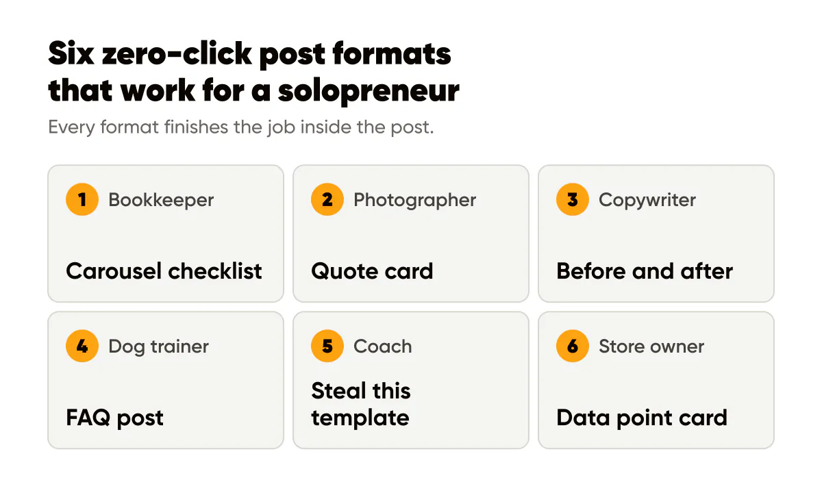
1. The carousel checklist. Slide one names the outcome, the middle slides are the steps, and the last slide is the whole list on one screen so people save that slide alone. Example for a bookkeeper: "7 things to do before you send your books to your accountant," ending with a single-slide summary of all seven. If you design the checklist as one tall image, the Instagram carousel splitter cuts it into slides that line up when swiped.
2. The quote card with the full insight. Not a teaser for the caption, the actual point in one sentence, with the reasoning underneath. Example for a wedding photographer: "Golden hour is a schedule, not a filter. Move the ceremony, not the edit." The card can be screenshotted and shared without losing anything, which is the test.
3. The before and after. Two states, one change, and the change named on the image. Example for a copywriter: a client's old homepage headline on the left, the rewrite on the right, and one line saying which rule made the difference. The caption explains the rule; the image already proves it.
4. The FAQ post. Take a question you answered in a DM this week and answer it in full. Example for a dog trainer: "Why does my dog pull harder when I pull back?" with the complete answer on the image and again in the caption. No "book a call to find out." The people who want a trainer will book anyway, and they'll book the one who already helped.
5. The steal-this-template post. A fill-in-the-blank the reader can use today. Example for a business coach: "The three-line follow-up email that gets replies: line one references the meeting, line two names one next step, line three gives a date." Readers save it because it's immediately useful, and they think of you when they need the next one. Because this format repeats weekly and has to look the same every time, I produce mine in batches with an AI Instagram post generator rather than laying each one out by hand.
6. The data point card. One number from your own work, with context. Example for an online store owner: "Most of our returns last quarter were size exchanges. Here's what we changed on the product page," with the actual figure from their own reports on the image. Use your own numbers only. A figure from your business is a claim nobody else can post, and it needs no link to be believed.
What still needs a link
Zero-click doesn't mean no-click. It means the click is the exception, and you spend it on purpose. Three things still need one, and they're the same three for almost every solopreneur I know.
The email signup. Email is the only surface where no algorithm or answer engine sits between you and the reader, so the zero-click strategy makes your list more valuable, not less. Run most of your content as complete-in-place value, then make the occasional ask unmistakable: one post, one link, one reason to subscribe. Generosity in the feed is what makes that ask land.
The sales page. When someone is ready to buy, they need a page with the price, the details and the button, and no carousel replaces that. The mistake is linking to it from every post. Link to it from the posts whose job is conversion, which for me is two or three a month, and let the rest of the month build the trust that makes those posts work.
Long-form. Some ideas are genuinely too big for a post, and pretending otherwise produces a carousel that says nothing. When a post is the short version of a guide, say so plainly on the last slide and put the link in the bio or the first comment. The post still has to deliver something complete on its own, or it's just a teaser with extra steps.
My ratio is roughly nine posts in ten with no link at all, and one that asks clearly. If your ratio is the reverse, you're not running a zero-click strategy; you're running ads with worse targeting.
Measure it
Not with traffic. If you judge zero-click posts by link clicks you will kill your best work, because the posts that get saved most are usually the ones that ask for nothing. The honest proxy stack in 2026 looks like this.
Saves and shares per post. These are the two signals platforms weight most heavily and the two that tell you a post was complete enough to keep. I explain how to read them in saves and shares, the metrics that grow your account. A post with more saves than likes is doing its job.
Profile visits. A save is private; a profile visit is a person deciding to find out who you are. When profile visits rise after a run of zero-click posts, recognition is turning into interest, even though no link was involved.
Follower quality and inbound DMs. Are buyers following, or bots? Do people message you mentioning a specific post? Those DMs are the conversion event that traffic used to be.
Branded search. I check it monthly in Search Console. It's the cleanest signal that feed-only impressions are building real memory, because someone who types your name into Google was reached somewhere you couldn't measure.
Link clicks still matter for the two or three posts a month whose job is conversion; for everything else, judge the post by what it did in place. And compare like with like: a checklist carousel against last month's checklist carousel, not against the sales post.
Do this this week
Pick one of the six formats and make a post that would still be useful if the caption, the bio and the link all disappeared. Post it, and a week later compare its saves and profile visits to your last five posts. If it did better on those two numbers, that's the format to repeat, and the whole strategy is that repetition.
Put it into practice
Turn this into posts designed for your feed
Paste your website or say what you do. Creobee plans, writes and designs your posts about it as one feed in your logo and colors, captions included, and on Autopilot it posts them for you.
How the AI Instagram post generator works