Saves and Shares: The Two Instagram Metrics That Actually Grow Your Account
Saves and shares are the Instagram interactions that extend reach beyond your followers. Here is which content earns each, and how to design a post for them.
Saves and shares grow an Instagram account because both are deliberate actions Instagram's ranking systems predict and reward, and a share puts your post in front of someone who did not follow you. Likes are cheap and private. Reference-style content earns saves; relatable, identity-affirming content earns shares. Design for one of the two on every post.
Why saves and shares beat likes
A like costs nothing and tells no one. A save means someone expects to need your post again. A share means someone staked a little of their own reputation to put it in a friend's inbox or on their Story. These are different levels of commitment, and Instagram treats them differently.
The evidence is in Instagram's own ranking explainer, which describes the predictions the system makes about a post: how likely you are to spend time on it, comment, like, save, share, or tap the profile. Sharing and saving are on that list explicitly. On top of that, Instagram's head has said publicly and more than once that sends, meaning shares to friends in DMs, are a signal the company weights heavily when deciding what to recommend. The Instagram for Creators blog repeats the same advice in plainer language: make things people want to send.
Then there is the arithmetic. A share to a Story or a DM reaches a person who never followed you. A like does not. Every share is a small, targeted distribution event that you did not have to pay for or hashtag your way into. If you want the broader ranking picture, I laid it out in how the Instagram algorithm ranks posts in 2026.
What kind of content gets saved on Instagram?
People save things they intend to use later. On my account, the saved posts cluster into a few archetypes, and I suspect yours will too.
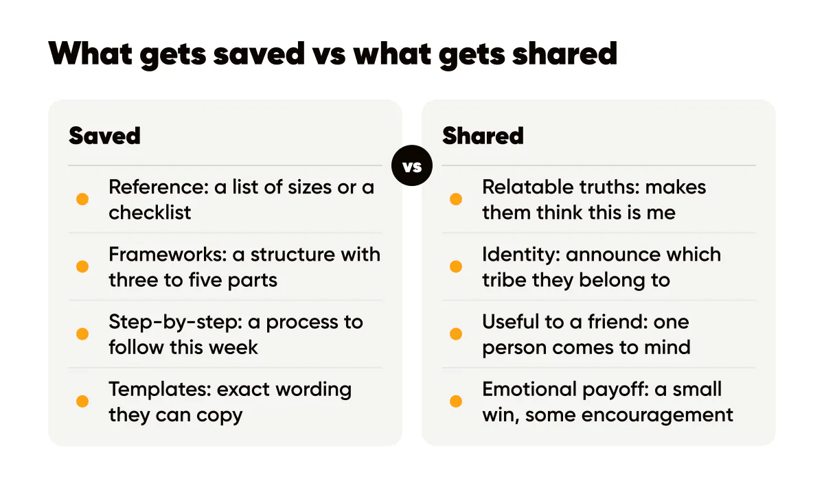
- Reference: a list of sizes, a settings walkthrough, a checklist. Anything someone would otherwise have to look up.
- Frameworks: a named structure with three to five parts. "The four-line bio" gets saved; "thoughts on bios" does not.
- Step-by-step: a process they plan to follow this week, ideally as a carousel.
- Templates and swipe files: exact wording they can copy, like caption openers or CTA lines.
- Comparisons: two options side by side with a clear recommendation.
The common thread is density and future use. A save-worthy post carries more usable information than a person can absorb in the scroll, so saving is the rational move. The carousels that convert format exists largely because carousels are the natural home for this kind of density.
What kind of content gets shared?
Sharing is social, so the content has to say something about the sharer. Four kinds of posts reliably travel on my account and on accounts I study.
Relatable truths: a sentence about the shared experience of your audience that makes them think "this is me." For freelancers, "The client who says quick question never has a quick question." Identity statements: a post that lets someone announce which tribe they belong to by resharing it. Useful-to-a-friend: a tip so specific that the sharer immediately thinks of one person who needs it, and sends it with "you." Emotional payoff: a small win, a kind observation, a piece of encouragement that lands at the right moment.
Shares reward brevity. A relatable truth in eight words on a clean 4:5 background outperforms the same idea buried in a paragraph. The share happens in a second or it does not happen.
Designing a save-worthy 4:5 post
A save-worthy post is designed to be opened again, so it has to be legible at a glance and complete when read closely. Here is the structure I use for a single-image reference post at 1080 by 1350.
- Headline at the top third: name the thing and promise the count. "Instagram sizes for 2026, all five."
- Body in the middle: the actual list, three to six lines, each short enough to fit one line at roughly 44 pixels tall. This is the part that gets saved.
- One line of context at the bottom: when it applies or where to get more.
- Logo, small, in its usual spot, so that when the post is saved or screenshotted it still carries your name.
The trade-off is that a dense post is less striking in the feed than a two-word statement. I accept that, and I alternate: one dense reference post, one short shareable statement, so the account earns both signals over a week rather than trying to win both on every tile. A weekly posting schedule that fixes which kind of post goes out on which day keeps that alternation from depending on your mood.
For a shareable post, invert the ratio: one sentence, large, high contrast, nothing else. Then write a caption that adds the second layer, the story or the reasoning, for the people who tap through. Buffer's piece on why carousels earn engagement makes a related point: the format that invites a second look is the one that collects the deliberate actions.
Should I ask people to save or share?
Yes, once, specifically, and only when it is true. "Save this for your next launch" is a real instruction that helps someone who was already inclined. "Like, comment, save and share" is noise, and Instagram has said it demotes engagement bait. The difference is whether the request tells the reader why the action serves them. I keep a list of phrasings that do not sound desperate in social media CTA examples.
Measuring it without fooling yourself
Professional accounts see saves and shares per post in Insights. The number I track weekly is saves plus shares divided by reach, per post, because it corrects for the posts that simply reached more people. Sort your last thirty posts by that ratio and the two archetypes above will show up at the top, in your own niche's dialect.
Do not compare a Tuesday reference post to a Friday relatable post on likes; they are doing different jobs. Compare saves to saves and shares to shares. Which numbers are worth tracking at all, and which are vanity, is the subject of measuring creative performance.
Do this this week
Write two posts. The first is a reference post: a list your audience would otherwise have to look up, designed at 4:5 with the list readable at phone size and your logo small. The second is a shareable post: one relatable sentence about your customer's daily reality, eight words or fewer, high contrast. Post them two days apart and check saves on the first and shares on the second after a week. Whichever archetype wins, make three more of it, using the teach-first structure in educational content that sells to keep the offer connected.
Shares are also where community starts: the prompts in community-led growth prompts are built to be sent to a friend.

Put it into practice
Turn this into posts designed for your feed
Paste your website or say what you do. Creobee plans, writes and designs your posts about it as one feed in your logo and colors, captions included, and on Autopilot it posts them for you.
How the AI Instagram post generator works