How to Rebrand Your Instagram: A Two-Week Plan
How to rebrand your Instagram without confusing followers: keep one anchor, announce the change, re-template evergreen posts. A two-week plan and a checklist.
Refresh your social branding by evolving, not replacing. Keep one anchor your followers already recognize, usually the brand color or the logo mark, change the rest in one coordinated step, announce it plainly, and re-template your evergreen posts so the old look disappears from your grid within two weeks.
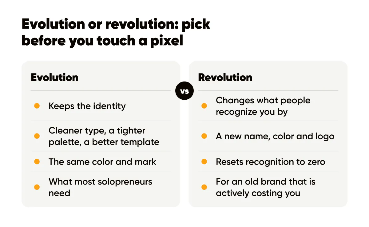
Evolution or revolution: pick before you touch a pixel
There are two kinds of brand refresh. Evolution keeps the identity and improves the execution: cleaner type, a tighter palette, a better template, the same color and mark. Revolution changes what people recognize you by: new name, new color, new logo. Most solopreneurs who think they need a revolution need an evolution, and the ones who need a revolution usually know it because the old brand is actively costing them (a name that no longer describes the business, a color that clashes with a new niche).
I did an evolution on Creobee's visuals last year. Same amber, same wordmark, but the posts were rebuilt with bigger type, fewer words and a fixed logo corner. Nobody asked what happened. Saves went up. That is what a good refresh feels like from the outside: nothing, except the posts are better.
Recognition is the asset you are protecting. The mere-exposure effect describes how repeated exposure to something makes people prefer it, and your followers have been exposed to your current look hundreds of times. Throw all of it away at once and you reset that clock to zero. My brand consistency post makes the longer argument for why recognition compounds faster than reach.
Should you change your brand color or your logo first?
Change one, not both, in a single refresh. The anchor is whichever element your followers would use to describe you. For most small brands it is the color; people say "the orange one" long before they can describe the logo. If the color is the anchor, keep it exactly and you can redraw the logo, change fonts and rebuild every template. If the logo mark is the anchor, keep the mark and shift the palette.
If you genuinely must change both, do it in two refreshes six months apart. It is slower, and it is far less likely to leave followers scrolling past you.
Decide the new system on paper first
Do not redesign inside your posting tool. Write the new system on a single page: three colors with hex codes and contrast pairs, two fonts with sizes, logo rules, two or three layout templates, five tone words. The one-page design system is the exact structure I use, and it takes about an hour.
Then build three sample posts in the new system and place them next to three current posts. Show them to five people who follow you and ask one question: "Same brand or different brand?" If they say different, you have drifted from your anchor. Pull back until they say same, then check the new posts still feel like an upgrade. The Von Restorff effect is a useful reminder here: the thing that stands out gets remembered, and you want the new posts to stand out from competitors, not from your own history.
The two-week transition sequence
Here is the sequence I recommend, compressed into fourteen days so the grid does not sit half-old and half-new for a month.
- Days 1 to 3: finalize the design system, rebuild your templates, and update the logo version files. Do not post anything new yet.
- Day 4: announce. One post, in the new look, that says plainly what changed and why. "Same amber, cleaner posts, easier to read on your phone" is enough. Pin it.
- Day 4, same day: change the profile picture, the bio wording if needed, and the Story highlight covers so the profile page is consistent from the first visit.
- Days 5 to 10: publish only new-look posts. Batch them in advance so the cadence does not slip while you adjust.
- Days 8 to 14: re-template your evergreen posts (details below) and reshare the best three as new posts. Delete or archive nothing; the old posts are history, not a liability.
By the end of week two, the top nine to twelve squares of your grid, which is what a new visitor actually sees, are entirely the new brand. Everything below the fold ages out naturally. The grid planning guide covers how to sequence those top rows deliberately, and Instagram feed design that plans each new post as part of one patterned grid keeps them consistent after the refresh.
Do you need to announce a brand refresh at all?
For an evolution, one light post is plenty, and skipping it entirely is defensible. For anything touching the logo or color, yes, announce it. The cost is one post. The benefit is that the people who notice the change get a reason for it instead of a moment of "did I follow the wrong account?" Frame it in their terms: easier to read, faster to recognize, clearer offers. Nobody cares about your new kerning.
Re-templating your evergreen posts
The refresh is also a free content week. Every strong post you have made in the old look is a candidate to be rebuilt in the new one. Pull your top posts by saves and profile visits, keep the headline, and rebuild the image in the new template. If you maintain an evergreen content library, this is the moment it pays for itself: the messages are already proven, and only the wrapper changes.
I did this with about twenty posts in one sitting. A template editor with a brand kit makes it quick: open the old post, apply the new template, keep the headline. The output is a month of proven content that also trains your followers on the new look faster than new material would.
Refresh checklist for this week
If you have been circling a refresh for a while, here is the smallest useful version:
- Name your anchor: color or mark. Write it down. It does not change.
- Draft the one-page system and build three sample posts.
- Run the same-or-different test with five followers.
- Schedule the fourteen-day sequence, with the announcement on day four and the profile update the same day.
- Rebuild your top ten evergreen posts in the new template and queue them across weeks two and three.
Then leave it alone for three months. The most common refresh mistake I see is a second refresh two months later because the first one felt incomplete. Recognition needs repetition, and repetition needs you to stop changing things. Check the bio while you are in there; the Instagram bio guide shows how to make the profile page do its job for a new visitor who has just noticed the new look.
Put it into practice
Turn this into posts designed for your feed
Paste your website or say what you do. Creobee plans, writes and designs your posts about it as one feed in your logo and colors, captions included, and on Autopilot it posts them for you.
How the Instagram feed design works