One-Page Brand Guidelines: Build Yours in an Hour
One-page brand guidelines you can build in an hour: three colors, two fonts, logo rules, three layouts and tone words to reuse in every tool and AI prompt.
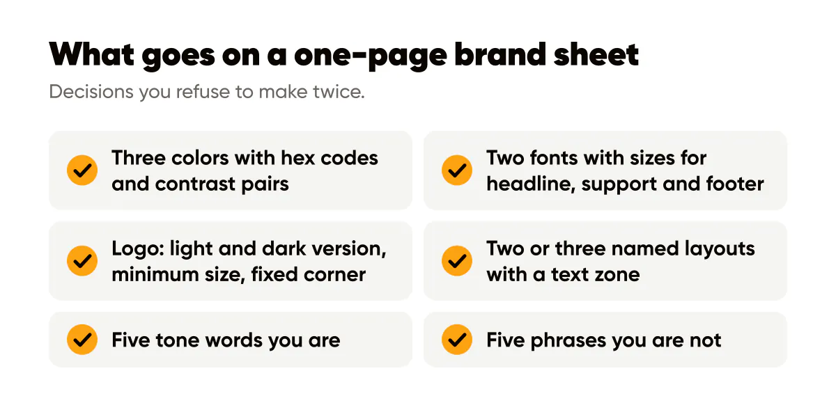
A one-page design system is a single sheet with your three colors and their hex codes, two fonts with sizes, logo rules, two or three layout templates and five tone words. It takes about an hour to build, and it removes the daily decision fatigue that makes solopreneur brands drift.
Why a solopreneur needs a design system at all
The phrase "design system" sounds like something a forty-person product team maintains in Figma. Strip it down and it is just a list of decisions you refuse to make twice. Which blue. Which font at which size. Where the logo goes. What you sound like.
I resisted this for the first year of posting for Creobee. Every post was a fresh set of choices, and every fresh choice was a chance to be slightly different from last time. The grid looked like a group project. When I finally wrote the sheet, post production got faster and the account started to look like one thing. That is the whole pitch: fewer decisions, more recognition.
The sheet also becomes the input for every tool you use. A template editor's brand kit, your website theme, your email template and the settings panel of any AI generator all ask for the same handful of values. Writing them once means never reconstructing them from memory.
Section one: three colors with contrast pairs
Pick one brand color, one near-black and one light neutral. Optionally one accent. Write the hex codes. Then, for each background color, write which text color goes on it. That last part is the one most brand sheets skip and the one that saves you the most grief.
Our brand color is an amber, hex FCA311. It looks great as a background and terrible under white text, which fails contrast badly. So the sheet says: amber background, near-black text. Near-black background, white or amber text. Light neutral background, near-black text. Three pairs, no thinking. Run each pair through the WebAIM contrast checker once and record the ratio next to it.
How many colors is too many?
More than four and you have stopped making a system and started making a mood board. Every additional color is another decision per post and another way to drift. If you genuinely need seasonal variation, swap the accent and keep the other three fixed. The brand color palette guide goes deeper on choosing the brand color itself and why bright colors need dark text.
Section two: two fonts and their sizes
One display font for headlines, one text font for everything else. That is the ceiling, not the floor; one family in two weights works fine. Write the font names, the weights you use, and the sizes on your primary canvas.
For a 1080x1350 post viewed on a phone, my sheet reads: headline 96 to 120 pixels bold, supporting line 44 to 52 pixels regular, footer or handle 32 pixels. Those numbers are for my fonts and my layouts; yours will differ, but you should have numbers. "Big" is not a size. Google Fonts has a clear primer on pairing typefaces if you are picking the pair from scratch, and my typography rules for social posts cover line length and case.
Section three: logo rules and layout templates
For the logo, write three things: which version goes on light backgrounds and which on dark, the minimum size relative to the canvas, and the fixed position. Mine says: white mark on dark, dark mark on light, never smaller than one twelfth of the canvas width, bottom-right with a margin of at least 60 pixels.
Fixed position matters more than people expect. A logo that wanders between corners reads as four different brands. Where to put your logo on social posts covers the corner conventions and the interface overlap zones to avoid.
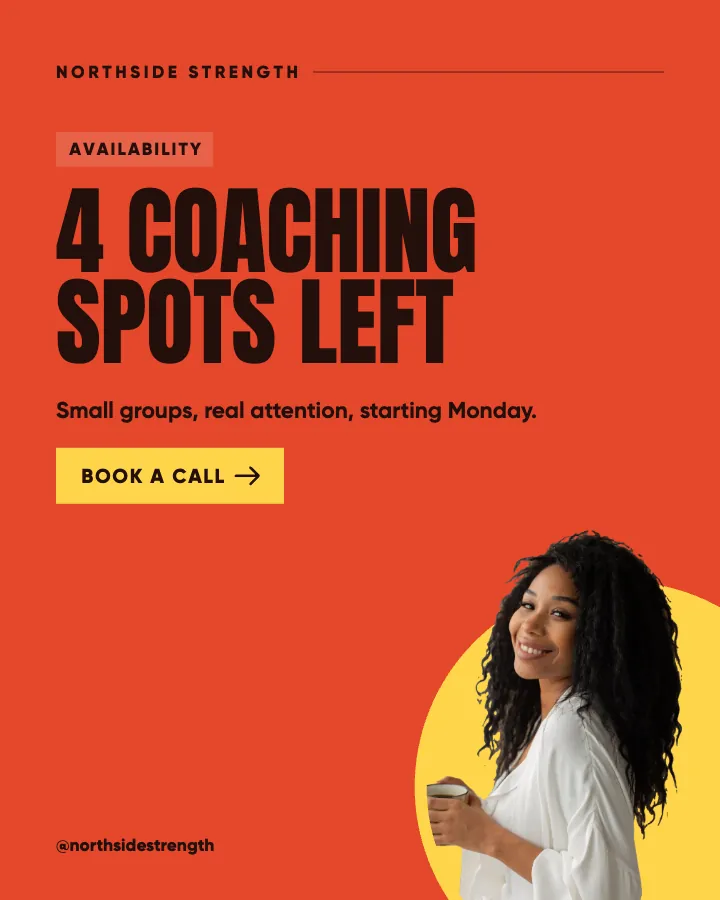
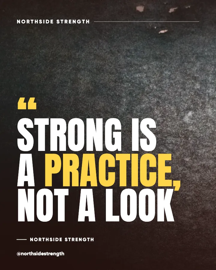
For layouts, name two or three and sketch them, even badly. Mine are Statement (headline centered, nothing else), Tip (small label top-left, headline, one supporting line) and Offer (dark background, headline, one line of detail, logo). Three families cover almost every post I make, and a grid that alternates among three related layouts looks intentional without looking rigid.
For each template, note the text zone: the rectangle where text is allowed to live. Keep it away from the bottom edge, where Instagram's caption overlay sits in some views, and away from the extreme edges in general. For a 1080x1350 canvas I keep text inside a box that starts 100 pixels from each side.
Can a one-page system really cover every post?
Not every post. It covers the large majority that are text-led brand posts, which are also the posts you make most often and the ones where drift hurts most. Launches, carousels with screenshots and the occasional photo-only post live outside the system on purpose. The system exists so that the routine work is automatic and your attention is free for the exceptions. The AI image branding tips post covers how the same constraints translate into generator settings.
Section four: tone words and banned words
Five words that describe how the brand sounds, and five words or phrases it never uses. Mine: direct, practical, specific, warm, unhyped. Banned: game-changer, unlock, elevate, seamless, "in today's fast-paced world". This section is the one that turns a design sheet into a brand sheet, and it is the part you paste into every AI prompt. The brand voice guide for AI expands this into a fuller voice file when you are ready.
Build it this week, in one sitting
- Open a blank document. Title it with your brand name and today's date.
- Colors: pick three, write hex codes, run three contrast pairs, record the ratios. Twenty minutes.
- Fonts: choose two, or one family in two weights, and write sizes for headline, support and footer. Fifteen minutes.
- Logo: light version, dark version, minimum size, fixed corner. Five minutes.
- Layouts: name and sketch three. Ten minutes.
- Tone: five words you are, five phrases you are not. Ten minutes.
Then use it immediately. Load the colors and fonts into whatever tool you post from, and generate or design your next batch inside those constraints. If you would rather not maintain templates by hand, Instagram templates for small business that fill themselves in from a brief can take the brand color and logo from this sheet and keep every post of the month inside them. The test of a design system is not how it looks on the page but whether next month's grid looks like this month's. The brand consistency piece explains why that recognition compounds faster than reach.
Put it into practice
Turn this into posts designed for your feed
Paste your website or say what you do. Creobee plans, writes and designs your posts about it as one feed in your logo and colors, captions included, and on Autopilot it posts them for you.
How the Instagram feed design works