How to Create a Cohesive Instagram Feed That Lasts
How to create a cohesive Instagram feed with a small system instead of perfectionism: two or three template families, one fixed palette and a posting rhythm.
A cohesive Instagram feed comes from a system of two or three template families, one fixed color palette and a repeating rhythm of post types, not from arranging every tile by hand. Recognition matters more than symmetry: a follower should identify your post mid-scroll before reading a word, and that takes consistency, not perfection.
How to create a cohesive Instagram feed in five steps
- Lock two or three colors and put them on every post, photo posts included.
- Pick one headline font and keep its weight and case the same everywhere.
- Put the logo in the same corner at the same size on every post.
- Define two or three template families and alternate them, so neighbors never match.
- Make each month in one sitting, so the rules still hold on a tired Thursday.
The rest of this article is why each step matters and how to keep it up without rearranging tiles by hand.
Why grid perfection is a trap
I have watched people spend a Sunday afternoon rearranging nine tiles in a preview app, delete a post because it broke the checkerboard, and skip a week because the next photo "didn't fit." That is grid perfectionism, and it kills more accounts than bad design does, because the account that stops posting loses by default.
The grid also matters less than it used to. Most people see your posts in the feed or in Explore, one at a time, with a stranger's post above and below. The grid is seen mainly by people who already tapped your name. It should look intentional, but the tile-by-tile puzzle is optimizing the wrong screen.
What matters on both screens is recognition. The mere-exposure effect is the well-documented finding that people prefer things they have encountered repeatedly. Every post that looks like your other posts is another exposure. Every post that looks like a new brand resets the count.
What makes an Instagram feed look cohesive?
Cohesion is a Gestalt problem: the eye groups things that share color, shape and arrangement, which the Interaction Design Foundation summarizes in its overview of Gestalt principles. Your feed looks cohesive when the posts share enough of those properties that the brain reads them as one set, in the grid and one at a time in the feed. In practice, three things do almost all the work:
- One palette. Two or three colors that appear on every post, even when the background is a photo. Lock them and stop choosing.
- One type system. The same display font for every headline, the same weight, the same case. Type inconsistency is the fastest way to look like three different people run the account.
- One logo position. Same corner, same size, every time. Small and predictable beats big and wandering.
Notice that none of these is about the arrangement of tiles. You can post in any order and still look cohesive if the posts themselves share a system. The reasoning behind this, and why recognition beats reach, is in brand consistency on social media.
The two-or-three template family system
A template family is a layout with fixed rules and variable content. On the Creobee account I run three:
- Text post: a solid or gradient brand-color background, one headline of two to eight words, the logo top center. This is the workhorse.
- Photo post: a real photo, darkened enough for white text, a shorter headline, logo in the same spot.
- Quote or proof post: a light background, a longer sentence in the text font, a small attribution line.
Three families give the grid rhythm without chaos. When all three share the palette, type and logo position, any order works. If you are building your first system, the one-page version in a one-page design system for solopreneurs is enough; you do not need a brand book.
How do I keep the grid from looking repetitive?
Alternate families. My default rhythm is text, photo, text, quote, and then it repeats. That means no two adjacent tiles are the same family, so the grid has texture, while every tile is obviously mine. When I break the rhythm for a launch or an announcement, I break it on purpose and return to it afterward.
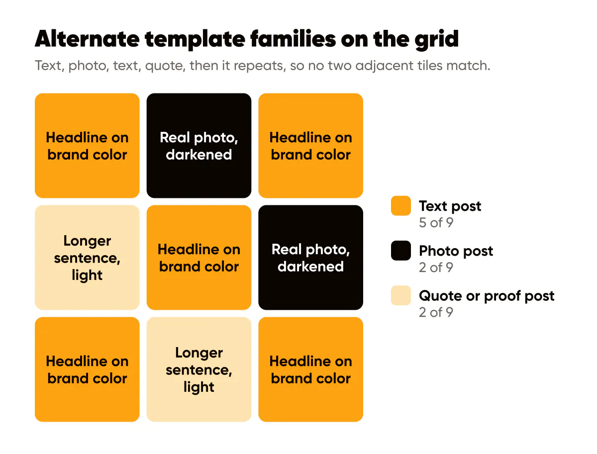
The other lever is the background within a family. A text post family can rotate between two brand-color backgrounds, or between a flat color and a subtle gradient, without touching the type or logo. The variety lives in the layer that does not carry identity.
Batch generation keeps a feed cohesive
Here is the practical secret. Cohesion fails post by post: you are tired on Thursday, you grab a different font, you put the logo somewhere new. It succeeds when a whole month is produced in one sitting inside one family, because the tool holds the rules while you focus on the words.
This is how I use Creobee, an AI Instagram post generator, for my own account. I pick a style, a grid pattern and my brand color, add my logo, and produce the whole set of 4:5 posts, headlines and captions included, at once. The posts take turns between a full-size picture, a block of brand color and a light version, in a pattern that keeps its shape as new posts push the old ones down; the Instagram feed design page has more on how that works. The set is cohesive by construction. When I want my own photos in the mix, I run a separate batch on one of them. A month of posts, two sittings, no Thursday drift. The scheduling side of that habit is covered in batching content workflows.
The trade-off is real: a batch of thirty posts in one family can feel samey when you scroll them in a folder. In the feed, where they are spread over weeks and interleaved with other families, that sameness reads as identity. Judge the grid, not the folder.
Does the grid need to be a puzzle or a checkerboard?
No. I would argue against a puzzle, and a checkerboard is optional. Puzzle grids, where nine tiles form one image, break the moment you post anything off-plan, and every single tile makes no sense on its own in the feed. Checkerboards are a rhythm, not a rule: placed by hand, tile by tile, the alternation breaks the first time a launch or a time-sensitive post jumps the queue. A checkerboard only holds when the looks are assigned by post order, so every new post takes the look its slot needs. The Nielsen Norman Group's aesthetic-usability effect is the reminder that people forgive a lot when something looks considered; considered is a much lower bar than perfect. Which layouts hold and which break is in Instagram grid layout ideas that still work with Reels.
A quick grid audit
Open your profile and take a screenshot of the top twelve tiles. Then ask four questions. Do at least ten of the twelve use the same two or three colors? Is the headline font the same on every text post? Is the logo in the same place on every tile where it appears? Are all the tiles the same ratio, ideally 4:5 as described in the Instagram post size cheat sheet? Every no is one rule to lock for the next batch. You do not need to fix the old posts; the grid heals itself as new posts push the old ones down.
Do this this week
Define your three template families on one page: background rule, headline font and size, logo position, and one example each. Then produce the next two weeks of posts in one sitting inside those families, alternating text, photo, text, quote. Post them in that order without previewing the grid. At the end of two weeks, screenshot the top twelve tiles again and compare. If you can tell which posts are yours at arm's length without reading, the system is working.

Put it into practice
Turn this into posts designed for your feed
Paste your website or say what you do. Creobee plans, writes and designs your posts about it as one feed in your logo and colors, captions included, and on Autopilot it posts them for you.
How the Instagram feed design works