Color Psychology in Marketing: What Research Shows
Color psychology in marketing: what the research supports, what is folklore (blue does not simply mean trust), and a practical way to pick a brand color.
Color psychology in marketing is mostly folklore dressed as science. Color meaning depends on culture, category and context, so "blue means trust" is not a rule you can build a brand on. What holds up is narrower: distinctiveness within your category, appropriateness to what you sell, and enough contrast to be read. Pick for those three.
What color psychology in marketing gets wrong
You have seen the chart. Red is urgency, blue is trust, green is health, yellow is optimism, purple is luxury. It appears in a thousand slide decks and it feels true, because you can always think of a brand that fits. The trouble is you can also think of one that does not, for every color on the chart.
Red is the color of a fast-food chain and of a luxury shoe sole. Blue belongs to a bank, a social network, and a discount airline. Green is a health brand and a fuel company. If a single color can mean all of those things, the color is not carrying the meaning. The brand is, and the color is along for the ride.
The 99designs fundamentals of color psychology is a good starting read precisely because it is candid about this: associations exist, but they are shaped by culture and personal experience, and they shift with context. White reads as clean in one culture and as mourning in another. The chart is a list of Western commercial habits, not a map of the human mind.
Is there any evidence that color affects buying decisions?
Some, but not the kind the chart implies. What the literature reasonably supports is that color affects whether something is noticed, whether it is recognized as belonging to a brand, and whether it seems appropriate for what is being sold. It does not support the idea that painting a button green makes people healthier or that a blue logo makes strangers trust you.
Put differently: color works on attention and recognition, which are measurable, and on mood in a diffuse and context-dependent way. It does not work as a persuasion dial. If a color test moved your conversion rate, the most likely explanation is contrast or distinctiveness, not the emotional content of the hue.
What actually holds up
Three things, in my reading and in my own experience picking Creobee's amber.
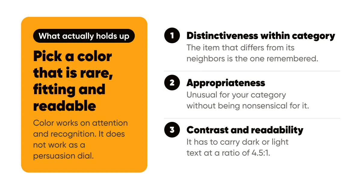
Distinctiveness within category. The Von Restorff effect describes how the item that differs from its neighbors is the one remembered. In a feed where your competitors are all blue and teal, an amber post is noticed for being amber, regardless of what amber is supposed to mean. This is the strongest argument for any color choice, and it is category-specific by definition.
Appropriateness. Colors carry conventions inside categories, and violating them costs you legibility as a brand. A funeral home in neon pink is distinctive and wrong. A children's toy in banking navy is safe and forgettable. You want the color that is unusual for your category without being nonsensical for it, and that is a judgment call, not a lookup.
Contrast and readability. This one is not psychological at all, and it matters more than the other two combined for social posts. A color that cannot carry dark text or light text at a contrast ratio of 4.5:1 will produce unreadable posts forever. The WCAG 2.2 contrast minimum is the standard to check against, and the brand color palette guide walks through the test.
Should I pick my brand color based on what it means?
No. Pick it based on what your category looks like, what you sell, and what text it can carry. Then, if you want, write a sentence about what the color means to you and put it in your brand sheet. Nobody else will read it, and that is fine, because the meaning followers assign to your color will come from what you post in it, not from a chart. That is why I care more about using one color the same way in every post, which is what a social media post generator that designs in your brand colors is for, than about what the hue means.
The Interaction Design Foundation's color theory overview is useful here for the mechanics, such as harmonies and how hue, saturation and lightness interact, because those mechanics decide whether your palette works together. The theory is real. The psychology, as usually sold, is not.
How I chose Creobee's color
I will use my own decision as the example, because I can describe it honestly. The category was design and AI tools, and the feeds I looked at were dominated by purples, blues and black-and-white minimalism. Amber was nearly absent, so it would be noticed. It is warm, which felt appropriate for a tool meant to help solo founders rather than enterprise teams. And it carries near-black text at a ratio well above the minimum, while failing badly with white text, which told me exactly how to use it: as a background for dark type and as an accent word on dark surfaces.
At no point did I ask what amber means. I asked whether it was rare, fitting, and readable. Three yeses, decision made.
A practical selection method
Here is the process, condensed to something you can do in an hour:
- List the ten accounts your customers also follow and write down each one's dominant color.
- Cross out the colors that appear more than twice; those are the category defaults you will not stand out against.
- From what remains, cross out anything that would read as nonsensical for what you sell.
- Test each survivor against near-black and against off-white in a contrast checker, and keep only the ones that pass 4.5:1 with at least one of them.
- Pick the survivor you can live with for three years, because switching later spends the recognition you built.
Once chosen, the color's real work begins, and it is repetition. A color becomes yours only through consistent use in the same roles across every post, which is the argument of the brand consistency guide. Whether that consistency comes from a designer's template or a batch of AI-generated posts does not matter; the AI image branding tips cover holding a palette steady in generated visuals.
What about seasonal colors and trends?
Use them in imagery, not in your palette. A photo with autumn tones behind your unchanged amber accent and navy text is seasonal and still recognizably yours. Swapping the palette itself to orange in October and red in December resets the recognition you spent the year building. Trend colors in particular are a trap for small brands: by the time you adopt one, your feed looks like everyone else's, which is the opposite of the distinctiveness that made color worth choosing carefully in the first place.
Do this this week
Do the ten-account color survey. It takes fifteen minutes and it is the single most useful color exercise I know, because it replaces an abstract question about meaning with a concrete question about your actual feed. Then run your current brand color through the contrast checker against your darkest and lightest colors and write down both ratios.
If the color you already have is common in your category or fails contrast with both text colors, do not panic and do not change it this week. Read the one-page design system for solopreneurs first, and make the change once, deliberately, as part of a system rather than as a reaction.


Put it into practice
Turn this into posts designed for your feed
Paste your website or say what you do. Creobee plans, writes and designs your posts about it as one feed in your logo and colors, captions included, and on Autopilot it posts them for you.
How the Instagram feed design works