Gradient Backgrounds for Social Media: The Rules
Gradient backgrounds for social media posts that stay classy: two palette colors, low contrast, one direction, one abstract family, and when a flat color wins.
Gradients look classy when they use two colors from your own palette, stay low in contrast within the gradient itself, run in one consistent direction, and sit under text that still clears the contrast ratio. Abstract shapes work the same way: one repeatable family, not a new idea per post. When in doubt, a flat color wins.
Why gradient backgrounds go wrong on branded posts
Gradients have a reputation problem. Ten years of purple-to-teal startup hero sections and rainbow story templates taught everyone that a gradient is what you add when you have nothing to say. That reputation is mostly earned. Most bad gradients fail for the same three reasons: too many colors, too much contrast between the colors, and no relationship to the brand that is posting.
But a gradient is just a background with a little depth. Used with restraint, it does something a flat color cannot: it gives a text-only post a sense of light and surface, so the words feel placed rather than pasted. That is worth having, especially for small brands whose posts are mostly text. The trick is to treat the gradient as a material, not as decoration.
How many colors should a gradient have?
Two. Occasionally three if the third is a shade between the other two. Never four, and never a hue wheel. The two colors should come from your palette, ideally your brand color and a darker or lighter version of it, or your brand color and your near-black. The brand color palette guide explains how to build a small palette with a dark, a light, and a brand color; every gradient you need can be mixed from those three.
The Interaction Design Foundation's overview of color theory covers why neighboring hues blend smoothly and why complementary hues produce a muddy band in the middle when you fade between them. That muddy band is the visual signature of an amateur gradient. Keep the two colors close on the wheel, or keep them the same hue at different lightness, and the middle stays clean.
Keeping text readable on a gradient
A gradient makes contrast harder to reason about because the background is a different color at the top of the headline than at the bottom. My rule is to measure text against the lightest point of the gradient if the text is light, and the darkest point if the text is dark. If both ends pass the WCAG 2.2 contrast minimum of 4.5:1 for normal text, everything in between passes too.
That is why internal contrast matters so much. A gradient from a deep navy to a slightly lighter navy is easy: off-white text clears the ratio everywhere. A gradient from navy to sky blue is a trap: the text passes at the top and fails at the bottom, and the post looks fine in the editor and unreadable in the grid. Keep the lightness range within the gradient narrow, and you buy yourself a background that behaves like a flat color for contrast purposes while still having depth.
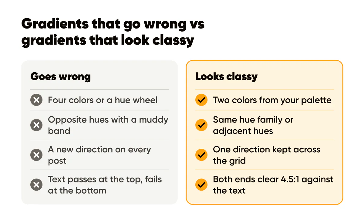
Three checks I run on any gradient template before it goes into a batch:
- The two end colors are the same hue family or adjacent hues, never opposite.
- The lighter end and the darker end both clear 4.5:1 against the text color, measured with a checker rather than by eye.
- The gradient does not put its lightest area directly behind the headline unless the headline is dark.
The readability rules for text over images apply here as well, and rule two in that post, the scrim, is the escape hatch when a gradient you like is too bright under the words.
Direction, angle and the repeatable family
Pick one direction and keep it. Top-left to bottom-right, or top to bottom, or a soft radial glow from one corner. A grid where every gradient flows the same way reads as a system. A grid where one post fades left, the next fades up, and a third has a spotlight in the middle reads as three different people making posts.
This is the part most brands skip, and it is where the classy feeling actually comes from. Consistency of direction is invisible when done right and glaring when done wrong. The same goes for grain: if you add a fine noise texture to soften the banding, add it to every gradient at the same strength.
Are abstract shapes better than gradients?
They are a different tool with the same rule. Abstract shapes, meaning blurred blobs, soft circles, angled bands, or a single arc behind the text, give a post more personality than a plain gradient. They also introduce more ways to be inconsistent. The way to use them is as a family: pick one shape language, two or three variations of it, and reuse those for months.
The abstract backgrounds in Creobee are a decent illustration of the family idea. The abstract ones come in families (swirls and silk, gradients, glow and neon, chrome and 3D), and inside a family the lightness range and the fine grain are held constant. Individually they vary; side by side they read as siblings. Each preset is also measured for the text color that reads on it, and the headline switches to white or black to match, so a batch of thirty posts on one family looks like one brand. Deciding the background, type and text color for the whole batch at once is also why it works without Instagram templates to fill in post by post. The guide to choosing background images for branded posts compares this approach with photo backgrounds in more detail.
When a flat color is the better choice
Often. A flat color is the most honest background there is: nothing to blend, nothing to band, nothing to fight the type. If your post has more than two lines of text, a flat color usually wins because the reader's attention should go to the words. If your logo has fine detail, a flat color wins because a gradient behind it makes the edges swim. If you are not confident in your gradient, flat wins because a plain post is never embarrassing.
I run gradients on quote posts and announcements, where the text is short and the background is doing atmospheric work. Everything with a supporting line or a list goes on flat color. The minimalist social media design guide makes the broader case that fewer elements survive the scroll, and a gradient is an element. And when the gradient itself needs to be dark rather than colorful, the dark backgrounds guide covers the contrast rules for near-black.
Do this this week
Build one gradient template, not five. Take your brand color and your near-black, set a top-to-bottom fade with the dark end at the bottom where the logo sits, add a light grain if the fade bands, and test off-white text at both ends with a contrast checker. Use that single template for your next two quote posts and one announcement, and keep everything else flat.
After a week, look at the grid. If the gradient posts read as part of the same brand as the flat ones, you have a family. If they stand out as a different style, the fix is almost always narrower contrast inside the gradient or a more consistent direction, not a new color.

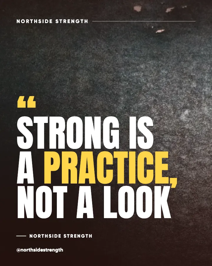
Put it into practice
Turn this into posts designed for your feed
Paste your website or say what you do. Creobee plans, writes and designs your posts about it as one feed in your logo and colors, captions included, and on Autopilot it posts them for you.
How the Instagram feed design works