Minimalist Social Media Design: Say Less, Get Read
Minimalist social media design, explained: why two-to-five-word posts survive the scroll, how to write a three-word headline, and how whitespace does the work.
Minimalist social media design means one idea per post, expressed in two to eight words, with enough whitespace that the words are the only thing to look at. It works because a feed post gets a glance, not a read, and a short line fits inside that glance while a paragraph cannot. Say less, and more of it lands.
Why minimalist social media design survives the scroll
The brain is astonishingly fast at recognizing pictures. MIT researchers found people could identify the gist of an image seen for as little as 13 milliseconds, and the MIT News write-up of that study is worth reading. Text is different. Reading is serial: one word, then the next. A five-word headline can be taken in almost as a shape. A twenty-word headline has to be read, and in a feed, reading is a decision the viewer has to make in your favor.
There is a second constraint. Miller's Law, as summarized by Laws of UX, describes the limits of working memory, commonly stated as around seven items. A post that asks the viewer to hold a headline, a subtitle, three bullet points, a date and a price is asking for more memory than a glance can spare. A post with three words asks for almost none.
Minimalism is not a style choice for me. It is a concession to how people actually look at a phone.
How many words should a social post headline have?
Two to eight, and I split that range into two modes. Ultra-minimal is two to five words, usually a noun phrase or a verb phrase, where one emphasized word carries the meaning: "Batch. Then breathe." or "Receipts before revenue." Short and punchy is five to eight words, a full claim with a subject and verb: "Three posts a week beats thirty in a weekend."
When I built Creobee's headline generator, those became the only two options, labeled ultra-minimal and short and punchy, because every time I allowed longer headlines the posts got worse. The constraint produced better lines than freedom did. Whatever tool you write in, adopt the same ceiling.
One idea per post
Minimalism in words only works if there is minimalism in ideas. A three-word headline that tries to say two things fails just as surely as a paragraph does. Before writing, name the one idea in a full sentence. Then cut that sentence until only the idea's skeleton is left.
Here is the reduction in practice, using one of my own lines:
- The full thought: "Most solopreneurs post inconsistently because they try to create each post from scratch on the day, and batching a month of posts in one sitting fixes that."
- The one idea: "Batching fixes inconsistency."
- The punchy version, five to eight words: "Batch on Monday. Post all month."
- The ultra-minimal version, two to five words: "Batch. Then breathe."
- The emphasized word: "Batch," set in the brand color.
Each step removes information, and each step makes the post more readable in a glance. The caption gets the full thought back. The image gets the skeleton. Splitting the work between the two is the whole method, and it is why I never worry that a minimal image says too little: the caption is right there for anyone who stops.
Does minimalism work for every kind of business?
For the feed post, yes, because the feed is the same for everyone. Where it does not fit is inside content that the reader has already committed to: a carousel's inner slides, a Story sequence, a blog post. There, more words are welcome because the attention has already been won. The mistake is to treat the feed post like a carousel slide and pack it. The carousel design guide covers where the extra words belong.
If your line refuses to shrink, the fix is usually a sharper claim rather than a longer one. The three honest hook formulas are a reliable way to find the sharper claim, and most of them collapse to under eight words without losing their edge.
Whitespace is a design element, not leftover space
Minimal words need room. A three-word headline crammed into the top third of a canvas with a photo, a subtitle and a large logo below it is not minimal; it is a small headline in a crowded post. Whitespace, meaning the empty area around the words, is what tells the eye that the words matter.
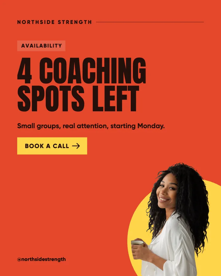
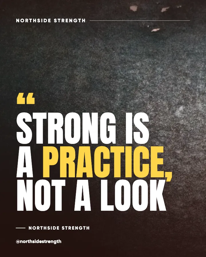
My working rule on a 1080 by 1350 canvas is that the headline block occupies less than half the canvas height, and nothing else sits within a wide margin of it except a small logo in a bottom corner. The background is a flat color or a photo darkened to the point of being atmosphere. The typography rules for social posts give the size and weight specifics, and the visual hierarchy guide explains why space is the cheapest way to create a focal point.
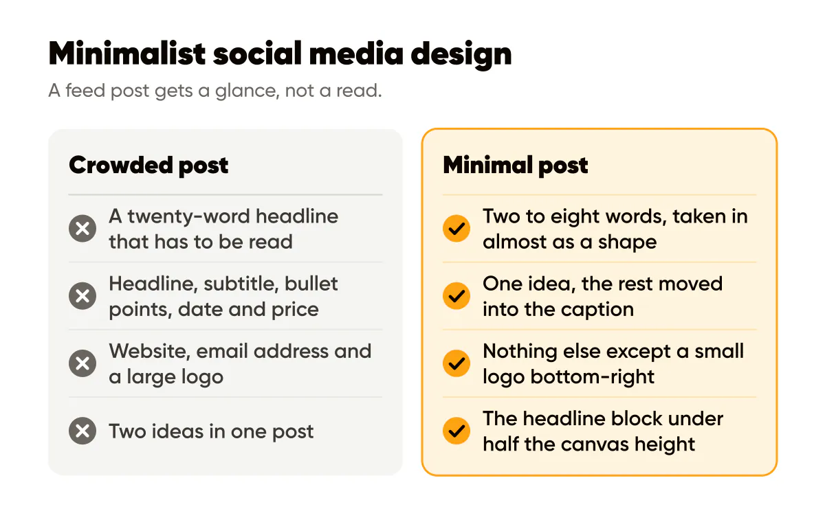
A test I run: cover the headline with your thumb. If the rest of the post still looks like a complete design, there is too much on it. A minimal post with the headline covered should look nearly empty.
Is a minimal post too plain to stand out?
In a feed full of crowded posts, plain is what stands out. The Nielsen Norman Group's research on how users read on the web found that people scan rather than read, and scanning favors whatever is easiest to parse. A calm post with three big words is easier to parse than anything around it. That is not a hunch about aesthetics; it is a consequence of how attention is allocated when there is too much of everything.
The risk is not plainness. It is genericness. Three generic words on a plain background is a fortune cookie. Three specific words with a position in them is a post. The quote post guide has the test I use to tell the difference, and an Instagram quote maker that writes original lines in your voice and sets them in your colors gives you a specific line to start from.
A worked example
A hypothetical wedding photographer wants to post about booking early. Before: a photo of a couple, the headline "Now booking 2027 weddings, limited dates available, inquire today," a subtitle with the website, an email address, and a large logo. Everything is true and nothing is read.
After: the same photo darkened to a warm near-black, the headline "2027 is filling." in a heavy sans with "filling" in the photographer's blush accent, nothing else on the canvas except a small logo bottom-right. The caption carries the dates, the link and the invitation to inquire. The feed post now does the one job a feed post can do, which is to get read.
Do this this week
Take your next five headlines and write each one three times: the full sentence, the punchy version under eight words, and the ultra-minimal version under five. Post the shortest version that still contains a specific claim. Move everything you cut into the caption. Then compare saves and profile visits against your previous five posts, not likes.
When minimalism starts working, the temptation is to add things back. Resist it, and instead lock the empty space into your template so the next batch starts minimal by default; the brand templates that convert browsers into buyers guide shows how to make the constraint permanent.
Put it into practice
Turn this into posts designed for your feed
Paste your website or say what you do. Creobee plans, writes and designs your posts about it as one feed in your logo and colors, captions included, and on Autopilot it posts them for you.
How the Instagram feed design works