Dark Background Social Media Posts: When and How
Dark background social media posts stop the scroll when used well: when near-black beats white, contrast rules for light text, and a 70/30 rhythm for your grid.
A near-black background beats white when a post needs to stop the scroll: offers, announcements, short quotes. It stands out because most of the feed is light, but it hides detail and tires the eye over long text. Use dark for roughly a third of your grid, keep text contrast above 4.5:1, and avoid pure black and pure white.
Why dark backgrounds on social stand out
Open Instagram and scroll for ten seconds. On my feed, the large majority of what passes by is bright: daylight photos, white text cards, pastel templates. A dark card interrupts that stream the way a pause interrupts speech. The eye lands on it because it is different from its neighbors, not because it is better designed.
That is the whole advantage, and it is a real one. But it comes with two costs. First, dark backgrounds hide detail. Fine lines, thin type, small logos, and any photo with shadows all lose definition against near-black. Second, dark posts are heavier to read at length. Two lines of light text on dark is fine. Six lines of body copy is a strain, especially at grid size.
So I treat dark as a tool for short, high-stakes messages, and light as the default for everything else. That split keeps the dark posts effective, because if every post is dark, none of them interrupts anything.
When should a post be dark instead of light?
My rule is that a post earns a dark background when it carries one of three message types. An offer, because the post needs to feel like a moment rather than a Tuesday. A quote or short claim of eight words or fewer, because the words are the entire visual and deserve maximum contrast. An announcement, like a launch date or a closing notice, because the reader should feel a change of register.
Educational posts, checklists, and anything with a supporting line of text stay light. They have more words, and words read more comfortably as dark type on a light ground. The guide to offer posts that convert goes deeper on why the offer template in particular benefits from the dark treatment.
Contrast rules for light text on dark
Light text on dark is not automatically high contrast. A mid-gray headline on charcoal can fail the same way pale yellow on white fails. The WCAG 2.2 contrast minimum asks for a 4.5:1 ratio for normal text and 3:1 for large text, and those thresholds apply in both directions. The formula does not care which color is the background.
In practice, dark posts pass more easily than light ones because a near-white on a near-black clears the ratio by a wide margin. The failures come from the second color: the accent, the supporting line, the logo. A brand blue that looks fine on white may sink into a dark ground and read as murky. Run the actual pair through the WebAIM contrast checker rather than trusting your eye on a bright monitor, because the phone in a dim room is where the post will be read.
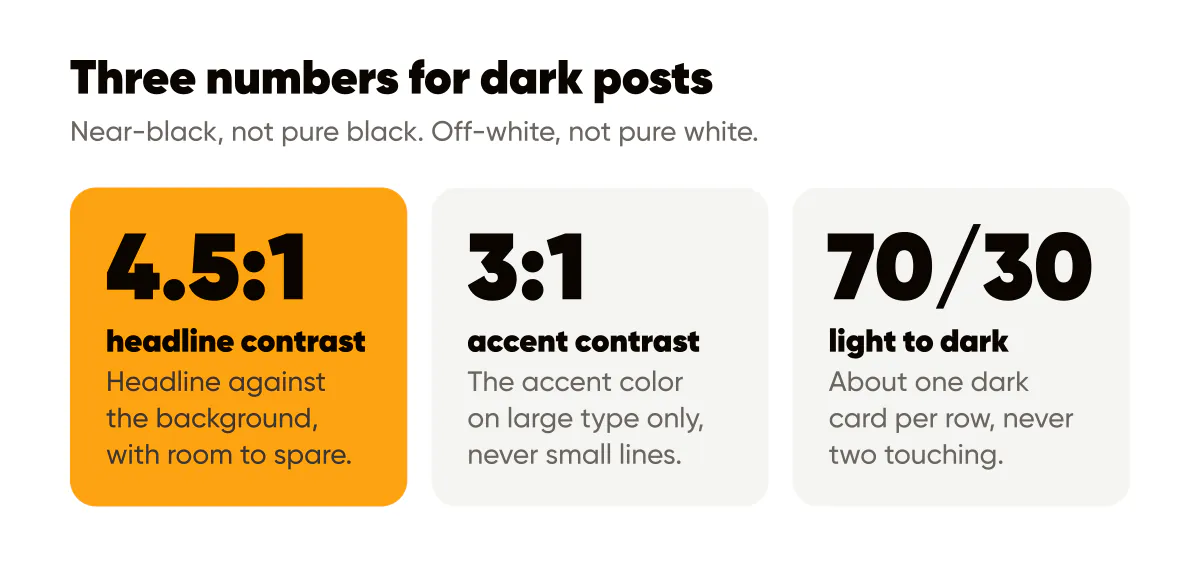
Three things I check on every dark template:
- The headline color against the background clears 4.5:1 with room to spare, since compression and phone brightness both eat margin.
- The accent color, if any, clears at least 3:1 and is used only on large type, never on small supporting lines.
- The logo has a light version, because a dark logo on a dark card is the most common dark-post mistake I see.
Should I use pure black and pure white?
No, and this is the one opinion in this post I hold firmly. Pure black (hex 000000) under pure white (hex FFFFFF) produces the highest possible ratio and also the harshest read. On an OLED phone, pure black pixels switch off entirely, which to my eye makes white text appear to float and shimmer at the edges. The effect is subtle, but it makes small type feel sharper than it is, and it makes the post look like a default rather than a brand.
Use a near-black instead: something like a very dark charcoal or a deeply shaded version of your brand color. Pair it with an off-white, a warm or cool tint a few steps down from pure white. You lose almost nothing in measured contrast and gain a surface that looks considered. The brand color palette guide explains how to derive that near-black from your existing palette so it belongs to your brand rather than to the software default.
WebAIM's article on contrast and color accessibility also covers why contrast is about luminance rather than hue, which is the reason two saturated colors of similar brightness fail even when they look very different.
The amber-on-near-black example
Creobee's brand color is amber, and the dark posts I make for our own account are the clearest example I can give. The ground is a near-black with a slight warm cast, so the amber reads as belonging to it rather than sitting on top. The headline is off-white in a heavy weight, two or three lines, left aligned. One word in the headline is amber, the word that carries the promise. The logo sits in the bottom right in its light version, small.
Amber on that near-black clears 3:1 comfortably, which is why it is allowed on the large headline word and not on the supporting line. The off-white handles everything small. The whole post has three colors, and the amber appears in exactly one place, so it works like a highlighter rather than a paint bucket.
When I have tested variations on my own account, the version with two amber words consistently looked louder and read worse than the version with one. The eye did not know where to go first. Restraint is the technique, and the readability rules for text over images apply doubly here because dark grounds forgive nothing.
A 70/30 light-to-dark rhythm
A grid that is all dark looks like a mood board for a nightclub. A grid that is all light looks like every other small business. Neither gives the reader a rhythm. My practice is roughly 70 percent light posts and 30 percent dark, which on a three-column grid means about one dark card per row, never two dark cards touching.
That ratio is my habit, not a rule from any study, and it shifts with the brand. A luxury service can run darker. A children's tutor should probably run lighter. The point is that dark posts stay rare enough to keep their interrupt value, and predictable enough that they become part of the brand pattern. If you batch your posts, this is easy to plan: make the month in the light template, then make the offer, quote, and announcement posts in the dark one. The Instagram feed design patterns in Creobee work on the same principle: the looks follow one pattern across the grid, so the rhythm holds as you keep posting. The guide to gradients and abstract backgrounds covers what to do when a flat near-black feels too plain and you want texture without losing contrast.
Do this this week
Pick the next offer or announcement you plan to post and build it dark. Use a near-black from your own palette, an off-white headline, one accent word in your brand color, and the light version of your logo. Run the headline and accent pairs through a contrast checker before you export. Then place it in your grid preview and look at the row: if the neighbors are light, you have your first interrupt.
Next, check how many of your last fifteen posts were dark. If the answer is zero, you have been leaving a tool in the drawer. If it is more than five, your dark posts have stopped standing out. Either way, the grid planning guide will help you slot the rhythm into a month of posts without overthinking it.


Put it into practice
Turn this into posts designed for your feed
Paste your website or say what you do. Creobee plans, writes and designs your posts about it as one feed in your logo and colors, captions included, and on Autopilot it posts them for you.
How the Instagram feed design works