Instagram Highlights for Business: What to Include
Instagram Highlights for business work as your profile's navigation: five Highlights in buyer order, short names, covers in one style and a quarterly refresh.
Instagram Highlights are the second thing a profile visitor sees after your bio, so treat them as a landing page's navigation bar: five Highlights ordered by the buyer's journey (Start here, Services, Results, About, FAQ), each with a branded cover in your palette and a name short enough to read in full.
Highlights are navigation, not an archive
Most accounts treat Highlights as a place where old Stories go to be remembered: "Summer 23," "Random," "Behind the scenes" with 140 clips. That is an archive, and nobody browses an archive on a stranger's profile.
A new visitor lands on your profile with a question: is this for me, and what do they do? They read the bio in two seconds, glance at the row of circles, and either tap one or scroll the grid. The circles are your one chance to answer their question in the order they would ask it. That is a navigation bar. It should be short, labeled clearly, and arranged so that the first thing a stranger needs is on the left.
Buffer's Instagram for Business Q&A and Hootsuite's Highlight covers guide cover the mechanics: how to create a Highlight, add to it, reorder it, and change its cover. What neither of them decides for you is what the five circles should be, so that is where I will spend the words.
How many Highlights should a business have?
Four to six. On most phones the profile shows four or five covers before the row scrolls sideways, and people rarely scroll it. Every Highlight past the fifth is effectively invisible, so if you have twelve, you have five plus seven that only you look at. Merge or delete until the first row is the whole story.
The five-Highlight buyer journey
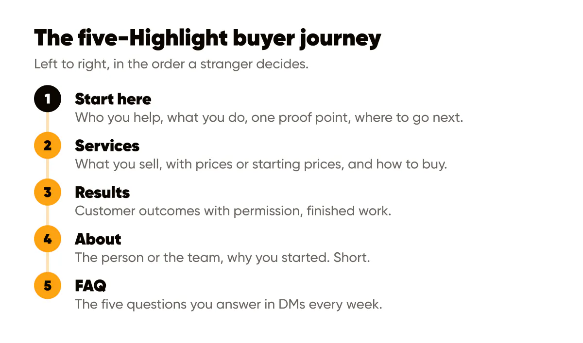
Here is the set I recommend for almost any one-person business, in this order from left to right.
- Start here. A 5 to 8 slide introduction: who you help, what you do, one proof point, where to go next. This is your landing page hero.
- Services (or Shop, or Menu). What you sell, with prices or starting prices where you post them, and how to buy.
- Results (or Reviews, or Before and After). Customer outcomes with permission, screenshots of kind messages, finished work.
- About. The person or the team, the studio, why you started. Short. People buy from people, but only after they know what you sell.
- FAQ. The five questions you answer in DMs every week, each as one slide with the answer on the image.
That order follows how a stranger decides: what is this, what can I get, does it work, who are you, and what is stopping me. The names on the circles are the second half of the job.
What should you name Highlights?
One word where possible, two at most, and the word a customer would use, not your internal term. "Services" beats "Offerings." "Results" beats "Client love." Instagram truncates long names under the circle, so a name like "Testimonials" can lose its ending on a smaller phone. Keep each name to about ten characters and check it on an actual device.
Avoid emoji-only names. They look playful and communicate nothing to someone who does not know your business, and they are not searchable or readable by screen readers.
Branded covers in one style
The covers are what make the row look like part of your brand rather than a pile of screenshots. The rule is one style, applied to all five, in the same palette you use on your posts.
You can upload a cover image from your camera roll when editing a Highlight, without posting it as a Story first, which means the covers can be designed assets. Make them all at the same size (a square canvas works, because Instagram crops the cover to a circle from the center), with the same background color or the same two-color scheme, and the same visual device: a simple line icon, a single letter, or just the word itself set in your brand typeface. Pick one device and use it for every cover.
I use the last option: no icons, just the Highlight's name set small in my typeface on my brand-color background, with the name also in the label below. It is redundant on purpose. The circle reads as my brand at a glance, and the word underneath does the labeling. When I change the palette, I remake five squares and I am done. Because the covers use the same color and type as my feed posts, the profile reads as one system, which is the entire argument in brand consistency on social media.
Two cautions. Do not use a photo as a cover unless every cover is a photo in the same treatment; one photo among four flat icons breaks the row. And keep the design inside the center of the square, because the circular crop removes the corners and Instagram shows the cover quite small.
Keeping Highlights current
A Highlight that shows a price from two years ago or a service you no longer offer is worse than no Highlight, because it makes the visitor doubt everything else. I refresh mine quarterly, on the same day I review my link in bio and my bio text, which I described in Instagram bio optimization.
The refresh checklist takes twenty minutes.
- Open each Highlight and delete anything outdated: old prices, expired offers, past events.
- Add the two or three best Stories from the quarter to Results and FAQ.
- Rebuild Start here from scratch if your positioning changed, even slightly.
- Check the order still matches how customers are actually finding and buying from you.
- View your profile logged out on a phone and read the row as a stranger.
Highlights and the link in bio should agree. If your link in bio currently points to a launch, the first Highlight should be about the launch too, and it should point people to the link. The strategy for keeping the link aligned with what you are posting is in link in bio strategy. Highlights and the link are the two clickable things on your profile; make them tell the same story.
Should Highlights match Reel covers and posts?
Yes, loosely. They do not need to be the same layout, but the palette and the typeface should be the same as the ones in your feed posts and your Reel covers. A profile where the grid is amber and black, the Reel covers are amber and black, and the Highlights are pastel with cartoon icons looks like three different businesses. Getting the posts themselves to share one look is Instagram feed design, and the Highlights simply borrow that system. The system for making the covers match is the same one I use for Reel covers that match the feed.
Rebuild your row this week
Delete or merge until you have five Highlights in the order above. Make five square covers in one style, brand color and typeface only, and upload them. Rename each one to a single customer-facing word. Then record a fresh Start here in five to eight slides, ending with where to go next, and make sure it sits on the far left; Instagram shows the most recently updated Highlight first, so update it last. Finally, look at your profile logged out, bio to circles to grid, and ask whether a stranger could tell in five seconds what you sell and how to get it. If not, the fix is usually in the first circle.
Put it into practice
Turn this into posts designed for your feed
Paste your website or say what you do. Creobee plans, writes and designs your posts about it as one feed in your logo and colors, captions included, and on Autopilot it posts them for you.
How the AI Instagram post generator works