Visual Hierarchy in Graphic Design: The 5 Levers
Visual hierarchy in graphic design is size, weight, contrast, position and whitespace. How to give a social post one focal point and test it in 3 seconds.
Visual hierarchy is the order in which the eye visits the parts of a design. On a social graphic, you control it with five levers: size, weight, contrast, position and whitespace. Use them to create exactly one focal point, the headline, with everything else visibly subordinate. If two elements compete, the viewer resolves the tie by scrolling.
Visual hierarchy in social graphics: one focal point or none
A feed post is looked at for about as long as it takes to decide whether to stop. In that window, the viewer's eye is going to land somewhere. Hierarchy is the discipline of deciding where, instead of leaving it to chance.
The Interaction Design Foundation's overview of visual hierarchy lists the classic principles, and they all reduce to one instruction for a small canvas: make one thing unmistakably dominant. On my posts that is the headline, or one emphasized word inside it. The supporting line is second. The logo is third and should feel like a signature, not a shout.
The most common failure I see is a tie. A headline and a supporting line at similar sizes. A logo as large as the text. A photo so vivid it outshines the words placed on it. Ties are not read as rich; they are read as cluttered, and the eye leaves.
Where does the eye go first on a post?
To the largest, highest-contrast element, and then roughly in reading order from there. The Nielsen Norman Group's research on the F-shaped reading pattern shows that people scanning text-heavy screens sweep across the top, then down the left side, sampling less as they go. A social post is not a web page, but the habit carries: the upper-left and upper-center of a portrait canvas get attention first, and the bottom-right gets it last.
That is why headlines sit in the upper or central band and logos sit in a bottom corner. You are placing elements along the path the eye already wants to take.
The five levers
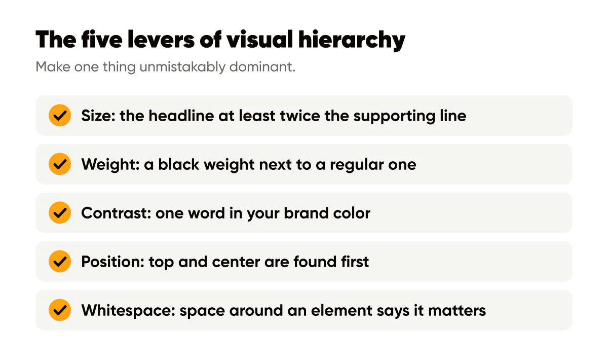
Size is the loudest lever. Make the headline at least twice the size of the supporting line, and the eye sorts them without effort. Weight is the second: a black weight next to a regular weight reads as two levels even at similar sizes. Contrast is the third, and it includes color; a single word in your brand color on an otherwise neutral canvas is a focal point by itself.
Position is the fourth. Elements near the top and center are found first; elements in corners are found last. Whitespace is the fifth and the most underused. Space around an element says it matters. Crowding says nothing matters. Most cluttered posts can be fixed by removing one element and letting the rest breathe.
Two principles from psychology help explain why these work:
- The Gestalt principles, such as proximity and similarity, describe how the eye groups elements; keep related items close and unrelated items apart, and grouping does the sorting for you.
- The Von Restorff effect describes how the one item that differs from its surroundings is the one that gets remembered; that is the entire logic of coloring a single word.
- Whitespace is not empty; it is the frame that makes the focal point legible as a focal point.
How do you test a design's hierarchy quickly?
Two tests, both under ten seconds. The squint test: squint at the post until the details blur. Whatever remains visible is your hierarchy. If the headline survives and the rest fades, you are done. If the logo or a photo detail survives instead, fix that first.
The three-second test: show the post to someone for three seconds, take it away, and ask what it said. If they can repeat the headline or the emphasized word, the hierarchy works. If they describe the picture or say "something about business," the words lost. I run both tests on every batch I generate, and they catch problems the design view hides.
Applying it to a 4:5 post
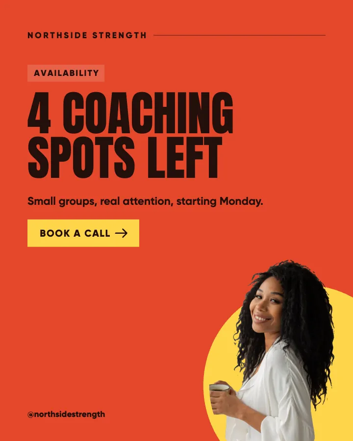
On a 1080 by 1350 canvas, the structure I use has three levels and nothing else. The headline, two to eight words, in the heaviest weight, positioned in the upper or central band. One optional supporting line at roughly half the size and a lighter weight, directly below the headline so proximity groups them. The logo, small and single-color, in a bottom corner with clear space around it.
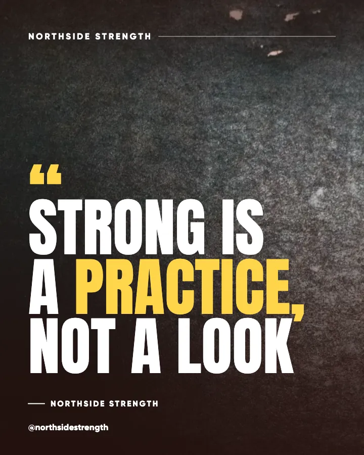
Emphasis goes to one word, set in the brand color or a heavier weight, never both a color and a size change at once, because doubling the contrast makes the word shout instead of lead. The background is either a flat color or a darkened photo, so it sits behind the hierarchy rather than inside it. The typography rules for social posts give the size and weight specifics, and the readability rules for text over images cover what to do when the background is a photo.
This three-level structure is also why minimal text works so well. Fewer words means fewer elements competing, which means a stronger hierarchy with less effort, a point the minimalist design guide makes from the writing side. If you would rather not build those layouts yourself, Instagram templates that come filled in give you the structure with the words already written.
Does hierarchy change for carousels?
The first slide follows the rules above exactly, because it is the one that has to stop the scroll. Inner slides can carry more text, since the reader has already committed by swiping, but each slide still needs one dominant element so the eye knows where to start. The carousel design guide covers how to keep a consistent hierarchy across ten slides so the set reads as one story rather than ten unrelated cards.
A worked example
A hypothetical online course creator wants a post announcing a new lesson. Before: the course title, a subtitle, a date, a price, the creator's photo, and the logo, all at similar sizes across a bright gradient. Everything is legible; nothing is dominant. Squint and you see a rectangle of stuff.
After: the headline "New lesson: pricing without guilt" in a heavy sans, with "pricing" in the brand color. One supporting line with the date, half the size. Photo removed. Price moved to the caption. Logo small in the bottom-right. Squint and you see one phrase and one colored word. The three-second test returns "pricing" every time. That is the entire job.
Do this this week
Take your three most recent posts and squint at each. Write down what survives. If it is not the headline, remove or shrink the element that won until it is. Then pick one word per post to emphasize and remove any second emphasis. Re-export and run the three-second test on someone who has not seen the post.
To make this structural rather than a per-post chore, bake the three levels into your templates; the one-page design system for solopreneurs is where those decisions get written down once so you stop making them every week.
Put it into practice
Turn this into posts designed for your feed
Paste your website or say what you do. Creobee plans, writes and designs your posts about it as one feed in your logo and colors, captions included, and on Autopilot it posts them for you.
How the Instagram feed design works