UPPERCASE or lowercase? Case Rules for Social Media Headlines
Sentence case vs all caps on social posts: caps for two to four word statements, sentence case for anything longer, lowercase only as a deliberate voice.
Use all caps for statements of two to four words, with a little extra letterspacing. Use sentence case for anything longer, because word shapes carry reading speed and caps flatten them. Use lowercase only as a deliberate, consistent brand voice. Whichever you choose, apply it across the whole grid, since mixed case rules look like mixed authorship.
Case rules for social media headlines
There are three case options for a headline: all caps, sentence case (capital first letter, lowercase for the rest, like a sentence), and all lowercase. Title Case, where every major word is capitalized, is a fourth, and I avoid it on graphics because it reads as a document heading rather than a spoken line. Each option changes two things: how fast the line can be read, and what the brand sounds like.
Reading speed favors sentence case. Voice is where the other two earn their place. All caps sounds like a declaration. Lowercase sounds like a murmur. Neither is wrong, but each is a choice about tone that should be made once and kept.
Why is all caps harder to read?
Because we recognize words partly by their outline. Lowercase letters have ascenders and descenders, so a word like "budget" has a distinctive silhouette. In caps, every word becomes a rectangle of the same height, and the reader has to process letter by letter. Practical Typography's page on all caps puts it plainly: caps are fine for a few words and tiring for more, and they need extra letterspacing to read well because capital letters are designed to sit next to lowercase, not each other.
That last part is the technical fix most people skip. Caps set at the default spacing look cramped. Adding a little tracking, which the letterspacing page covers, opens the letters up and makes the word shapes easier to separate. If your tool lets you adjust tracking, add some whenever you switch to caps. If it does not, keep the caps headline even shorter.
When all caps works
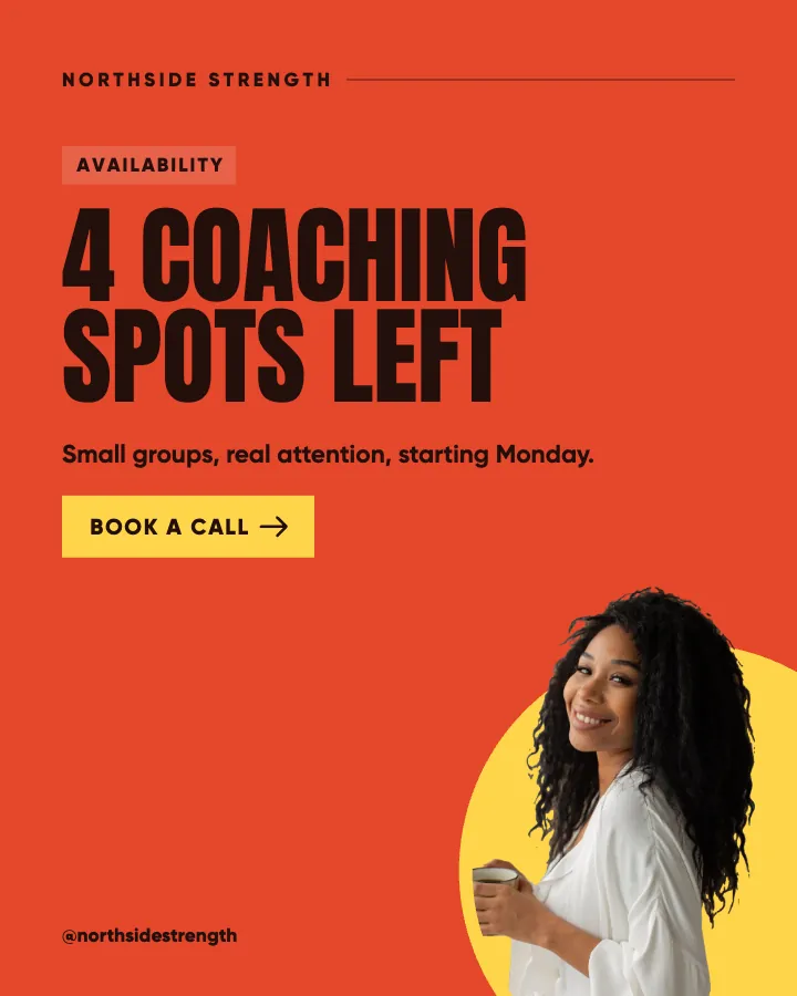
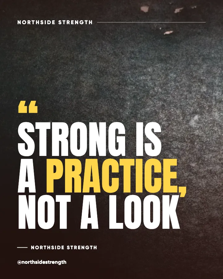
For statements of two to four words. "NEW CLASS TIMES". "OPEN SATURDAY". "STOP GUESSING". At that length the reader is not really reading; they are recognizing a shape, and a block of caps is a strong shape. Caps also give a short line more visual weight at the same font size, which is useful when the headline needs to hold the whole canvas alone.
Beyond four words the cost climbs quickly. A seven-word caps headline in three lines is a wall, and at grid size it becomes texture rather than text. My practice is caps for very short announcements and offers, sentence case for everything else, and I never mix the two on one image.
One more note: caps reduce the visible difference between weights. If you rely on a bold word for emphasis, caps make that emphasis quieter, and you may need color instead. The word emphasis guide covers that interaction.
Sentence case as the default
Sentence case is how the reader's brain expects language to arrive, which is why it reads fastest and why it is my default for any headline of five words or more. It also has a tonal advantage: it sounds like a person talking. "Your first client is already following you" in sentence case sounds like advice from someone across the table. The same line in caps sounds like a billboard.
For a solopreneur, the person-across-the-table register is usually the point. The typography guide for social posts covers the size and weight rules that go with it, and they are simple in sentence case: a heavy weight, a large size, two to four lines broken at natural pauses. Nielsen Norman Group's piece on legibility, readability and comprehension is a useful reminder that legible letters and readable lines are different problems, and case affects the second one most.
Sentence case also travels well. It looks correct on a light background and a dark one, in a quote card and an offer post, on Instagram and LinkedIn. Caps and lowercase both carry a stronger flavor, which is exactly why they need more discipline.
Is lowercase unprofessional?
Not by itself. All-lowercase headlines have become a recognizable brand voice, especially for wellness, creative and lifestyle brands that want to feel soft, informal and unhurried. Done consistently, lowercase reads as a deliberate choice. Done once, on a grid full of sentence case posts, it reads as a typo.
The trade-offs are real. Lowercase removes the capital that marks the start of a sentence, so multi-sentence headlines lose a cue and should be avoided. Proper nouns and brand names lose their capitals too, which some businesses cannot accept. And lowercase paired with a very light font weight can look faint at grid size; if you go lowercase, go heavy.
Where lowercase fits, it fits well. A hypothetical ceramics studio posting "slow mornings, handmade cups" in a heavy lowercase reads exactly like the brand wants to sound. The same studio posting "terms and conditions apply" in lowercase would read as sloppy. Match the case to the sentence's job, and keep the studio's overall rule consistent.
Consistency across the grid
Whichever rule you choose, the grid is where it is judged. Nine tiles in a row with the same case rule look like a brand. Nine tiles with caps here, lowercase there and sentence case in between look like three interns. Case is one of the cheapest consistency signals you have, because it costs nothing and shows on every post.
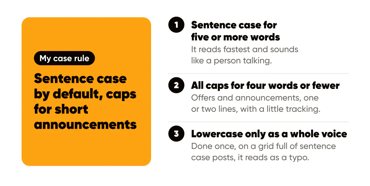
My own rule, which I apply in every batch, is:
- Sentence case for every headline of five or more words, which is most of them.
- All caps only for offer and announcement posts of four words or fewer, kept to one or two lines.
- Lowercase never, because it does not match how Creobee sounds, though I respect brands that use it well.
Creobee's designed styles set the case for you, one rule per style, so the posts its AI social media post generator makes together share it without you fixing each headline by hand. It works that way because consistency is easier to enforce as a default than as a habit.
The brand consistency guide covers the other consistency levers, palette, type, logo position and layout, and case belongs on the same short list. The minimalist design guide is worth reading alongside this one because its whole argument, fewer words, is what makes caps usable at all.
Do this this week
Write down your case rule in one sentence. Something like: sentence case by default, caps for announcements under five words, never lowercase. Then look at your last twelve posts against it and note how many break it. Rebuild the worst two, and set the rule into your template or your generation settings so the next batch starts compliant.
If you are tempted by lowercase as a voice, test it on a full week of posts, not one. A single lowercase headline tells you nothing; seven in a row tells you whether it sounds like you. And if the answer is caps, pair the decision with the text alignment rules, because short caps statements are the one case where centering nearly always wins.
Put it into practice
Turn this into posts designed for your feed
Paste your website or say what you do. Creobee plans, writes and designs your posts about it as one feed in your logo and colors, captions included, and on Autopilot it posts them for you.
How the Instagram feed design works