Left, Center or Right? Text Alignment Rules for Social Posts
Instagram text alignment for posts: center one to three short lines and quotes, left-align lists and longer text, skip right, and put the logo on the same edge.
Center text when the post has one to three short lines or a quote. Left-align anything longer, any list, and any post with a supporting line, because a ragged right edge gives the eye a consistent starting point. Right alignment is for rare deliberate effects. Whatever you pick, align the logo and the text to the same grid.
Text alignment rules for social posts
Alignment decides where the eye goes to start each line. Left alignment gives every line the same starting point, so the eye returns to a known position. Centered alignment moves the starting point with every line, which is fine for two lines and tiring for six. Right alignment moves the end point to a fixed position instead, which feels unusual in left-to-right languages and is best reserved for deliberate effect.
That is the whole theory. The rest is judgment about line counts, content types and how the text relates to the logo. My defaults, in one line each: center for one to three short lines and for quotes, left for anything longer or anything with a supporting line or a list, right almost never. Then align the logo to the same edge the text uses.
When should text be centered on a post?
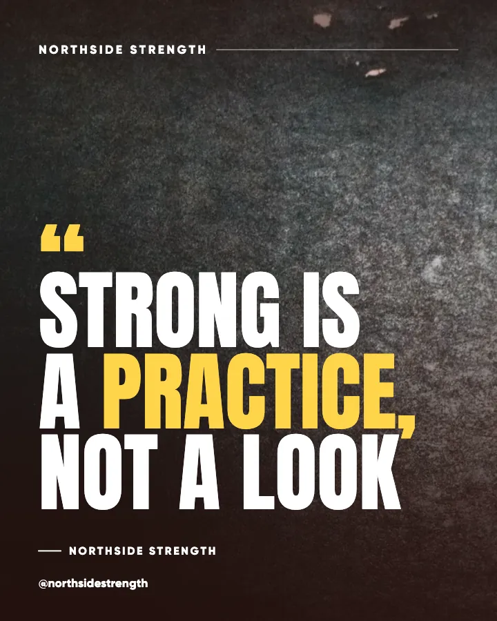
When the text is short enough that the eye takes it in as a shape rather than reading it line by line. A two-line headline, a three-word statement, a quote with an attribution: these are shapes. Centering gives them symmetry and a sense of occasion, which is why quote cards and announcements are usually centered.
Practical Typography's page on centered text makes the case that centering belongs to short passages and that longer blocks should be left aligned, because the moving left edge slows reading. On a social post that translates to a line limit. My ceiling for centered text is three lines, and each line should be short enough that the ragged edges are not dramatic. If the headline needs four lines, either cut words or switch to left alignment.
Quotes are the classic centered format, and the quote posts guide covers how to make them worth saving. The design rule is the same: center the quote, center the attribution beneath it at a smaller size, keep the whole thing inside the safe margins.
Why left-aligned text reads faster
Because reading is a sequence of jumps, and the jump back to the start of the next line is easiest when the start is always in the same place. Nielsen Norman Group's research on how users read on the web established that people scan rather than read, picking out words and skipping others. A consistent left edge supports scanning; the eye can drop straight down the edge and catch the first word of each line.
Left alignment also produces a ragged right edge, and that raggedness is useful. It gives each line a distinct shape, which helps the reader keep their place. Justified text, which forces both edges straight, is rare on social graphics and should stay rare, because it stretches word spacing unpredictably.
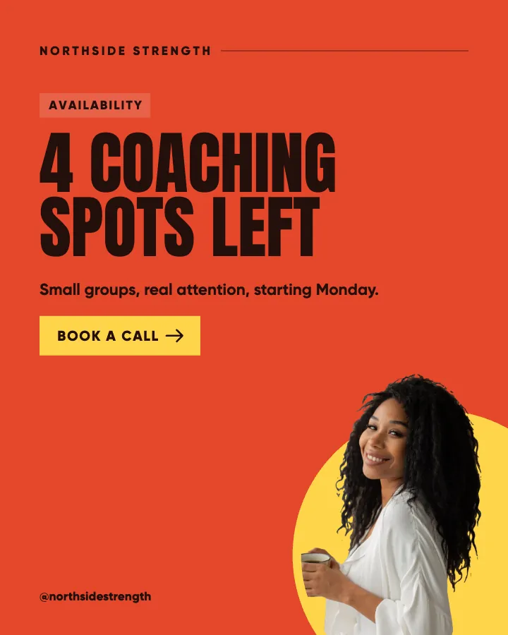
For any post with more than three lines, any list, any headline plus supporting line, I left-align. It also happens to be the alignment that reads best with an emphasized word, because the eye is already moving along a predictable line when it hits the heavier word. The readability rules for text over images reach the same conclusion from the contrast side.
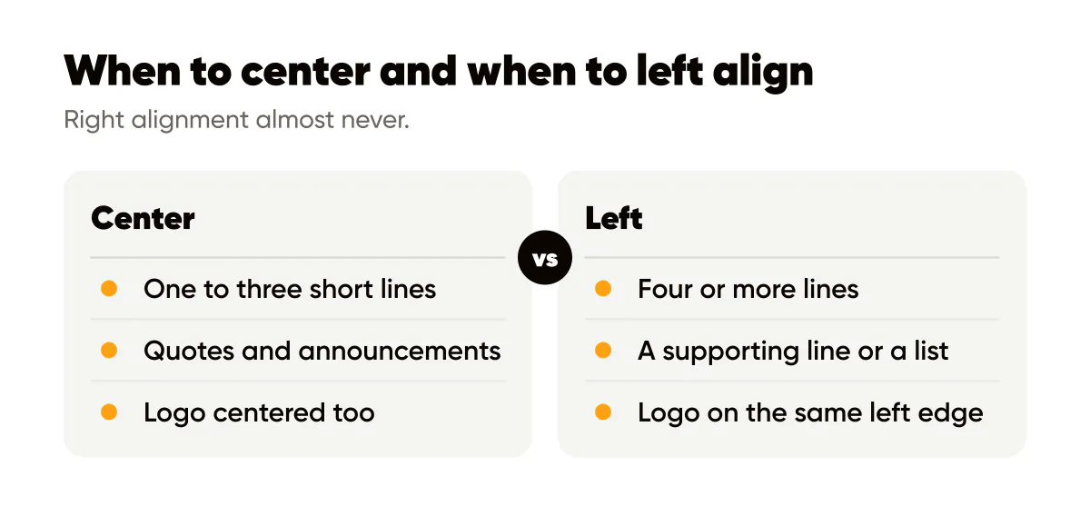
Three signs a post should be left aligned rather than centered:
- The headline runs to four or more lines at the size you need for grid readability.
- There is a supporting line, a list or a second block of text beneath the headline.
- The words include long items that would leave the centered ragged edges very uneven.
Is right-aligned text ever a good idea?
Rarely, and only on purpose. Right alignment can work when the text sits beside a subject on the left side of a photo, so the text hugs the right edge and the two elements face each other. It can work for a single short line placed against the right margin as a design gesture. It does not work for anything that needs to be read quickly, because the starting point of every line is different and the eye has to hunt for it.
In Creobee the designed Instagram feed styles set the alignment for you, and none of them aligns a headline right, on purpose. Every option in a tool is one more decision that slows a batch of thirty posts, and right alignment never earned its place on that list. If you need it for a specific composition, a manual editor is the right place to do it.
Aligning text and logo to the same grid
Alignment is not only about the text. The strongest posts put the text and the logo on the same invisible grid. If the headline is left aligned starting at 10 percent in from the left edge, the logo should sit on that same vertical line, either above the headline or in the bottom-left corner. If the headline is centered, the logo is centered too, or it goes to a corner where its offset does not fight the symmetry.
The failure I see most is a centered headline with a logo in the bottom-right corner and a handle in the bottom-left. Three different alignments, three different edges, and the post looks like it was assembled rather than designed. The logo placement guide covers which corners work for other reasons; here the rule is simply that whatever edge the text uses, the logo respects it.
Whitespace does a lot of the work of making alignment visible. Aligned elements with generous space between them look deliberate; aligned elements crammed together look accidental. The spacing rules in the whitespace guide pair naturally with this post.
A worked example
A hypothetical bookkeeper wants a post that says "Three receipts you are probably throwing away" with a supporting line "and what each one is worth at tax time." First attempt: both lines centered, the headline in three lines and the supporting line in two. Five centered lines of varying length produce a diamond shape that is hard to scan, and the supporting line looks like part of the headline.
Second attempt: left aligned. The headline in three lines with a consistent left edge, a clear gap, then the supporting line at a smaller size on the same edge. The logo sits in the bottom-left corner on the same vertical line. The post now reads top to bottom in one motion, the two text blocks are visibly different, and the logo looks like part of the composition. Same words, same colors, same fonts; only the alignment changed.
For the same bookkeeper's quote post, "Cash flow is a habit", one line, centered, with the attribution centered beneath it and the logo centered at the bottom. Different content, different rule, and both belong to the same brand because the margins and type are unchanged.
Do this this week
Open your last ten posts and note the alignment of each. Then apply the two-rule test: centered posts should have three lines or fewer, left-aligned posts should carry everything else. Rebuild any post that breaks the rule, and while you are in there, move the logo onto the same edge the text uses.
Then set the rule into your templates: one centered template for quotes and short statements, one left-aligned template for everything with more words. Two templates, two alignments, and the decision is made before the next batch. The visual hierarchy guide is the natural next step once the starting edge of each line is settled.
Put it into practice
Turn this into posts designed for your feed
Paste your website or say what you do. Creobee plans, writes and designs your posts about it as one feed in your logo and colors, captions included, and on Autopilot it posts them for you.
How the Instagram feed design works