Highlighting One Word: The Emphasis Technique That Makes Headlines Land
Highlight one word in a headline, by weight or color, and pick the word that carries the promise. Why it works, and how it meets caps and line breaks.
Emphasize exactly one word in a headline, by weight or by color, and choose the word that carries the promise. One highlighted word gives the eye a landing spot and tells the reader what the post is about before they read the rest. Two highlighted words cancel each other out, and a whole highlighted line is just a second font.
Why one emphasized word makes a headline land
A headline on a social post is read in about a second, and in that second the eye does not move left to right through the words. It jumps to whatever is visually different, then fills in the rest. If nothing is different, it jumps to the biggest word, which is often "The" or "Your". If one word is heavier or a different color, the eye goes there first, and that word becomes the meaning of the post before the sentence is read.
The Laws of UX summary of the Von Restorff effect describes the underlying mechanism: when one item in a set differs from the rest, it is more likely to be noticed and remembered. The important word in that description is "one". The effect depends on the odd one out being singular. Two highlighted words are a pattern, not an exception, and the reader has to work out which one you meant.
So the technique is narrow. One word. Emphasized by weight or by color, not both. Chosen because it carries the promise. Everything else in this post is detail on those three sentences.
Which word should you emphasize?
The word that would survive if the headline were cut to one word. Take "Book more clients without posting every day". The promise is "clients", not "book" and not "day". Emphasize "clients" and the eye reads: this post is about clients. Emphasize "every" and the post is suddenly about frequency, which is the problem rather than the outcome.
A quick way to find it: read the headline aloud and notice where your voice naturally stresses. Then check that the stressed word is a noun or a strong verb rather than a connector. "Without" and "more" feel emphatic when spoken but look empty when highlighted, because they mean nothing on their own. The viral hook formulas post is useful here: most of those formulas have one slot that holds the payoff, and that slot is your emphasis word.
Avoid emphasizing the first word unless it is the promise. The first word already gets attention by position, so highlighting it doubles up on a word the reader would have seen anyway and wastes the technique.
Weight or color: pick one
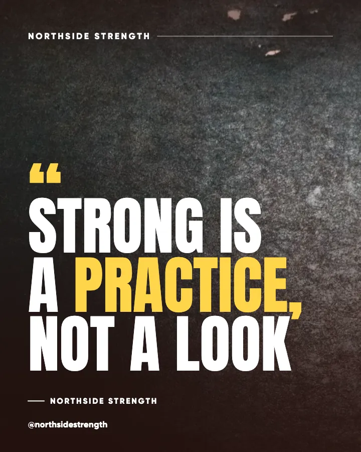
Weight emphasis means the highlighted word is set heavier, say black where the rest is bold, in the same color. It is quiet, it keeps the palette intact, and it works on any background. Color emphasis means the word switches to your accent color at the same weight. It is louder, it ties the headline to your brand color, and it fails whenever the accent does not have enough contrast against the background.
Doing both, heavier and colored, is the most common mistake I see. The word stops being an emphasis and becomes a second typographic voice, and the headline starts to look like a ransom note. Pick the one your brand can sustain. Brands with a strong, dark-friendly accent can use color. Brands whose accent is pale or whose backgrounds vary should use weight. Google Fonts Knowledge's piece on using type for hierarchy is a good grounding in how a weight step alone creates a clear level of importance.
In Creobee, an AI Instagram post generator that designs the whole post, the designed styles set the emphasis for you: each one highlights the word that carries the promise its own way, in the accent color, on a sticker or in italic. The model marks that word as it writes the headline, which means a headline has to have a clear promise word to begin with. That constraint makes headlines tighter, because a headline whose payoff is one word is usually a well-built headline.
How emphasis interacts with all caps and line breaks
All caps flattens word shapes, which makes weight emphasis less visible, since the difference between bold caps and black caps is smaller than between bold and black lowercase. If your headline is in caps, color emphasis tends to read better. If your headline is in sentence case, weight emphasis is usually enough. The case rules for headlines post covers when caps make sense at all, and Practical Typography's page on all caps explains why caps need extra letterspacing to stay legible in the first place.
Line breaks matter because the emphasized word should not be the only word on a line. A lone highlighted word on its own line becomes a heading rather than an emphasis, and the sentence reads as two separate statements. Break lines so the emphasized word sits inside a line with at least one other word, ideally at the start or the end of that line rather than the middle, where it competes with its neighbors on both sides.
Three checks before I export:
- The emphasized word is a noun or a strong verb that carries the promise, not a connector or a modifier.
- It is emphasized by weight or color, not both, and the color version clears contrast on that background.
- It shares a line with at least one other word and does not sit on the first line by accident.
Can you emphasize a word in a two-word headline?
Yes, and it works well, but the choice is stark. In "Stop guessing", emphasizing "guessing" makes the post about the problem; emphasizing "Stop" makes it a command. Both are legitimate, and they are different posts. In a two-word headline you are choosing the whole tone with one decision, so make it consciously. The minimalist design guide covers why two- and three-word headlines survive the scroll; emphasis is what gives them a direction.
Good and bad choices, side by side
Take five hypothetical headlines and the word I would and would not highlight.
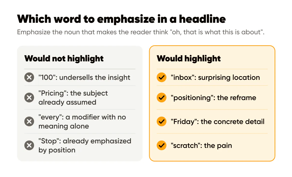
"Your first 100 customers are hiding in your inbox." Good: "inbox", the surprising location. Bad: "100", which looks like a number post and undersells the insight.
"Pricing is a positioning decision." Good: "positioning", the reframe. Bad: "Pricing", the subject the reader already assumed.
"We ship every Friday." Good: "Friday", the concrete detail. Bad: "every", a modifier with no meaning alone.
"Stop designing posts from scratch." Good: "scratch", the pain. Bad: "Stop", already emphasized by position.
"Consistency beats talent." Good: "Consistency", because it is the argument and the headline is short enough that leading with the emphasis still leaves the rest of the line readable. This is the exception to the first-word rule, and it works because the headline is three words.
The pattern: emphasize the noun that makes the reader think "oh, that is what this is about". The typography guide for social posts explains the weight and size floors that keep the emphasized word legible at grid size once you have picked it.
Do this this week
Take your next five headlines and, for each, write the one word you would keep if forced to cut the rest. Emphasize that word, by weight if your headline is sentence case, by color if it is caps and your accent has the contrast. Then look at all five in a grid view: the emphasized words should read as a list of promises. If one of them is "your" or "more", rewrite that headline. When the words are chosen, visual hierarchy in social graphics picks up on how the rest of the post supports them.
Put it into practice
Turn this into posts designed for your feed
Paste your website or say what you do. Creobee plans, writes and designs your posts about it as one feed in your logo and colors, captions included, and on Autopilot it posts them for you.
How the Instagram feed design works