White Space in Graphic Design for Social Posts
White space in graphic design, applied to social posts: margins as a share of the canvas, one focal point, room around the logo and headline line spacing.
Whitespace is the empty area around your headline, logo and canvas edges, and it is what makes a post look expensive instead of crowded. Keep margins near 8 to 10 percent of canvas width, give each post one focal point, and let the logo breathe. Crowded posts read as cheap because nothing gets room to be seen.
Why whitespace in social graphics reads as quality
Look at any brand you consider premium and count the elements on their posts. Usually there are three: a headline, a small mark, and a lot of nothing. Now look at a post that feels cheap. It has a headline, a subheadline, two logos, a phone number, a website, a badge, and a photo, and every one of them touches the edge of the canvas.
Whitespace, or negative space if you prefer the design-school term, is the nothing. The Interaction Design Foundation's overview of white space describes it as an active element that groups, separates and directs attention, not leftover room. Crowding reads as cheap because it signals that nobody decided what mattered. Space reads as expensive because it signals confidence: this one line is enough.
There is a practical reason too. Posts are read on a phone, in a feed, in about a second. Nielsen Norman Group's work on scrolling and attention describes how attention is uneven across a page and drops as people move through it; a social feed is that pattern compressed into a thumb flick. Whatever you want seen has to be isolated enough to be seen in that flick. Space is what isolates it.
How big should margins be on a 1080 by 1350 post?
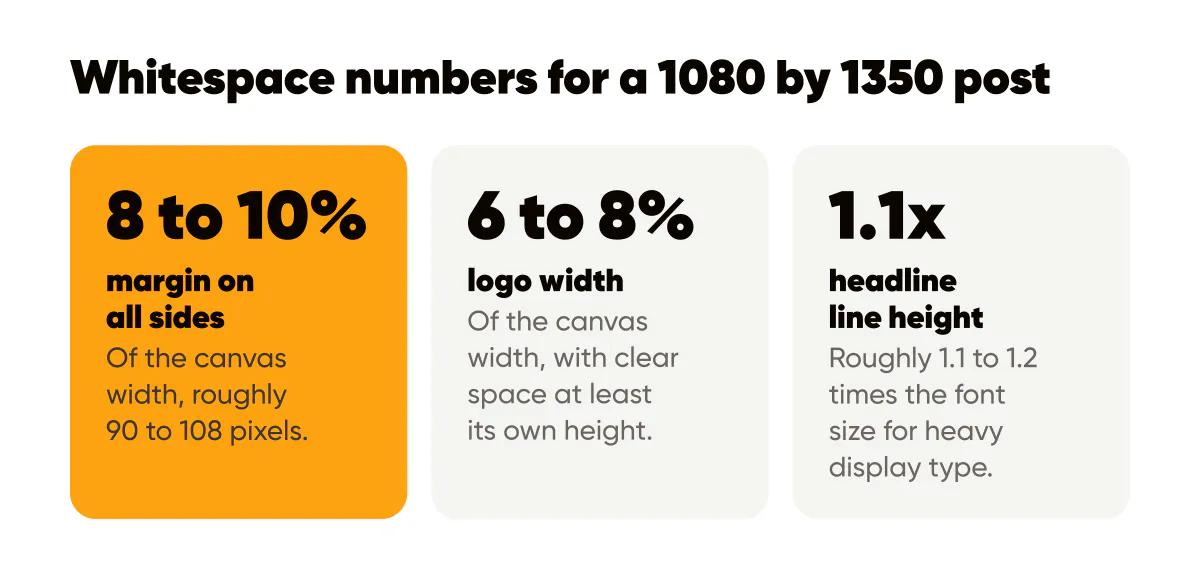
My rule is a margin of 8 to 10 percent of the canvas width on all sides, which on a 1080 by 1350 canvas is roughly 90 to 108 pixels. Nothing except a full-bleed background image crosses that line: not text, not the logo, not a decorative shape. Some templates run tighter and get away with it because the headline is short and heavy. But when in doubt, more margin is safer than less.
The reason percentages beat pixels is that the same template gets viewed at very different sizes: full width in the feed, a small tile in the grid, a tiny thumbnail in a share sheet. A margin that is a fraction of the canvas scales with all of them. A fixed thin margin that looks fine at full size disappears completely at grid size, and the text appears to touch the edge.
Margins also protect you from the platform. The profile grid crops a 4:5 post in some views, and Stories overlay interface elements at the top and bottom. Generous margins keep your words clear of both without a second version. It is a rule I built into the AI Instagram post generator I make: every post keeps its words clear of the strip the profile grid crops off each side.
One focal point per post
The single biggest whitespace mistake is not thin margins. It is putting two things of similar size on the same canvas and expecting the reader to look at both. They will look at neither. A post needs one focal point: usually the headline, sometimes a product photo with a short line under it. Everything else is visibly smaller and pushed to the periphery.
The test is simple. Squint at the post until the words blur. What remains as the darkest or largest shape is your focal point. If two shapes remain, you have two focal points and need to shrink one. The visual hierarchy guide covers this squint test and the other hierarchy tools in detail; whitespace is the tool that makes the rest of them work, because size and weight only register when there is empty space to compare them against.
This is also why I argue for fewer words. A three-word headline surrounded by space has more presence than a twelve-word headline that fills the frame. The minimalist design guide makes the case at length. Here the point is narrower: every word you cut becomes whitespace, and whitespace is what makes the remaining words land.
Breathing room around the logo
Logos suffer most from crowding because they are small and they are the brand. A logo jammed into a corner with the text running right up to it looks like a watermark. A logo with clear space around it on all sides, at least the height of the logo itself, looks like a signature.
Three rules I hold for every template:
- The logo never shares a horizontal band with the headline; it sits in its own zone, usually a bottom corner, with the headline finishing well above it.
- Clear space around the logo is at least equal to the logo's own height, and nothing, including decorative shapes, enters that space.
- The logo is small, roughly 6 to 8 percent of the canvas width in my templates, because a small logo with room around it reads as more confident than a large one crammed in.
The logo placement guide goes into which corners work and which collide with Instagram's interface; here the point is that wherever the logo lives, it needs air.
How much line spacing does a headline need?
Enough that the lines read as one block but do not touch. For heavy display type on a social post, I set line height at roughly 1.1 to 1.2 times the font size. Tighter than that and descenders collide with the next line's ascenders; looser and the headline breaks into separate sentences. Body text on a web page wants more, around 1.5, but a two- or three-line headline is not body text.
The space between the headline and any supporting line matters more than most people think. Make it clearly larger than the line spacing inside the headline, so the reader understands the supporting line is a different element. The typography guide for social posts has the size floors that go with these spacing numbers.
A before and after, in words
Picture a hypothetical yoga studio's post announcing a new morning class. Before: a photo of the studio fills the canvas. Over it, in the top third, "NEW 7AM FLOW CLASS" in white caps. Below that, "Every Tuesday and Thursday starting June 1st" in a smaller white line. Below that, the studio's logo, large, centered. Below that, the address. Below that, "Book now, link in bio". The bottom edge has the Instagram handle. Every element is about 20 pixels from its neighbor and the text reaches within 30 pixels of each side.
After: the same photo, darkened. One headline, "7am flow, twice a week", in three left-aligned lines, starting about a tenth of the way in from the left and top. Nothing else in the top two-thirds. The logo, small, in the bottom right corner with clear space around it. Everything else, the days, the start date, the booking instruction, moves to the caption where it belongs.
The second version has fewer facts on the image and more of them get read, because the one fact that matters is surrounded by room. That trade is almost always worth making. The text alignment guide covers why the left-aligned block in the after version helps the eye as well.
Do this this week
Take your most recent post and measure the gap between your text and the canvas edge. If it is under 8 percent of the width, rebuild the post with wider margins and cut whatever no longer fits. Then check the logo: does it have clear space equal to its own height on every side? If not, shrink it or move the headline up.
Do this for one template, lock the margins and the logo zone into it, and let every post you make next week start from that template. Spacing is the cheapest upgrade in design, because the fix is to remove things, and removing things costs nothing. Write the margin and logo rules into your one-page design system so they survive the next tool change.

Put it into practice
Turn this into posts designed for your feed
Paste your website or say what you do. Creobee plans, writes and designs your posts about it as one feed in your logo and colors, captions included, and on Autopilot it posts them for you.
How the Instagram feed design works