LinkedIn Image Posts for Founders: What Gets Read
LinkedIn image posts for founders: the 4:5 size that works, the file types LinkedIn accepts, text-first writing with one graphic, and a calmer palette.
On LinkedIn, the text is the post and the image is the supporting act. A branded 4:5 graphic works well there because it takes up most of the mobile screen, but it should carry one line that reinforces the written post, not replace it. Calm palette, readable type, no corporate stock imagery.
Why a 4:5 image works on LinkedIn too
LinkedIn is a text platform with images attached, which is the opposite of Instagram. But the feed is still a phone feed for most people, and a portrait image takes more of that screen than a landscape one. I moved my LinkedIn graphics from a wide banner format to the same 1080 by 1350 portrait I use on Instagram (the LinkedIn post image size guide lists the other accepted ratios), and the difference was obvious in a scroll: the image stopped looking like a small banner and started holding the screen.
There is a practical bonus. One 4:5 image serves Instagram, LinkedIn and Pinterest without a redesign, which is the whole premise of cross-posting one graphic to three platforms. I do not want a separate template family per network. I want one family and a different caption.
The trade-off: a tall image pushes the text of your post down, and LinkedIn truncates the post behind a "see more" fold. If the post is the point, the image cannot be so loud that people scroll past the words. That is why the image on LinkedIn should be quieter than the same template on Instagram.
What image formats does LinkedIn accept?
LinkedIn's help page on supported media file types lists the formats that upload cleanly; for images that means the common ones you would expect, such as JPG and PNG. I export PNG for text-heavy graphics because the type stays crisp, and JPG when there is a photo background and file size matters. LinkedIn will recompress either, so avoid thin type and subtle gradients that fall apart under compression.
Check the page before you assume anything about GIFs or file size limits, because those details change and I have been caught by them.
Text-first, one supporting graphic
The founders whose LinkedIn posts get read follow the same pattern: a strong first line, a real story or specific argument in short paragraphs, and one image that either proves the point or makes it memorable. The image is never a second copy of the post.
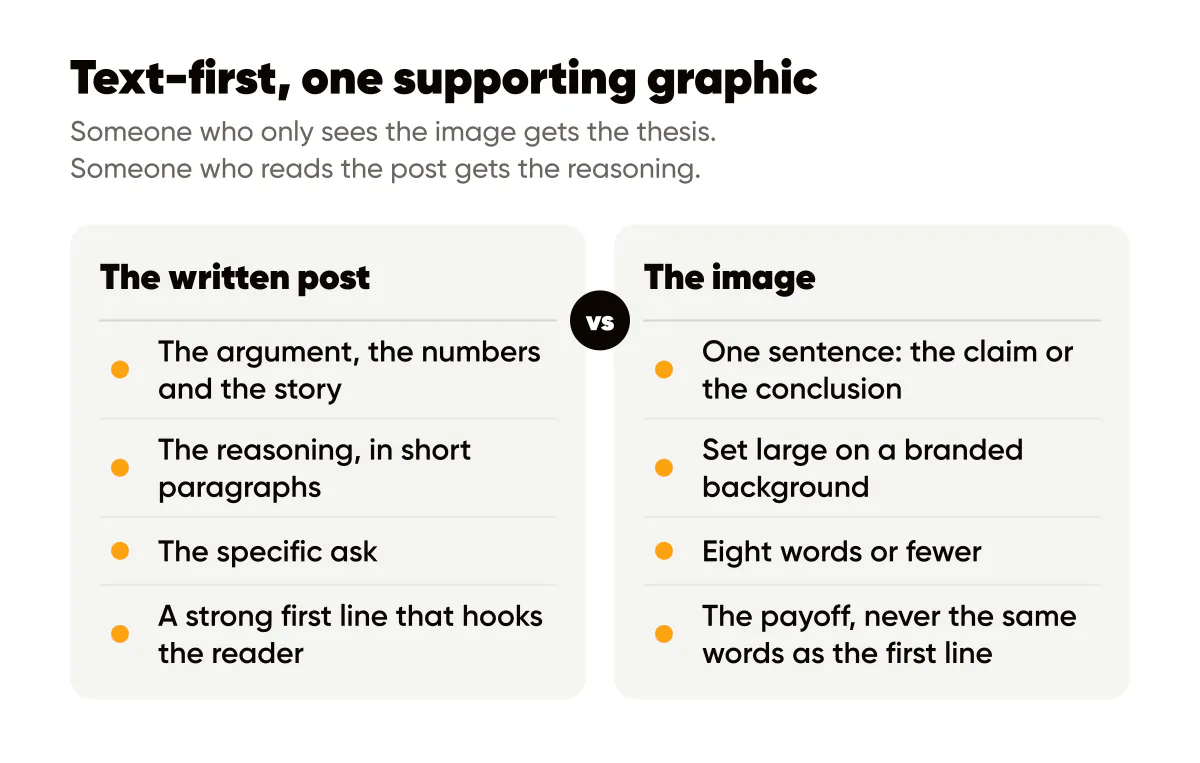
Here is how I split the job. The written post carries the argument, the numbers, the story and the ask. The image carries one sentence, usually the claim or the conclusion, set large on a branded background. Someone who only sees the image gets the thesis. Someone who reads the post gets the reasoning. Someone who does both sees the same idea twice, which is what makes it stick.
Should the image repeat the first line of the post?
No, and this is the mistake I see most. If the first line and the image say the same words, the reader has nothing to gain from opening the post. Use the first line as the hook and the image as the payoff, or the reverse. Example: first line "I turned down a 40k client last month and I would do it again." Image: "Bad-fit revenue costs more than no revenue." Same idea, two angles, and each one makes the other more interesting.
A related rule: keep the image text to eight words or fewer. LinkedIn shows images fairly large on mobile, but people are reading, not looking, and a paragraph on an image asks them to switch modes. The sizing and hierarchy rules from typography for social media posts apply directly; I just push the headline one step larger than I would for Instagram because the LinkedIn feed is denser.
LinkedIn's guidance on increasing the distribution of your content is written for articles, but the underlying advice, publish consistently and write for a specific audience, is the same thing I would tell any founder. No image trick substitutes for a post people want to read.
Professional, not corporate
The design register on LinkedIn is different. The same amber background that performs on my Instagram feed looks loud in a stream of headshots and gray link cards. That does not mean going beige. It means dialing the palette down one notch and leaning on typography.
- Keep your brand color but use it as an accent (one highlighted word, a thin bar, the logo) rather than the full background.
- Use a near-black or off-white background for most posts. Save the full-color background for announcements.
- Set headlines in the same typeface you use everywhere else. Consistency across platforms is the point of having a brand.
- Drop decorative elements: no icons, no stock photos of handshakes, no oversized quotation-mark graphics.
- Keep the logo small and in its usual corner. Your name and headshot already appear above the post; the logo confirms it, nothing more.
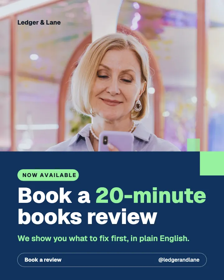
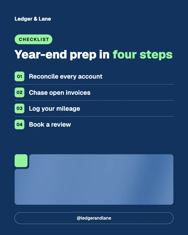
This is the same brand as my Instagram posts with two settings changed: the background and the style. Creobee's LinkedIn post image generator lets me choose both for each batch, so I run a dark-background set for LinkedIn and a brighter set for Instagram from the same brief and the same brand color. The outcome is a grid that looks like one company on both platforms, which is what I laid out in personal brand or business brand as the hybrid approach: business visuals, founder voice.
A worked example
Say you are a fractional CFO who wants to post three times a week. Monday: a text-only post about a cash-flow mistake you saw in a client's books, no image, because the story is the hook. Wednesday: a text post explaining a concept, with a near-black 4:5 image that says "Profit is an opinion. Cash is a fact." in your brand typeface, brand-color accent on "Cash." Friday: a short opinion post with a light-background image listing three words: "Runway. Margin. Sleep."
Notice the ratio: one image-free post, two posts with a single supporting image, zero carousels of slides nobody swipes. On LinkedIn the document post (a PDF carousel) has its place for frameworks, but for a founder building a voice, one text post plus one image is the sustainable format. The thinking behind that cadence is in LinkedIn thought leadership for founders.
Does the same image work on Instagram and LinkedIn?
The same file, yes. The same caption, no. On Instagram the caption can be conversational and short, with keywords for search. On LinkedIn the text is the product, so it needs a hook line, a real argument and a specific ask. Design the image once, write twice.
Do this this week
Take your three best Instagram text posts from the last month. For each one, write a 150 to 250 word LinkedIn post that tells the story behind the headline, and re-export the graphic on a near-black or off-white background with the headline one size larger. Post them Monday, Wednesday and Friday. Compare comments and profile views to your usual link posts. The images that work on both platforms are the ones you should keep in the family; the rules for keeping that family consistent are in brand consistency on social media.
Put it into practice
Turn this into posts designed for your feed
Paste your website or say what you do. Creobee plans, writes and designs your posts about it as one feed in your logo and colors, captions included, and on Autopilot it posts them for you.
How the LinkedIn post generator works